
|
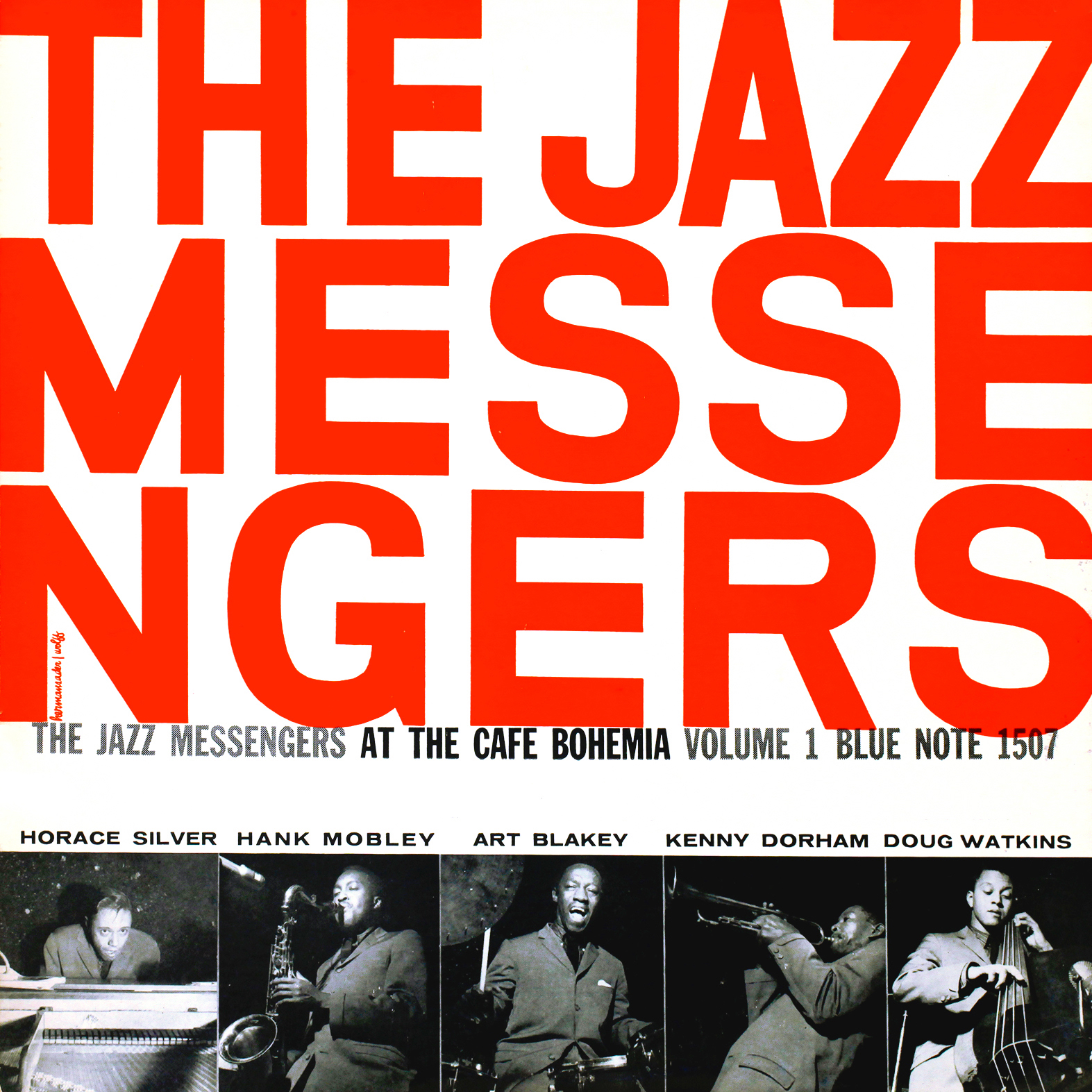
The Jazz Messengers at The Café Bohemia (Vol. 1) Blue Note 1507 Design: John Hermansader In 1956, John Hermansader, who did the majority of the covers for Blue Note’s 5000 series of ten-inch LPs, is on his way out. He will be replaced by his apprentice, Reid Miles, but this didn’t stop Hermansader from doing some striking work before his exit. This is certainly a unique marriage of American and European design traditions. Although the eye-catching font has a cutout and hence more playful feel, the emphasis on bold sans-serif typography with photography playing a supporting role follows in the Swiss tradition. This is an incredibly hip use of typography that is made all the more cooler by its unconventional, hyphen-less word break. |
|
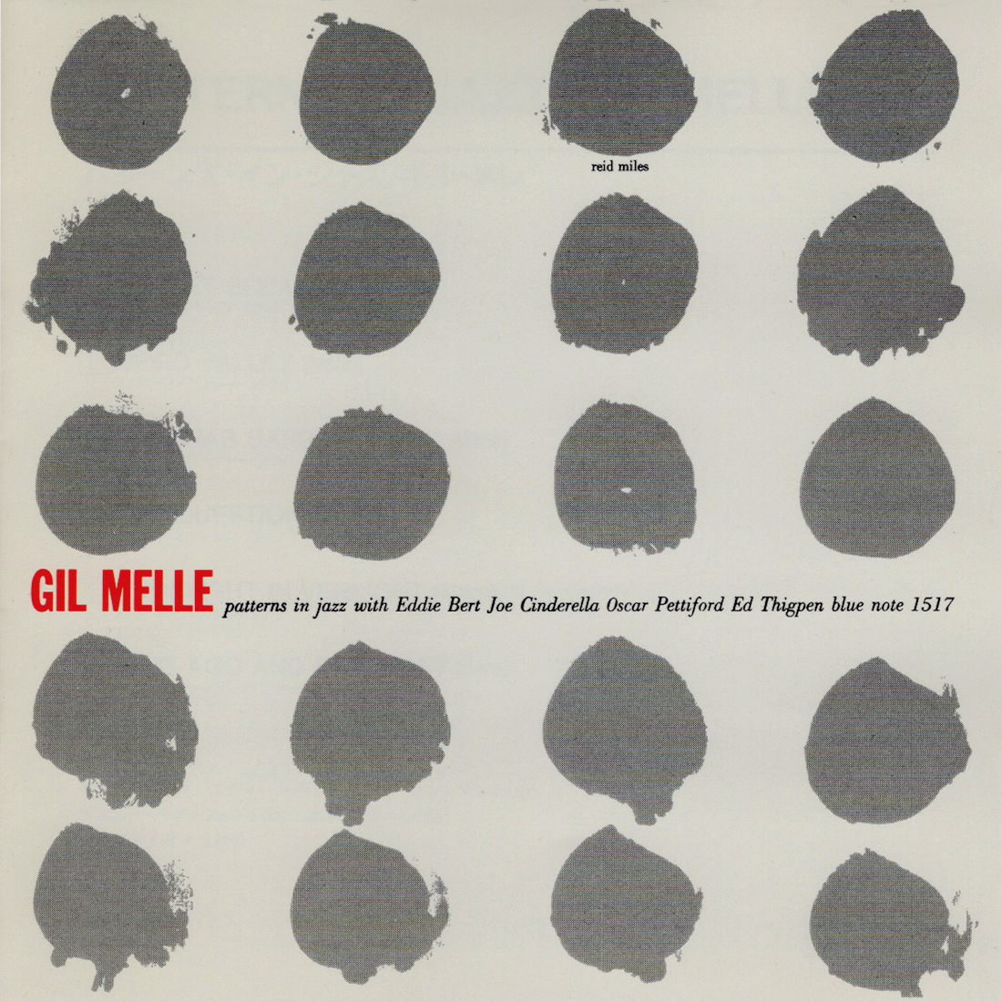
Gil Mellé Blue Note 1517 Design: Reid Miles Reid Miles’ first entry in the gallery has an understated simplicity, and the large, symmetric paint blots have “MODERN” written all over them. |
|
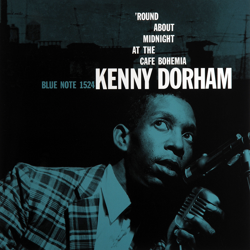
Kenny Dorham Blue Note 1524 Design: Reid Miles The shot of Dorham clutching a vintage-looking (even for that time) microphone is sublime, and the asymmetrical positioning of the album title is unquestionably of the Swiss tradition. There is also subtle use of a moonlit industrial cityscape that both completes the cover’s backdrop and cleverly complements the album’s title. |
|
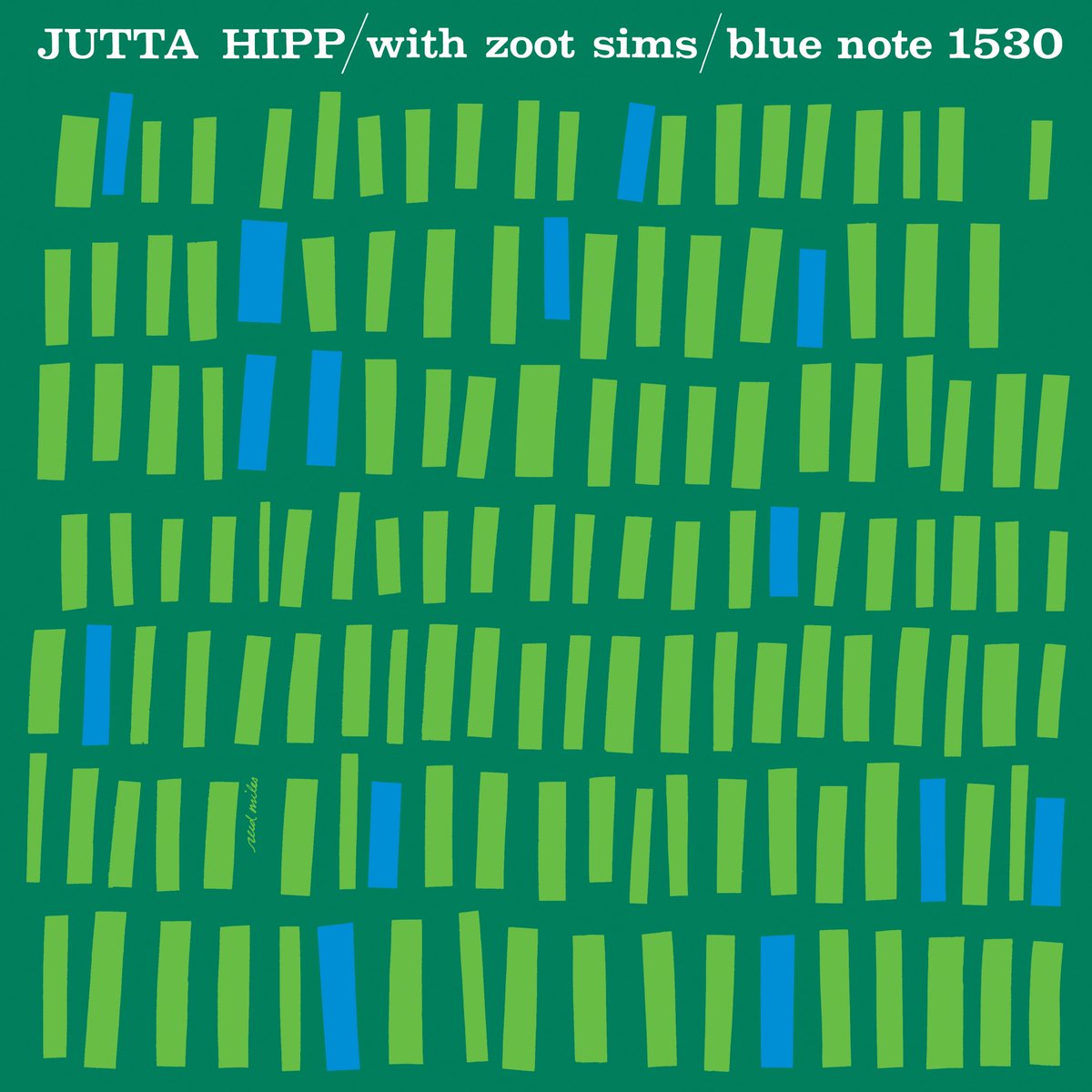
Jutta Hipp with Zoot Sims Blue Note 1530 Design: Reid Miles This is an album that probably sells a lot of copies just for the cover. Out of context, these rectangles might look playful and organically modern, but in context we can’t help but also think of this two-tone array of shapes as piano keys. For the first time in this gallery, we also see Reid Miles making use of one of his favorite serif fonts, Clarendon Bold. Incredibly classic and among my most favorite covers. |

|
Kenny Dorham Blue Note 1535 Design: Reid Miles I love the illustration and the bold combination of deep red, black, and white. A fine marriage of American and European styles. |
|
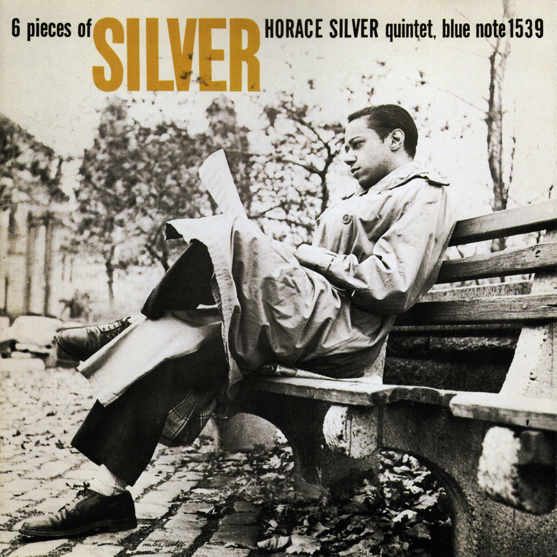
Horace Silver Quintet Blue Note 1539 Design: Reid Miles The photograph of Silver makes this cover. Smartly dressed in a trench coat and dress shoes, the leader peers at some sheet music while sitting on a city bench. Reid Miles adheres to the Modern design manifesto of form following function by strategically placing the album information in a way that does not intrude on this lovely photo. |
|
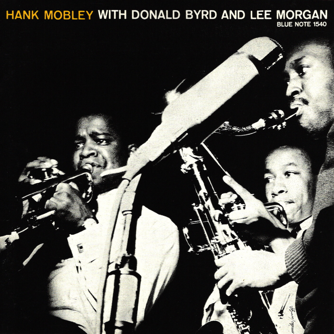
Hank Mobley with Donald Byrd and Lee Morgan Blue Note 1540 Design: Reid Miles Again, Miles’ minimal use of typography primarily serves to support a brilliant image of the album’s three stars. Francis Wolff’s photo has perfect perspective that highlights everyone’s faces along with instruments and microphone. |
|
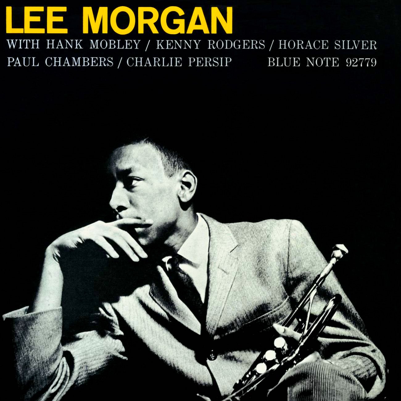
Lee Morgan Sextet (Vol. 2) Blue Note 1541 Design: Reid Miles Another cover where Wolff’s brilliant photography rightfully takes center stage. This is perhaps where the tag team of Miles and Wolff began venturing into new, unchartered territory as a design duo. Very few, if any, of the examples that accompany my essay place such a strong emphasis on photography in the finished product. |

|
The Magnificent Thad Jones Vol. 3 Blue Note 1546 Design: Harold Feinstein I’m not sure why Reid Miles wasn’t used on certain occasions, but here we have Harold Feinstein following in Miles’ footsteps by taking yet another wonderful candid photo and supporting it with some striking typography. The bold contrast of yellow and white on black is especially stimulating. |
|
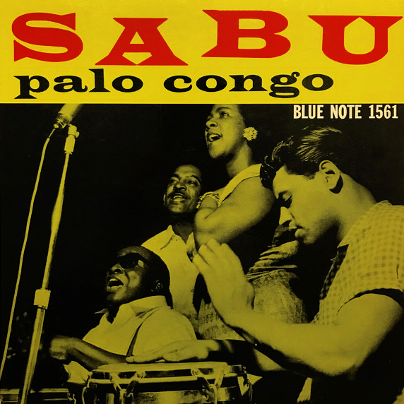
Sabu Blue Note 1561 Design: Reid Miles Here we have some playful use of a big serif font that, along with smart color choices, comprise this cover’s greatest strengths. |
|
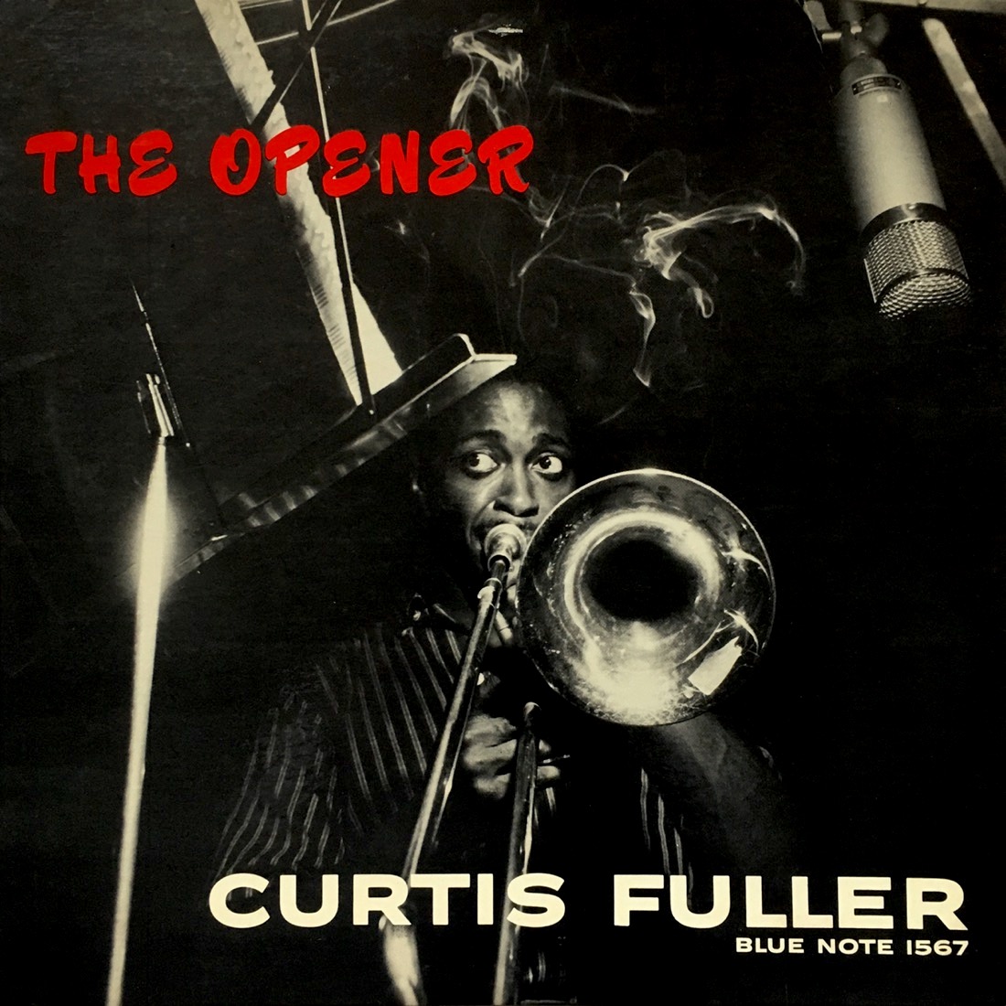
Curtis Fuller Blue Note 1567 Photography: Francis Wolff This is one of my favorite Francis Wolff photos. A wide-eyed Fuller intensely stares at his sheet music through a room (Rudy Van Gelder’s living room) filled with swirling cigarette smoke. A dangling Telefunken U-47 microphone picks up the sounds from Fuller’s instrument as he works through the changes. The fat, all-caps white font used for Fuller’s name provides great contrast, and though the strange font used for the album title is indeed quirky (the fact that it is in all caps is especially quirky), I think I like it as much as I do because of just how unorthodox it is. I’m also a fan of the contrast created by this deep red on top of the black background. Though there is no design credit, I have my suspicions that this is a Harold Feinstein cover. |
|
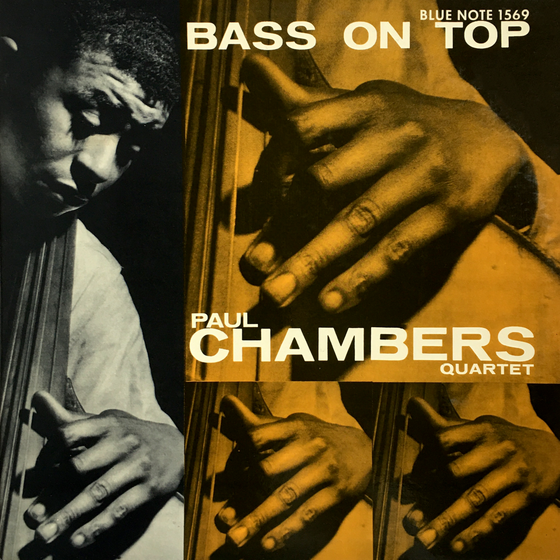
Paul Chambers Quartet Blue Note 1569 Design: Harold Feinstein Feinstein’s layout of the duplicate photos is maybe a bit too simplistic, but the colors, font, and photo of a contemplative Chambers in action all make up for it. |

|
Sonny Clark Blue Note 1576 Design: Reid Miles Here is a cover that manages to have strong appeal despite its very simple presentation. Miles makes great use of negative space, and the geometric simplicity of the cover’s three rectangular sections gives the user an instant sense of understanding the artist’s message. |
|
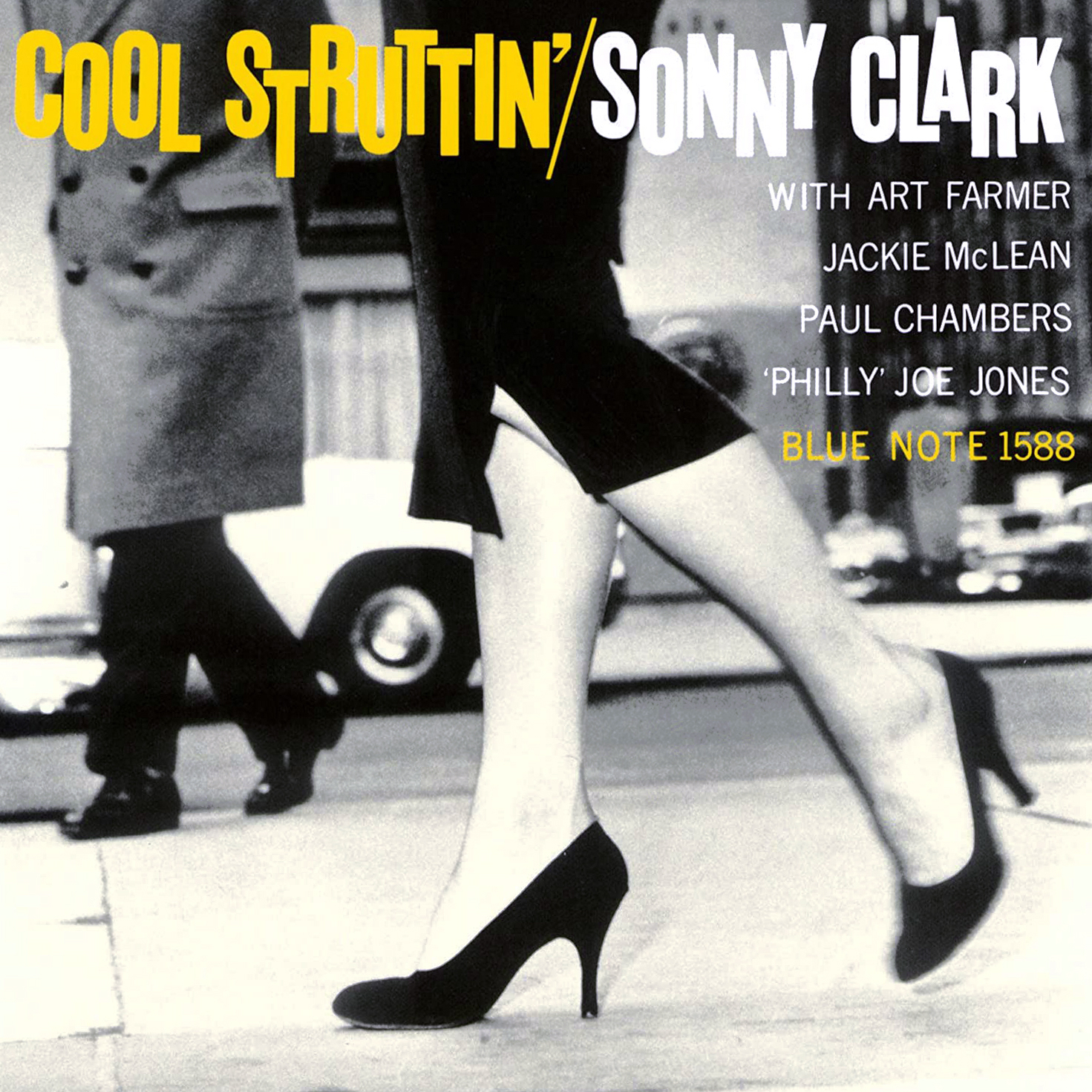
Sonny Clark Blue Note 1588 Design: Reid Miles This is arguably the most iconic jazz album cover of all time, and for good reason. It oozes hipness. Aside from the perfect framing of the image by Francis Wolff, Reid Miles bats cleanup and hits a home run with typography that is eye-catching and unobtrusive all at once. Now here we have a design motif that definitively does not fall into the category of Early Modern American design. The jumble of all-caps, sans-serif letters is a good example of American influence fused with the Bauhaus/Swiss tradition. Although it’s only 1958 when this album is released, this kind of word jumble will soon become a hallmark of ’60s typography. |
|
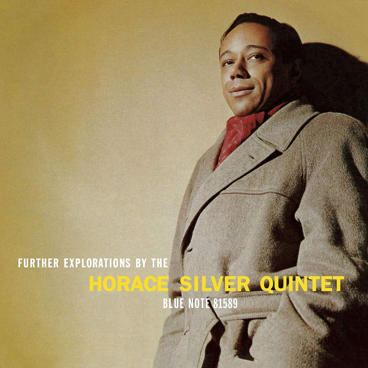
Further Explorations by The Horace Silver Quintet Blue Note 1589 Photography: Francis Wolff Wonderful use of negative space here, and Miles once again finds a way to subtly complement a great Francis Wolff photo with minimalist typography. Notice that this is a color photograph. Looking at the history of classic Blue Note album covers, it appears that Blue Note saved the use of color photography, which was more expensive, for its top-tier artists. Check other Silver covers in the late ’50s and early ’60s as well as other big Blue Note artists like Art Blakey and Jimmy Smith. |