
 |
As a fan of classic jazz, it was easy for me to fall in love with the art on the album covers. In fact, my foray into jazz record collecting began not with a record but with a book. Flipping through the pages of Blue Note Album Cover Art: The Ultimate Collection, I was captivated by the fresh Modern design, expressive photographs, and geometric typography of Blue Note’s legendary covers. As I browsed record store shelves and websites like Birka Jazz, it soon became clear that other classic jazz labels had a lot to offer in the way of album art as well.
In the years since, I have often peered at the covers of my favorite albums, wondering how these works fit into the larger puzzle of 20th century graphic design. On occasion, I would ask a couple friends who work as graphic designers to comment on my favorite covers and provide some historical context. But it wasn’t until recently that I started learning this history on my own.
My curiosity was rooted in my youth. I had a strong interest in art as a child and teen, an interest of which, for better or worse, was eventually thwarted by a sports-crazed family that felt a career in art wasn’t practical. So off I went to study history and mathematics in college. But my interest in art continued, and my passion for drawing morphed into a newfound interest in graphic design as I sought to self-promote my endeavors as an independent musician and DJ. (For some examples of my own amateur graphic design work, click here.)
The motivation for this study primarily came from a recent realignment of my collecting values. I started to seriously reconsider the way I collect, with the goal in mind of maximizing my joy and minimizing my stress related to collecting. The solution I found was partly informed by the realization that cover art plays a significant role in my collecting habits. I then began taking careful stock of my favorite album covers, and after accumulating many high-res album art images, I decided to share them in an online gallery.
But I continued to ask myself: What is it about these covers that makes them so timeless? I couldn’t help but suspect that there was something groundbreaking about album art design in the 1950s and ‘60s and I wanted to know more. So my designer friends pointed me in a direction by dropping some names and I went to work. A few weeks ago, I had no idea I would get to the place I am now, where I feel versed enough in the topic to write a piece on it, but here I am.
That said, disclaimer: I am not an expert. There are surely plenty of comprehensive texts on Modern graphic design studied by art majors all over the world. I was never one of them. In consideration of this, I am making a conscious effort to use a voice for this essay that is not authoritative, and I will more often than not make my best educated guess at what the valid conclusion of an expert might be. In the event that I miss my mark, you are welcome to debate and/or correct me by contacting me here.
For clarification, this essay’s aims are primarily twofold: 1. To discuss the graphic design styles utilized in the creation of my favorite jazz album covers, and 2. To contemplate the origins of those styles.
Timeless Design
We begin our journey during the classic era of the vinyl LP, approximately 1955 to 1965. What do we see during this time period? It’s not easy to generalize in situations like these, but many jazz album covers from this era have a few key properties:
- Graphic design that showcases typography and photography
- Sans-serif, all-caps typography
- “Two-tone” printing that only utilizes black and one other color
 |
There is something timeless about album cover design from this era that I do not feel is as much the case with design work preceding it. If I made an attempt to make an objective claim about this, I would surely fail. Yet I still feel it would be useful to say a little something about why I think this is the case.
In the broader world of art, there are certain movements that are helplessly “of a period”. In other words, anyone revisiting these works in the future who has some basic knowledge of art history is bound to successfully identify these works as being created in a particular time period and/or belonging to a particular movement; if they weren’t created in that period, the artist will have surely been inspired by that period. For example, someone with a verbose hairstyle wearing clothes that emphasize neon colors and black-and-white checkered patterns will more often than not be thought of as partaking in a revival of ‘80s fashion.
What we have with jazz album covers from the late ‘50s and early ‘60s, however, is a style that I would argue is more difficult to associate with a particular era of time. In fashion, I believe the appropriate analogy would be with the Ivy League style, also known as “prep”. Through the remainder of the 20th century and beyond, this particular style of dress has managed to remain relevant in parallel with rising and falling trends like that which typifies the style of the ‘80s.
What is it about this particular style of jazz album art design that, like Ivy League style, makes it so durable over the years? If I had to pin it down to one major theme, I would argue that it is the understated simplicity of the style that allows it to thrive decade after decade. Although we should keep in mind that in the grand scheme of things, the decades that have elapsed since the 1950s only represent a small fraction of the time covered by the whole of art history, so it remains to be seen just how “timeless” a lot of Modern art really is. Either way, it is beautiful design worthy of analysis.
Modern Art
When I began studying this topic, I already had a sense that the era of classic jazz album art is part of the Modern period of art and design. I have since learned that this period stretches back as far as the late 19th century, and though the Postmodern period can be said to have begun decades ago, one can argue that we are still in the Modern period today.
It seems that there were two major forces at work in the advent of Modern art: 1. The industrial revolution, and 2. A strong desire on behalf of the artists to break with the realist and romantic traditions before them. Modern painting, for example, appears to have schools such as Impressionism and Cubism at its foundation. As for the individuals, these were artists who were growing less and less interested in art that functioned to communicate a literal interpretation of reality, which in turn gave way to abstraction, surrealism, and the avant-garde. I might argue that the spirit of abstraction is very much alive in classic jazz album art, manifesting in the rigid geometry of the font choices, the structured placement of both typography and imagery, and the primal shapes that often make their way onto the covers.
Early Modern vs. Modern Design
There is something about this midcentury period of album art design that distinguishes itself from design trends in the decades leading up to it. Anyone having even a passing interest in the Early Modern American graphic design of the 1940s and early ‘50s should have an easy time picking out a few trends rejected by the Modern designers of the late ‘50s and early ‘60s. (Please note: While “Early Modern” design is of course “Modern” at the same time, I will be frequently referring to the period following the Early Modern period as simply “the Modern period”.) Though it certainly was not a clean-cut break, Early Modern design features a lot more illustration and hand-drawn fonts, the latter of which was inspired by a booming sign painting industry (thanks for this insight, Will). Indeed, these stylistic choices still show up in the Modern design era, but their use is not nearly as consistent and fades over time.
A good example of how things shifted from the illustration-based designs of the Early Modern period to a focus on photography and typography in the Modern period can be found in the evolution of album cover design for Blue Note Records during the ten-inch LP era, which spanned a short period of time from 1951 to 1954. Modern ideas show up from time to time during this period, but the label’s main graphic designers, Paul Bacon and John Hermansader, were mostly working in the Early Modern style.
 |
| Thelonious Monk, “Genius of Modern Music Vol. 2” (Design: Paul Bacon) [1952] |
Taking on the soon-to-be-legendary Reid Miles as an apprentice at this time may have influenced John Hermansader to start working more and more of the new Modern design elements into his covers. And when Miles took over as Blue Note’s chief cover designer at the dawn of the twelve-inch LP era in 1956, the influence of Early Modern design in Blue Note’s covers begins to dissipate. The greatest casualties were illustration and serif fonts, which quickly fell out of favor and into obscurity.
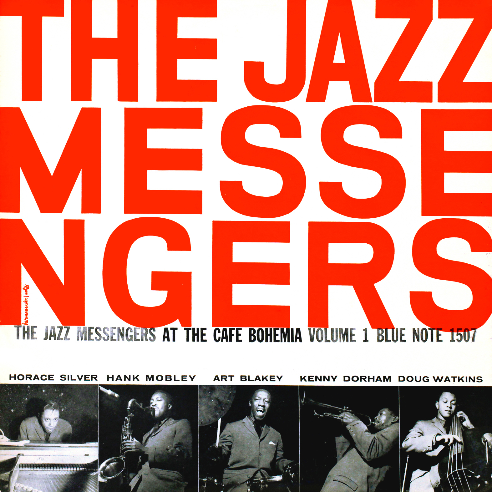 |
| The Jazz Messengers at the Cafe Bohemia (Design: John Hermansader) [1956] |
Of course, Miles wasn’t the only jazz album art designer working during this period, but I think his work has garnered more praise and has also proven more influential than any other designer from this era, by far. Regardless, Miles is representative of a movement in American graphic design away from the Early Modern style toward something fresh and new. (For more examples of the aforementioned designers’ works, please visit the The Deep Groove Mono Classic Jazz Album Art Gallery.)
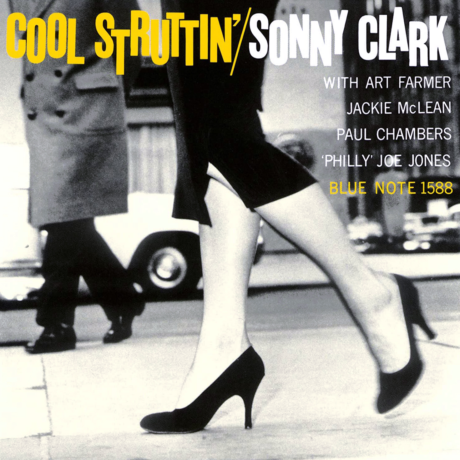 |
| Sonny Clark, “Cool Struttin'” (Design: Reid Miles) [1958] |
Modern Design Styles
Until now I have been biting my tongue in order to avoid prematurely introducing the notion of European influence in American graphic design. This is surely up for debate, but my feeling is that the style of design that dominated jazz album covers in the Modern period is most closely associated with the Swiss Style of graphic design, a style which eventually became known as the International Typographic Style due to its near-universal implementation all over the world during the latter half of the 20th century.
When I first began my research, I quickly realized that there were many European schools to study. I started reading articles addressing the Constructivist, De Stijl, and Bauhaus schools (all of which I will address more later), and I started seeing similarities between these schools and the classic jazz album art I love. But it wasn’t until I arrived at Swiss Style that I felt I had truly pinpointed the key source of inspiration for Modern American jazz album cover design.
The main properties of Swiss Style that show up in jazz album art are:
- Minimalist design that aims to include only the most essential graphical elements
- An emphasis on typography and photography
- Sans-serif fonts
- The use of an underlying grid for positioning of text and photos
- Asymmetrical positioning of typography within that grid
While this connection seemed clear to me, my designer friends emphasized that Modern American jazz album cover design also incorporated elements from outside the Swiss tradition. Generally speaking, European designers followed relatively strict guidelines laid out by the pioneers of the Continental movements (I will name several of these pioneers later). American designers, on the other hand, were more willing to diverge from these manifestos found in popular graphic design literature of the day. Here in the states, designers of the ’40’s, ’50s, and beyond were more likely to continue incorporating serif fonts, handwritten cursive, and illustrations in their work. They were also more likely to modify otherwise ideal design elements in order to give them a more human feel, and all of these deviations show up frequently in classic jazz album art alongside the hallmarks of Swiss Style.
Constructivism
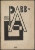
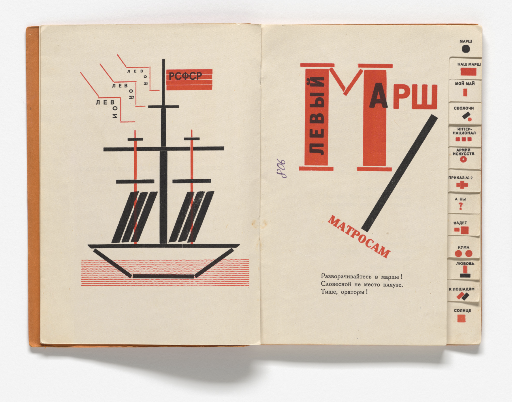
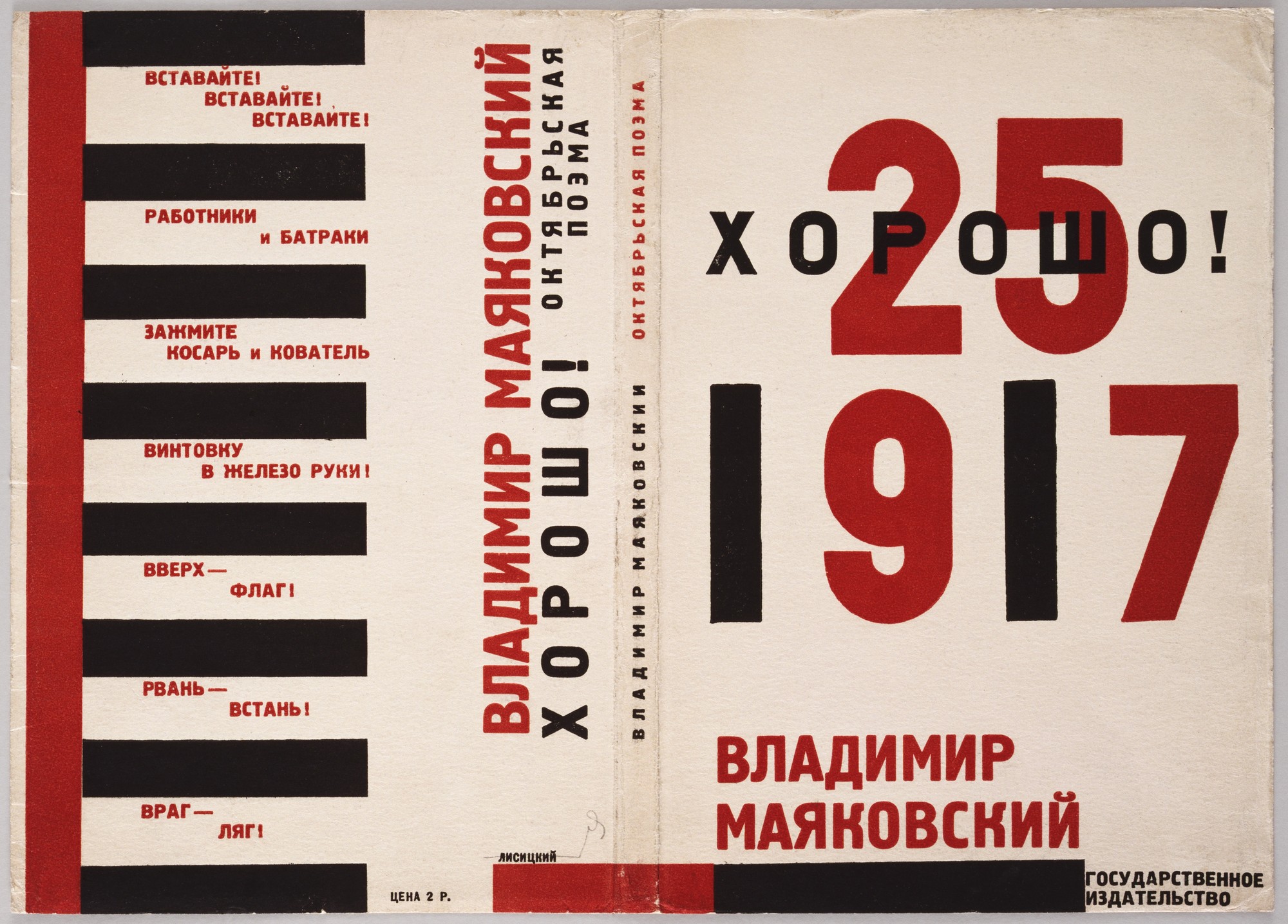
The earliest examples of graphic design I could find where I saw a relatively clear connection with classic jazz album art were in Constructivism, a Russian movement that began around 1915 and itself was influenced by the tenets of industrialism and the radical ideas at the heart of the Bolshevik Revolution. The emerging trend was to create bold, to-the-point graphic design for media such as posters and book covers that reflected the strong political currents common in Russian cities at the time. The design also had to be mass production friendly. Many Constructivist designers were mentioned in the articles I read, but I have chosen to focus on the work of Lazar Markovich Lissitsky, better known simply as El Lissitsky (Russian, 1890-1941), a man whose designs seemed especially connected to the lineage of Modern design manifesting in American jazz album art.
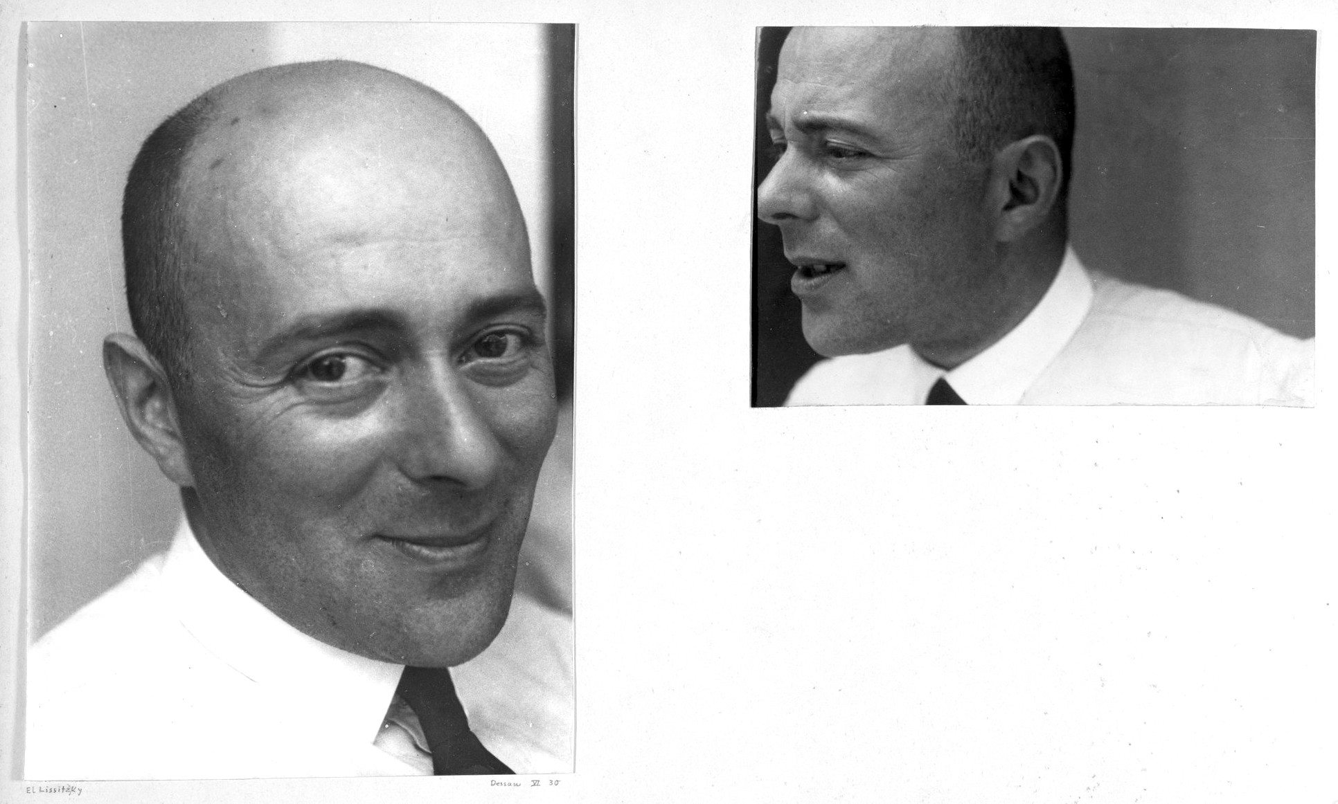 |
| El Lissitsky ca. 1931 (photos by Josef Albers) |
As you will see in the examples below, Lissitsky favored bold fonts and geometric shapes, and his minimalist outlook is evidenced by the smaller numbers of objects on each page. Elaborate decorations are completely absent, and Lissitsky’s work thus stands as an early example of the “form follows function” philosophy of Modern design, which aims to let the purpose of the work dictate what components are used. The hope is then to eliminate unnecessary clutter that may have otherwise resulted in a reversal of the two values. Needless to say, this way of thinking was consistent with the emphasis on efficiency within Russia’s new Communist society.
PLEASE NOTE: YOU CAN CYCLE THROUGH THE GALLERIES IN THIS ARTICLE BY SIMPLY CLICKING (DESKTOP) OR TOUCHING (MOBILE) THE ENLARGED PHOTO
-
 El Lissitsky, Cover for "Shest Povestei o Legkikh Kontsakh (Six Tales with Easy Endings)" (1922)
 -
 El Lissitzky, Cover for "Das Entfesselte Theater (The Theater Unbound)" by Alexander Airoff (1923)
 -
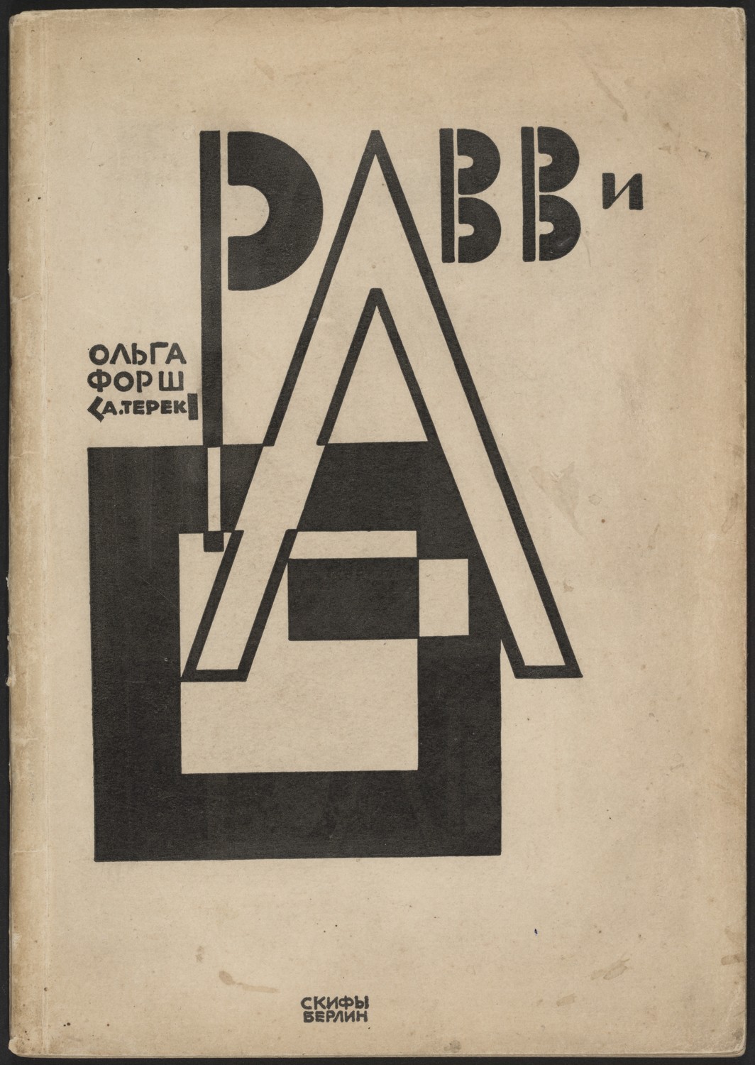
 El Lissitzky, Cover for "Ravvi (Rabbi)" (1922)
 -
 El Lissitsky, Cover for "Veshch (Thing)" (1922)
 -
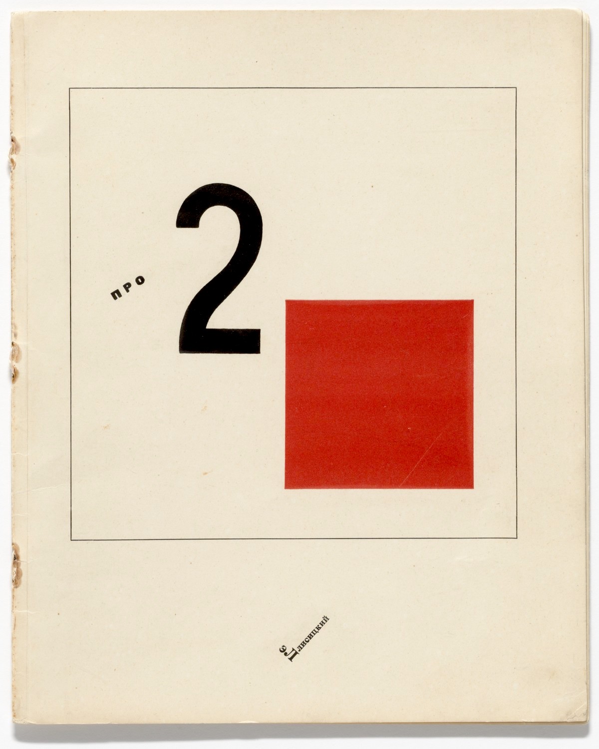
 El Lissitsky, "Pro Dva Kvadrata (About Two Squares)" (1920)
 -
 El Lissitzky, "Figurines: The Three Dimensional Design of the Electro Mechanical Show Victory over the Sun" (1920-21)
 -
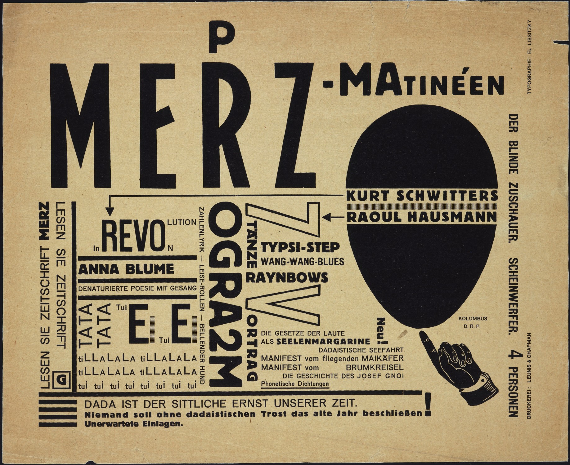
 El Lissitsky, Flyer for "Merz-Matinéen" (1923)
 -
 El Lissitsky, Inside of "Dlia Golosa (For the Voice)" (1923)
 -
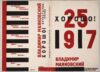 El Lissitzky, Jacket for "Good!" by Vladimir-Mayyakovsky (1927)


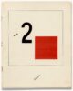
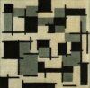
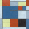
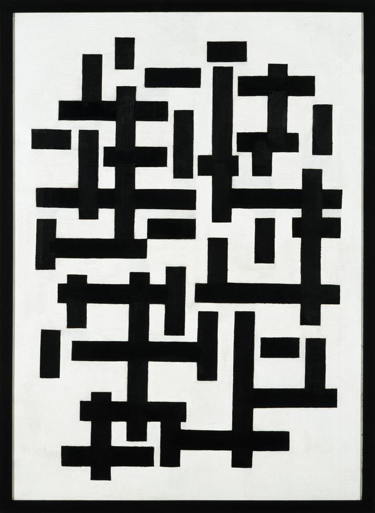
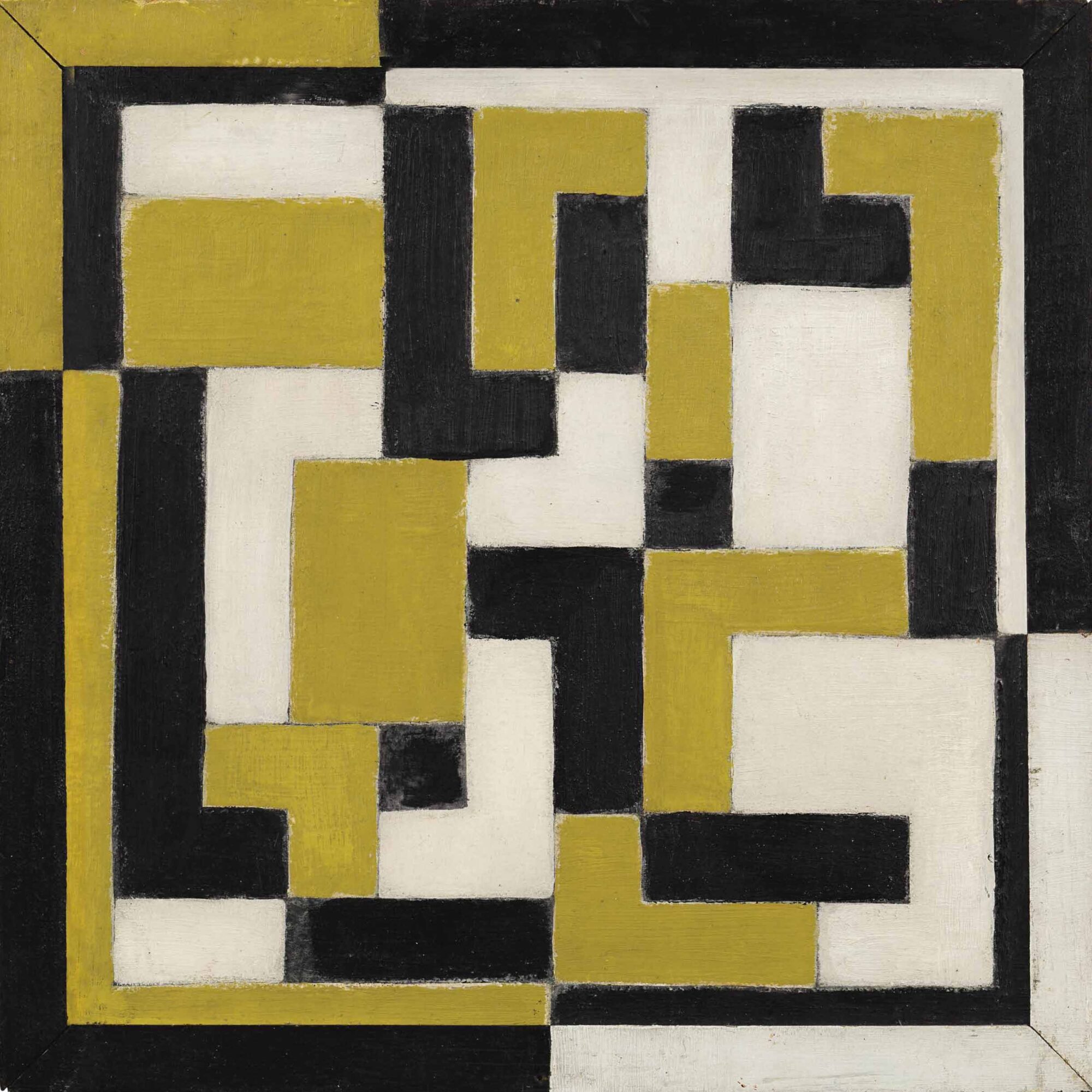
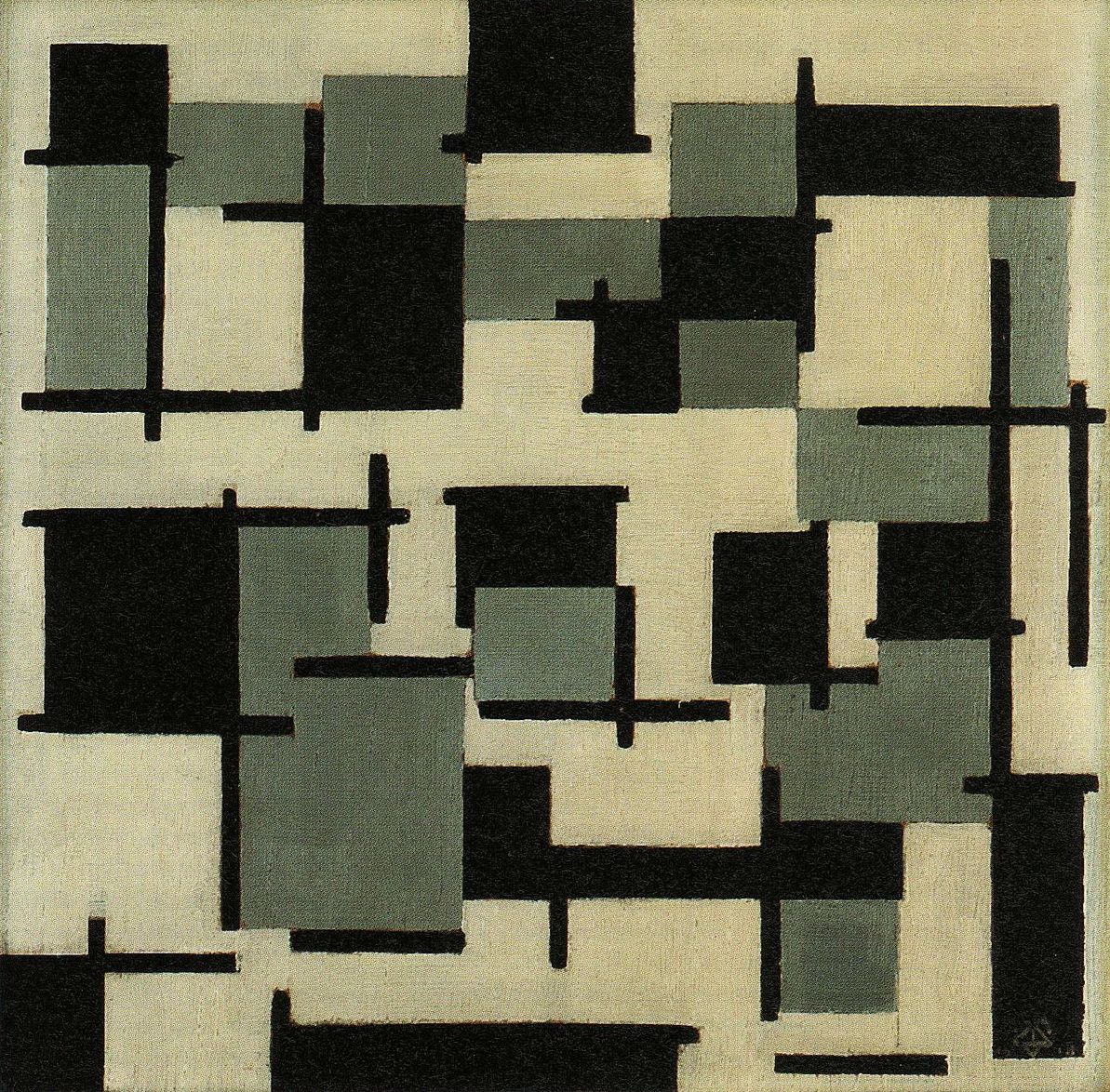
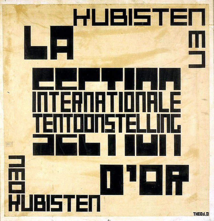
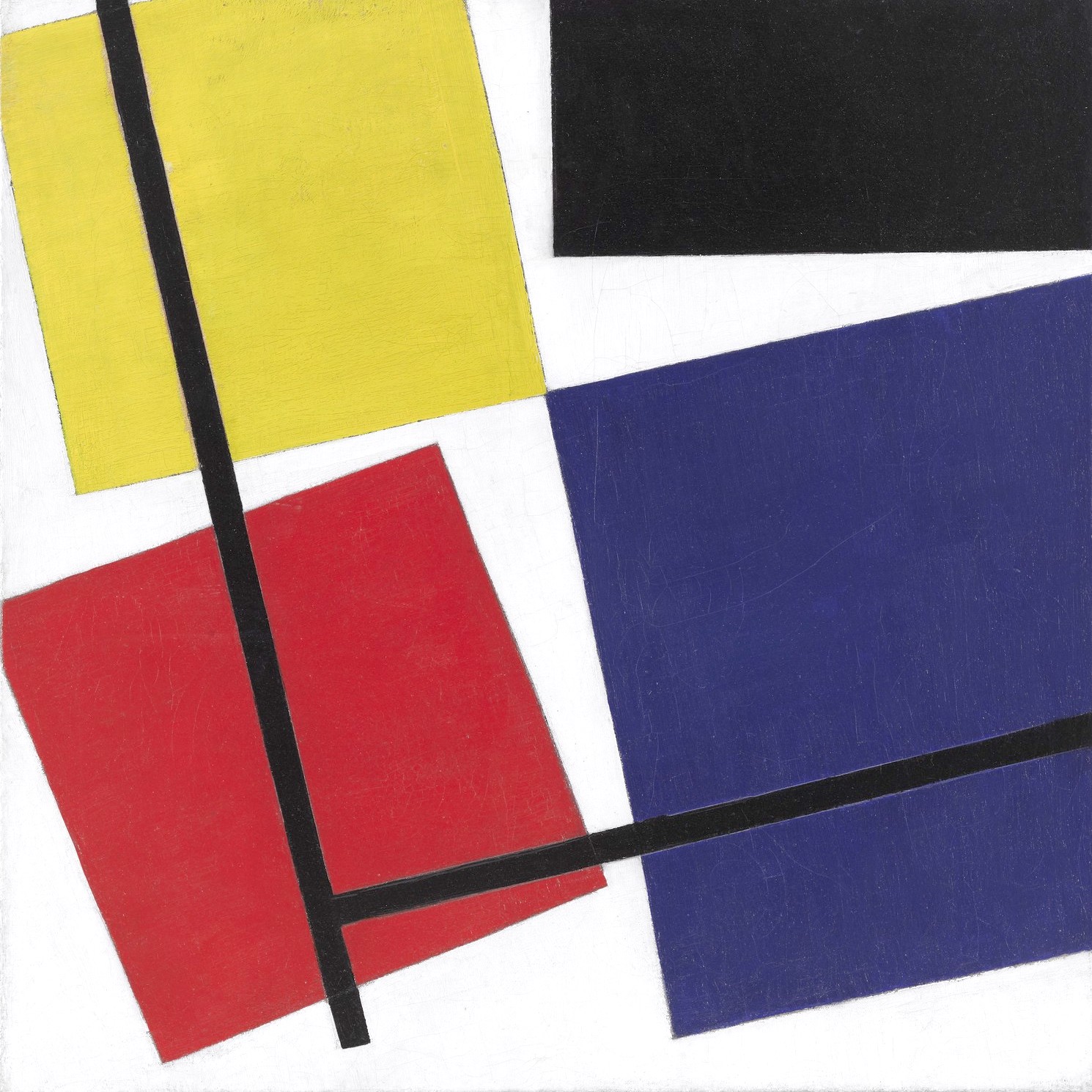
De Stijl
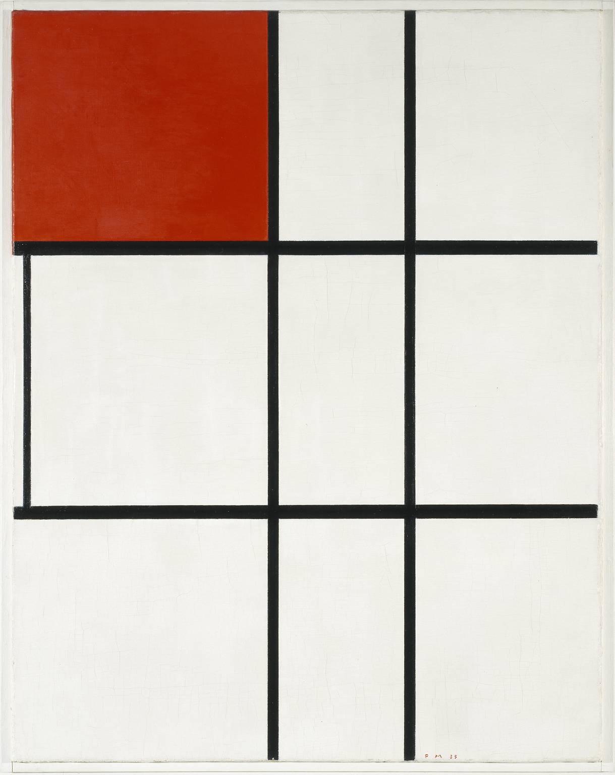
Over in the Netherlands, beginning around 1917, Dutch designers were working similar principles into their work. These designers, which included Piet Mondrian (Dutch, 1872-1944) and Theo van Doesberg (Dutch, 1883-1931), took things to a greater extreme than the Constructivists, stripping their new De Stijl style down to only the most primary of colors and the most fundamental of geometric shapes.
 |
| Piet Mondrian and Theo van Doesberg |
Though Mondrian and van Doesberg may be more properly in the category of painters than designers, their zealous minimalism and emphasis on simple shapes would soon prove an undeniable influence on an emerging German school that would serve as a hub of innovation in design during the 1920s and early 1930s.
-
 Theo van Doesberg, "Composition Weiss Black" (1918)
 -
 Piet Mondrian, "Composition B (No.II) with Red" (1935)
 -
 Theo van Doesberg, "Composition VII: de Drie Gratiën (The Three Graces)" (1917)
 -
 Theo van Doesberg, "Composition" (1917-18)
 -
 Theo van Doesberg, "Composition XIII" (1918)
 -
 Theo van Doesberg, "Design for an Exhibition Poster for La Section D'Or" (1920)
 -
 Piet Mondrian, "Composition C" (1920)
 -
 Theo van Doesberg, "Simultaneous Counter Composition (I)" (1929-30)
 -
 Theo van Doesberg, "Simultaneous Counter Composition (II)" (1929-30)


The Bauhaus School
The Bauhaus school opened in Weimar, Germany in 1919. Continuing in the Constructivist tradition of form following function, the school brought together a cornucopia of brilliant artistic minds from all over central Europe. This included Josef Albers (German, 1888-1976) and László Moholy-Nagy (Hungarian, 1895-1946), whose work I found particularly connected to American jazz album art.
 |
| Josef Albers and László Moholy-Nagy |
The Bauhaus school taught design in many different fields including architecture. It became a European center for advancements in design that earned a visit from Constructivist El Lissitsky himself in 1922. Also that year, though he was never officially affiliated with the school, De Stijl pioneer van Doesberg moved near the school’s grounds, and his ideas couldn’t help but permeate the Bauhaus philosophy.
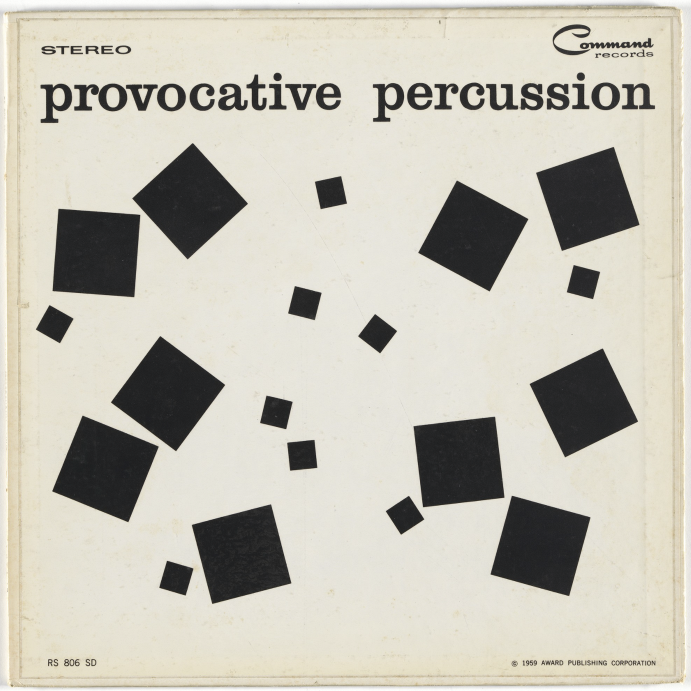
Josef Albers, who would emigrate to the U.S. after the Bauhaus closed in 1933, made extensive use of geometry in his work. Beginning as a professor at Black Mountain College in North Carolina, he would later land a position at Yale in 1950. Albers’ connection to jazz album art is further evidenced by his work designing album covers for American record label Command in 1959.
-
 Josef Albers, "Ascension from the Series Graphic Tectonic" (1942)
 -
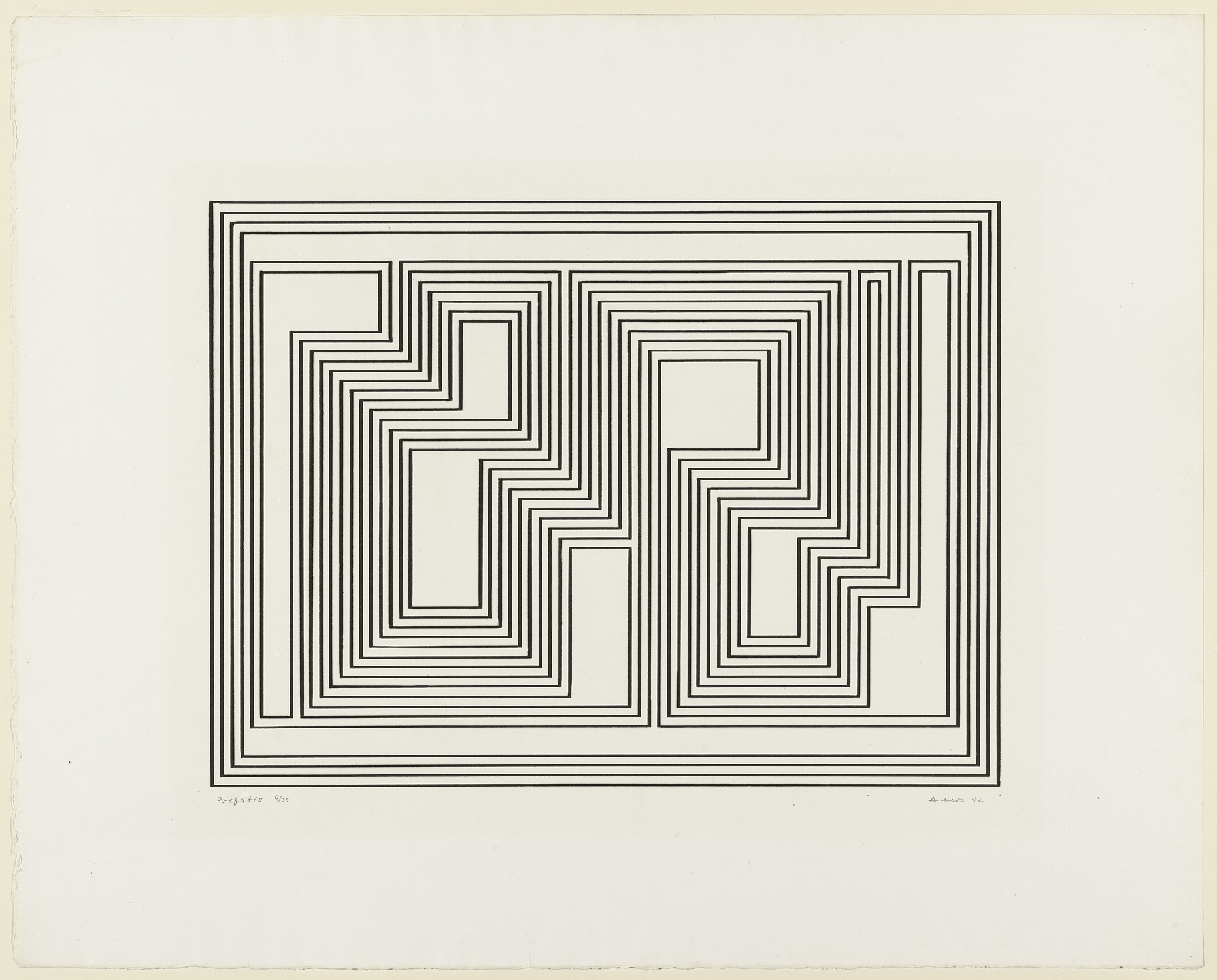
 Josef Albers, "Preface from the Series Graphic Tectonic" (1942)
 -
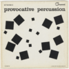 Josef Albers, Album Cover for Enoch Light and the Light Brigade, "Provocative Percussion" (1959)
 -
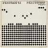 Josef Albers, Album Cover for Terry Snyder and the All Stars, "Persuasive Percussion" (1959)
 -
 Josef Albers, "Homage to the Square in Green Frame" (1963)


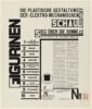
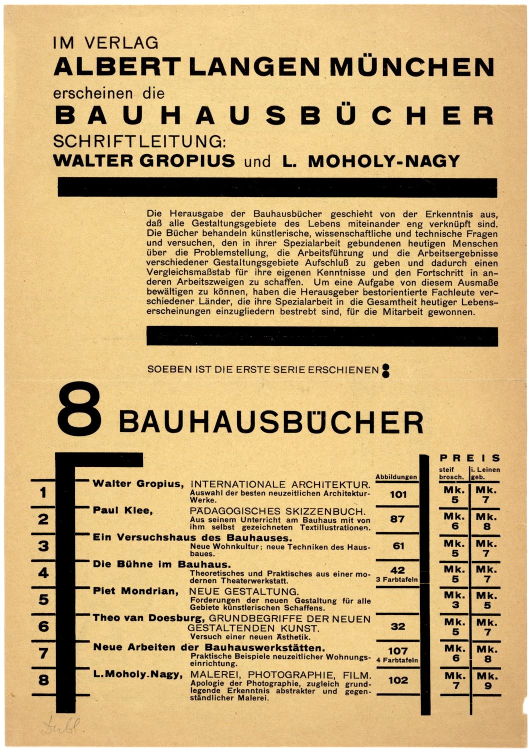
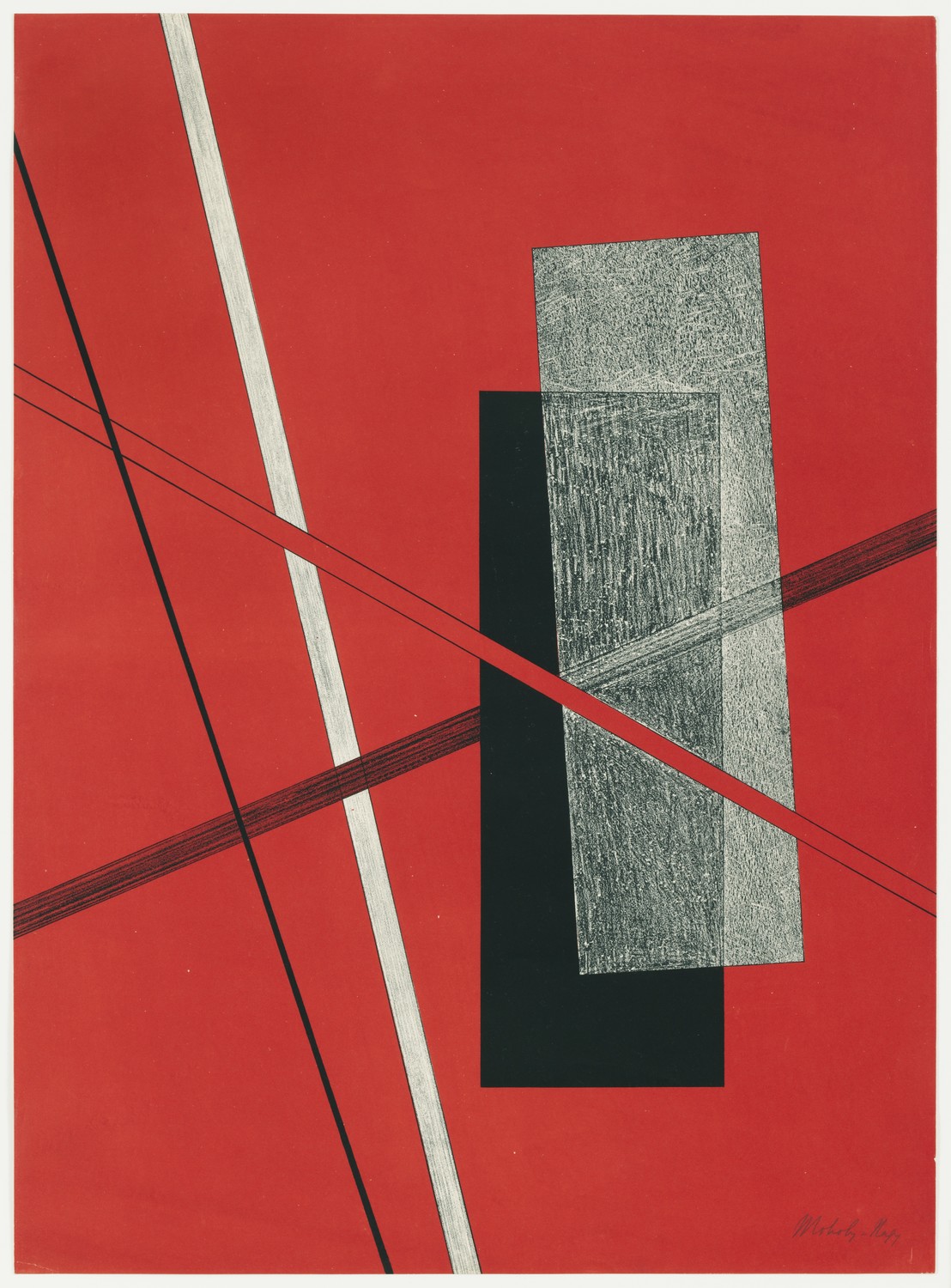
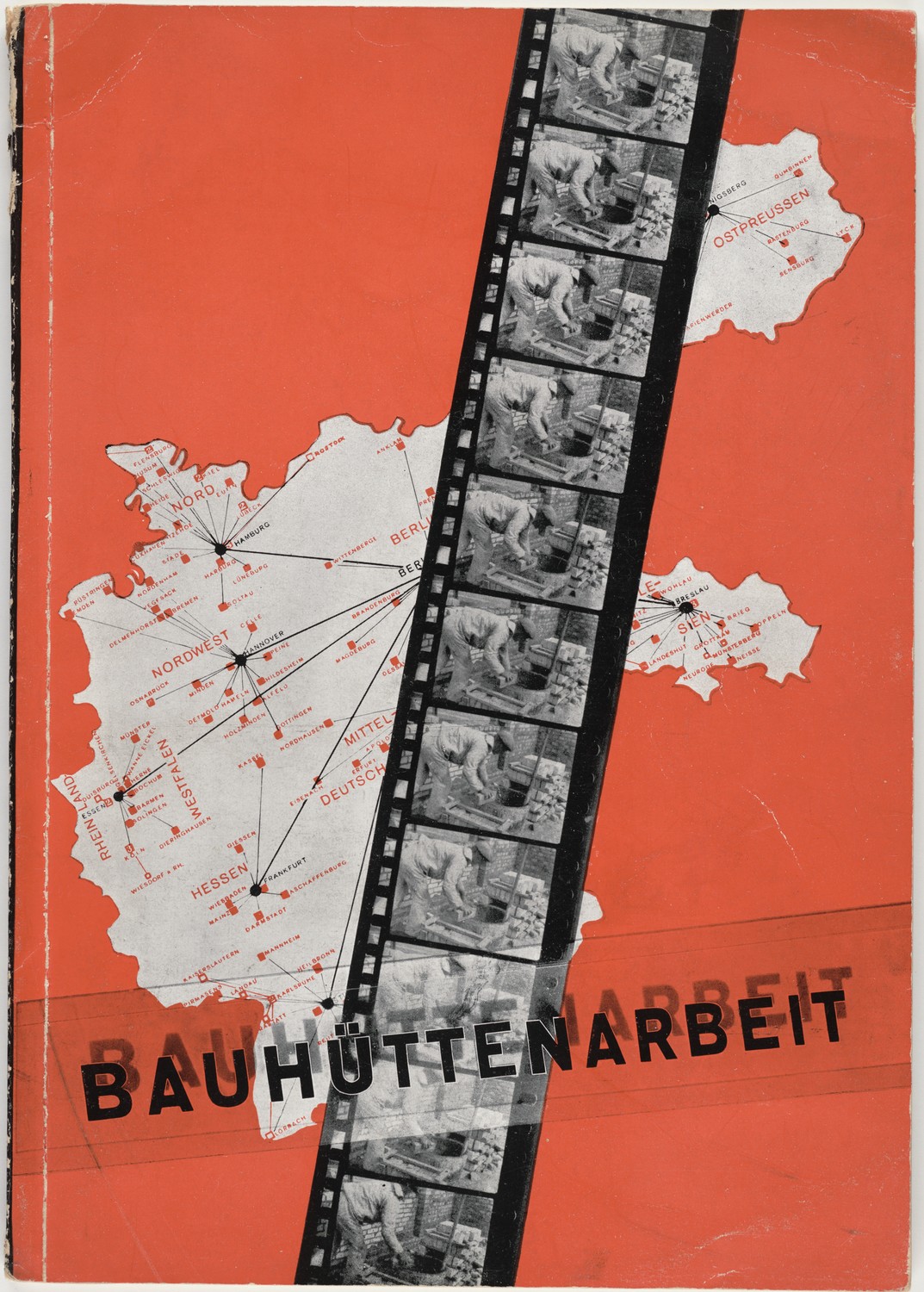
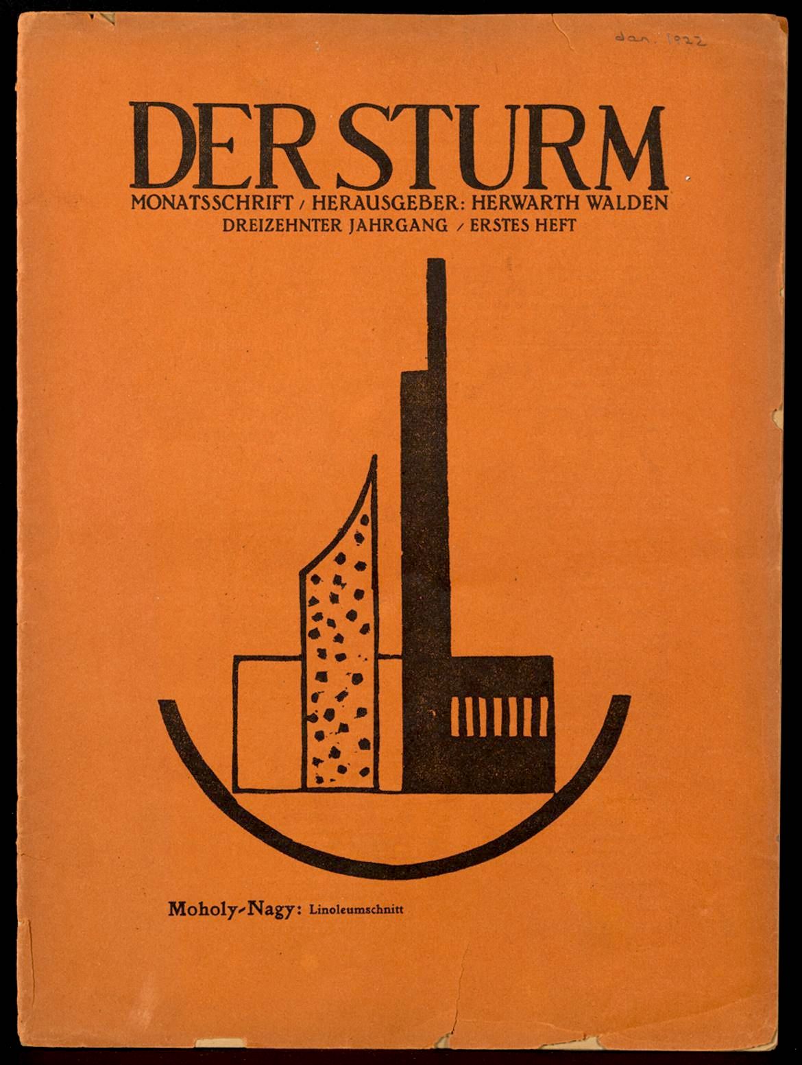
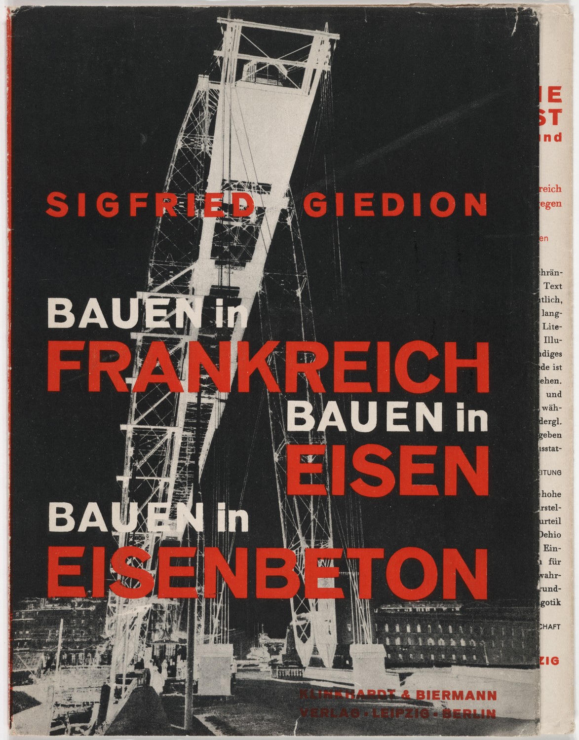
László Moholy-Nagy carried the torch of geometric simplicity passed on to him by the Constructivists, and his ideas were central to the Bauhaus philosophy. He also provides us with an early example of a designer integrating photography into work that otherwise emphasized typography, and jazz lovers should have no trouble seeing the connection between this technique and their favorite album art. Like Albers, Moholy-Nagy would relocate to the U.S. in the 1930s. After landing in Chicago, he established the Chicago School of Design in 1939, now known as the Illinois Institute of Technology’s Institute of Design.
-
 László Moholy-Nagy, Bauhausbücher (1925)
 -
 László Moholy-Nagy, "Konstruktionen. Kestenermappe 6 (Constructions. Kestner Portfolio 6)" (1923)
 -
 László Moholy-Nagy, Jacket for "Bauhüttenarbeit" (1928)
 -
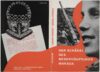
 László Moholy-Nagy, Cover for "Berlin-Hallensee: Der Sturm. Volume 13, Number 1" by Herwarth Walden (1922)
 -
 László Moholy-Nagy, Jacket for "Bauen in Frankreich, Bauen in Eisen, Bauen in Eisenbeton" by Sigfried Giedion (1928)
 -
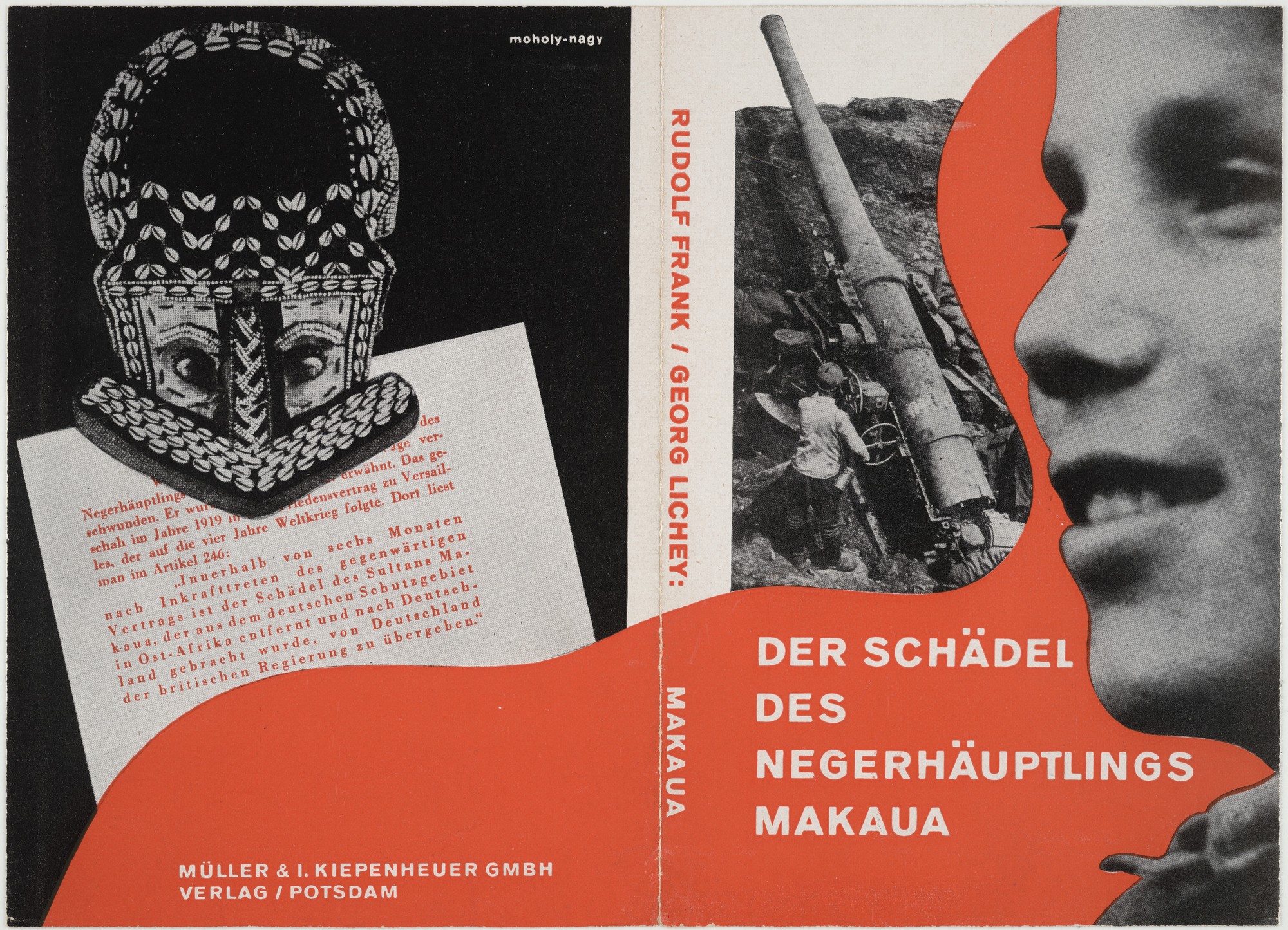
 László Moholy-Nagy, Jacket for "Der Schädel des Negerhäuptlings Makaua" by Rudolf Frank and Georg Lichey (1920s)
 -
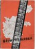
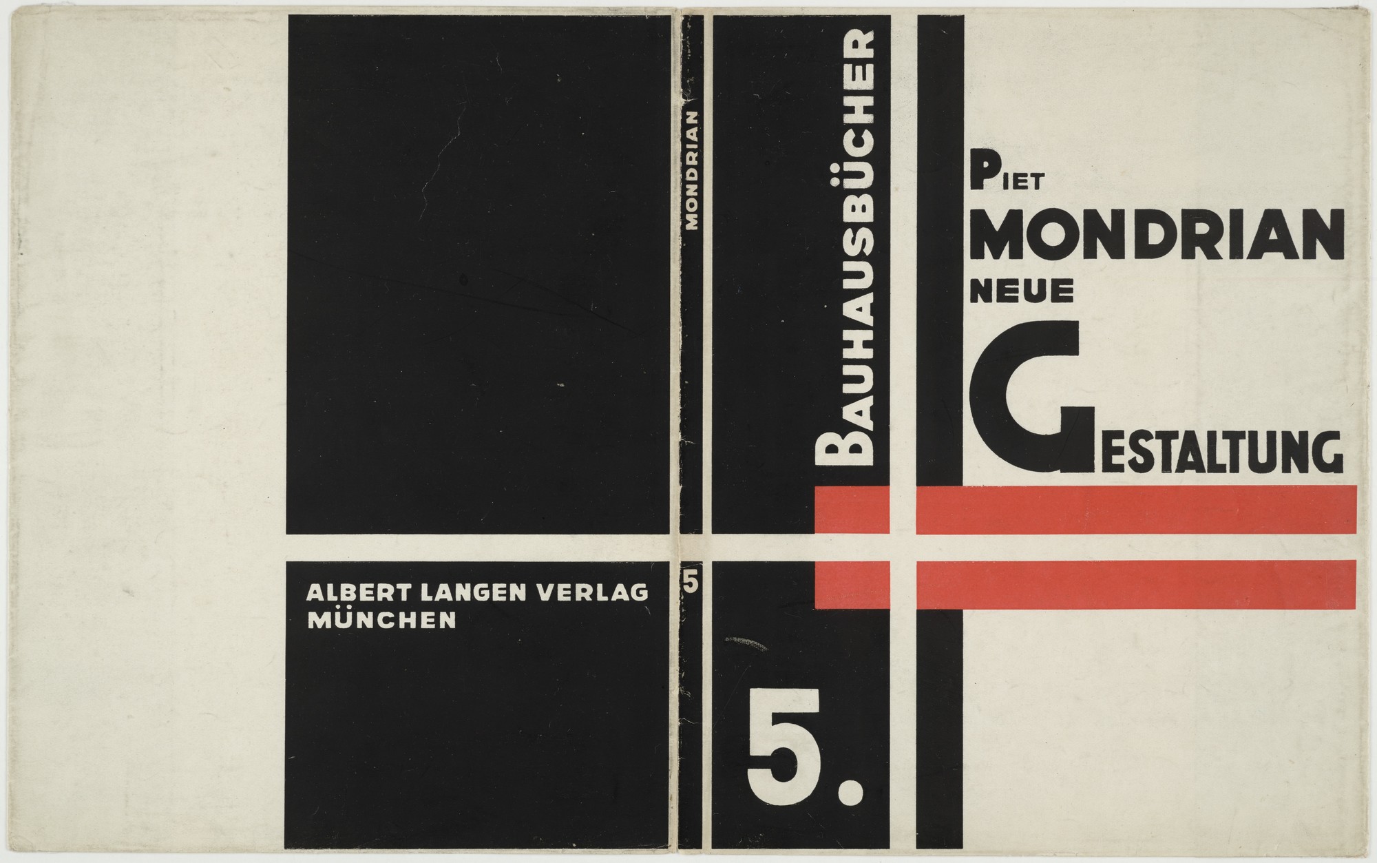
 László Moholy-Nagy, Jacket for "Bauhausbücher 5, Piet Mondrian: Neue Gestaltung" (1924)
 -
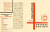 László Moholy-Nagy, "Where is Typography Headed? (Chart 22)" (1929)
 -
 László Moholy-Nagy, "Where is Typography Headed? (Chart 34)" (1929)


Swiss Style
The Swiss Style, which I began defining in a bulleted list above, developed concurrently with the neighboring Bauhaus movement, though its development continued beyond the closing of the Bauhaus school in 1933. That development persisted well into the 1950s and spread to many other areas of the globe including the United States.
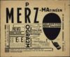
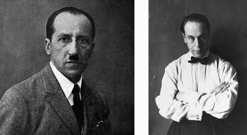
Perhaps at the foundation of the movement was a will to unquestionably make typography the primary focus in graphic design. That said, it makes sense that a typographer named Jan Tschichold (German-Swiss, 1902-1974) is widely considered one of the fathers of Swiss Style. From Germany originally, Tschichold escaped Nazi Germany in 1933 and settled in Switzerland.
 |
| Jan Tschichold in 1930 |
In addition to his extensive work designing book covers and movie posters, Tschichold was the author of Die neue Typographie, a fervent sans-serif design manifesto published in 1928 that would have lasting international influence. Ironically, by 1932 Tschichold denounced his militant outlook on design and even went as far as incorporating serif fonts into his own work. But the damage had been done: The minimalist thrust of European design continued to spread in Switzerland and found a home there in the 1930s.
-
 Jan Tschichold, Poster for "Die 3 Niemands Kinder (The Three Nobodies)" at the Phoebus-Palast Cinema, Munich (1927)
 -
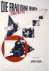
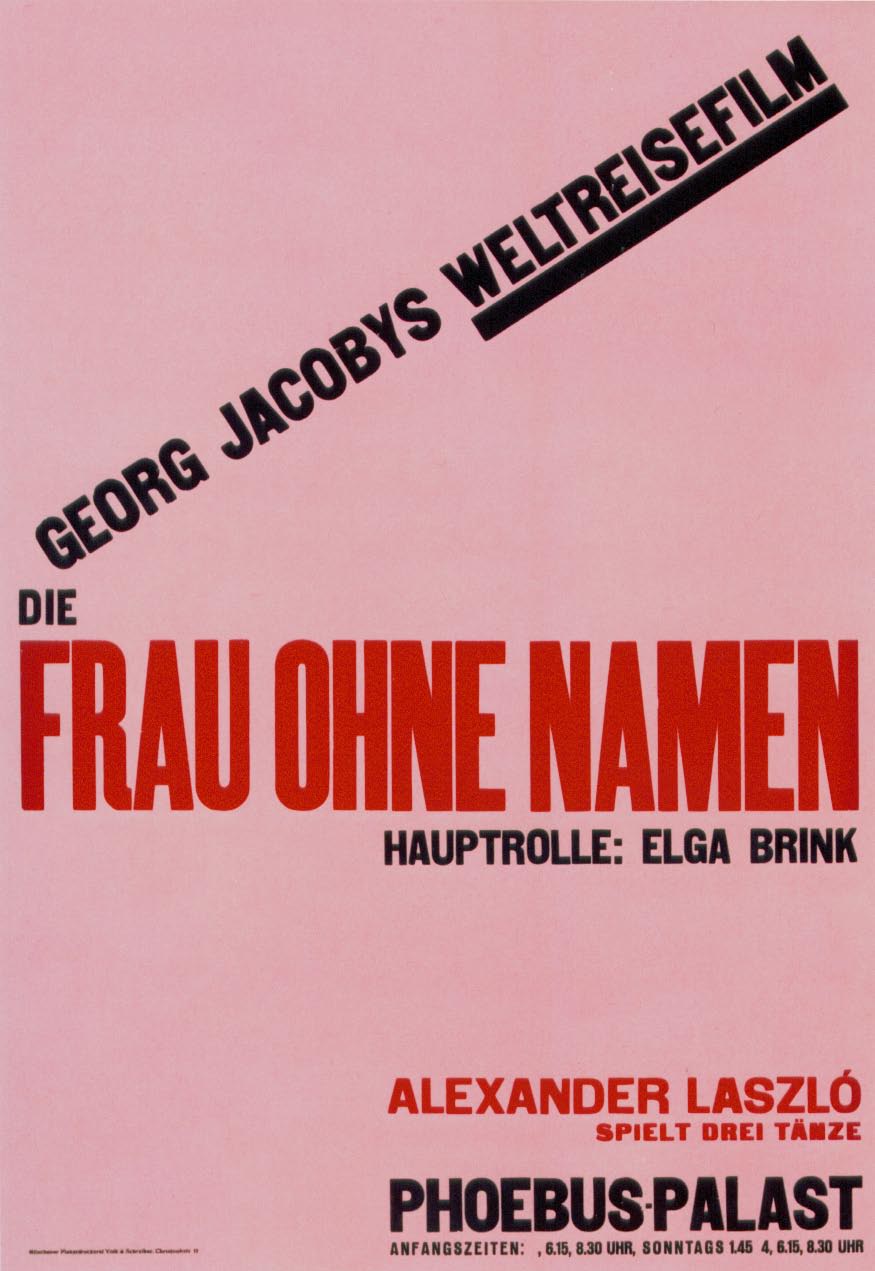
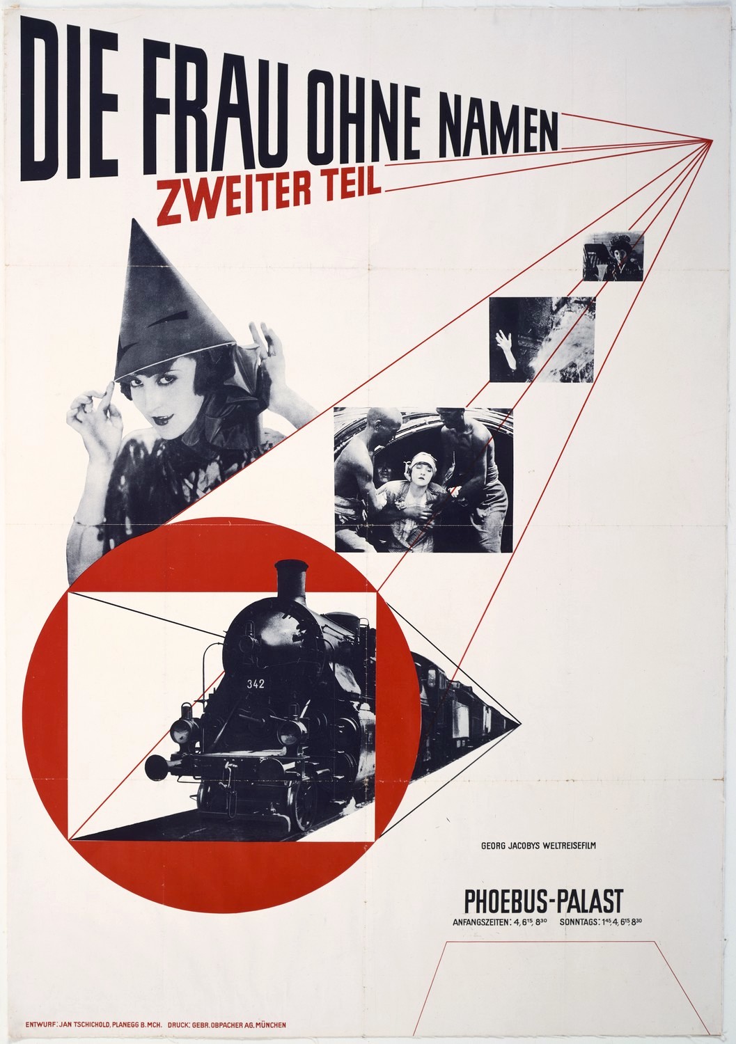
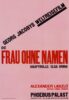 Jan Tschichold, Poster for "Die Frau ohne Namen (The Woman Without a Name)" at the Phoebus-Palast Cinema, Munich (1927)
 -
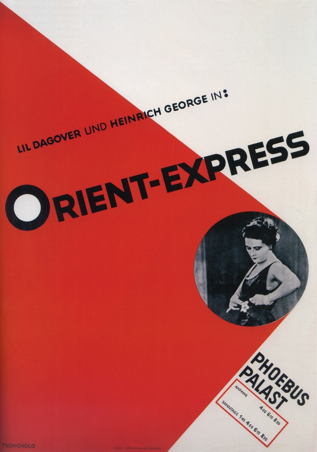
 Jan Tschichold, Poster for "Orient Express" at the Phoebus-Palast Cinema, Munich (1927)
 -
 Jan Tschichold, Poster for "Die Frau ohne Namen (The Woman Without a Name)" at the Phoebus-Palast Cinema, Munich (1927)
 -
 Jan Tschichold, Program for "Musikalische und Filmdarbietungen von Rang (Quality Music and Film Performances)" at the Phoebus-Palast Cinema, Munich (1927)
 -
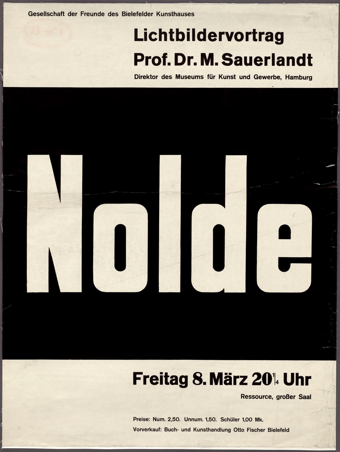
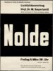 Jan Tschichold, Poster for "Nolde, Lichtbildervortrag (Slideshow) Presented by Prof. M. Sauerlandt" (1921)
 -
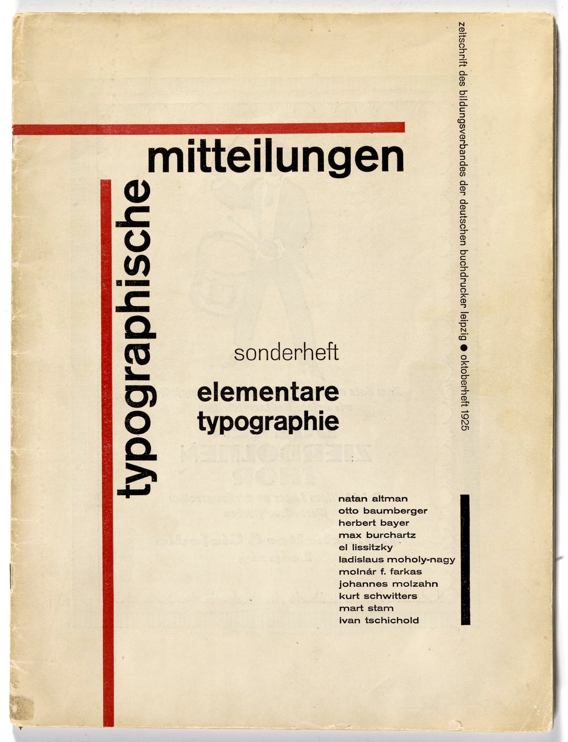
 Jan Tschichold, Cover for "Sonderheft Typographische Mitteilungen (Typographic Messages: Special Issue)" (1925)
 -
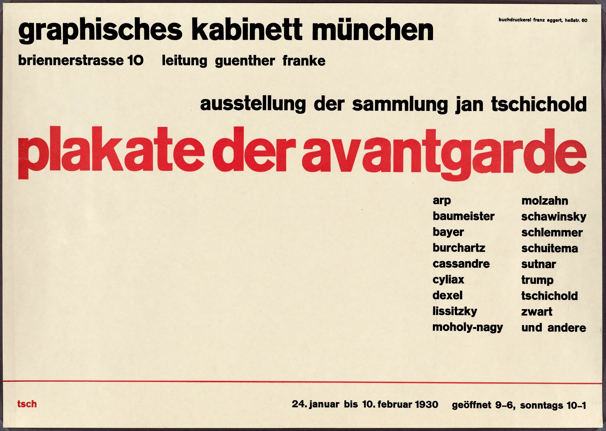
 Jan Tschichold, Poster for the Artist's Munich Exhibition, "Plakate der Avantgarde (Posters of the Avant-Garde)" (1930)


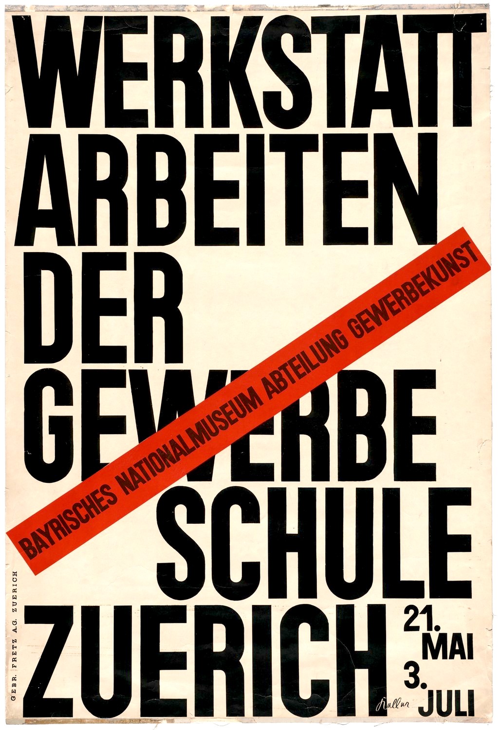
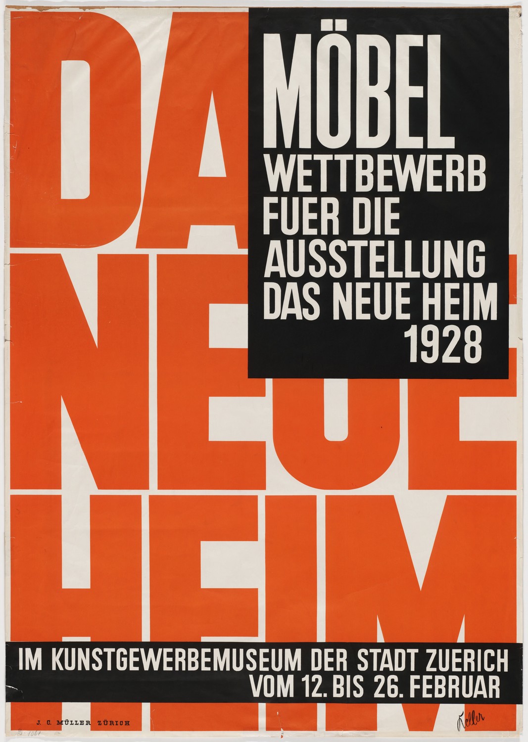
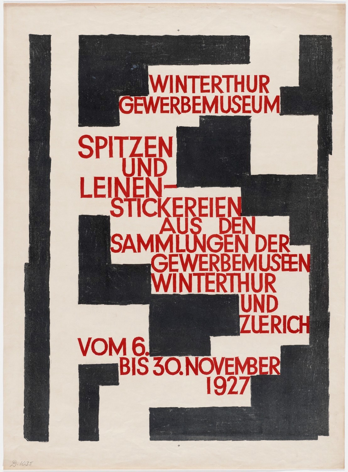
Another designer who was ahead of the curve in Switzerland was Ernst Keller (Swiss, 1891-1968). In 1918 Keller began teaching design in Zurich, and though there isn’t a wealth of information on him to be found, it’s easy to see from his work that he both taught and implemented a style early on that placed a heavy emphasis on bold sans-serif typography.
-
 Ernst Keller, Poster for Workshop Work at the Zurich Application School (1927)
 -
 Ernst Keller, Poster for a Furniture Competition for the Exhibition "The New Home" (1928)
 -
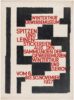 Ernst Keller, Poster for Lace and Linen Embroidery from the Collections of the Industrial Museums in Winterthur and Zurich (1927)
 -
 Ernst Keller
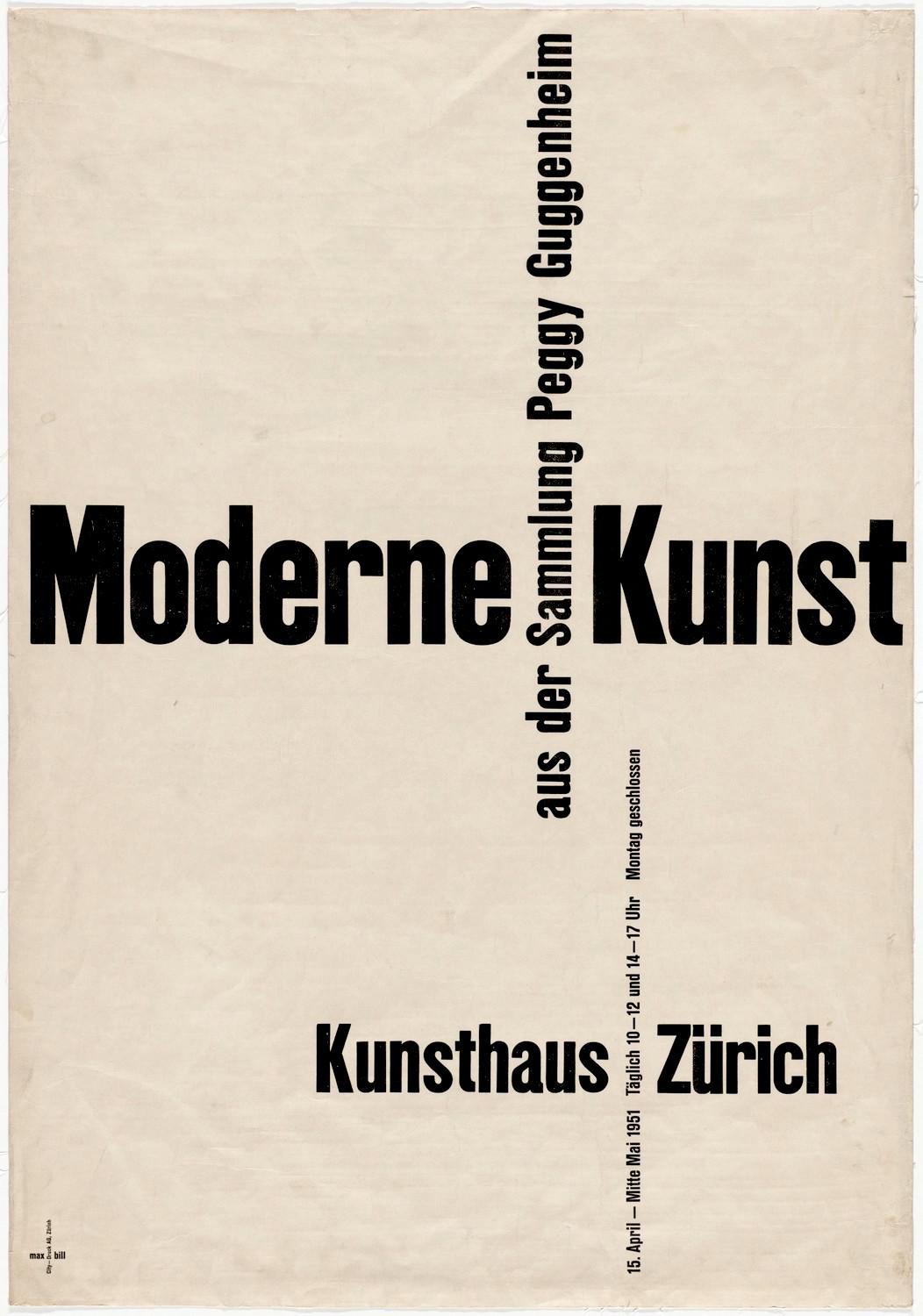
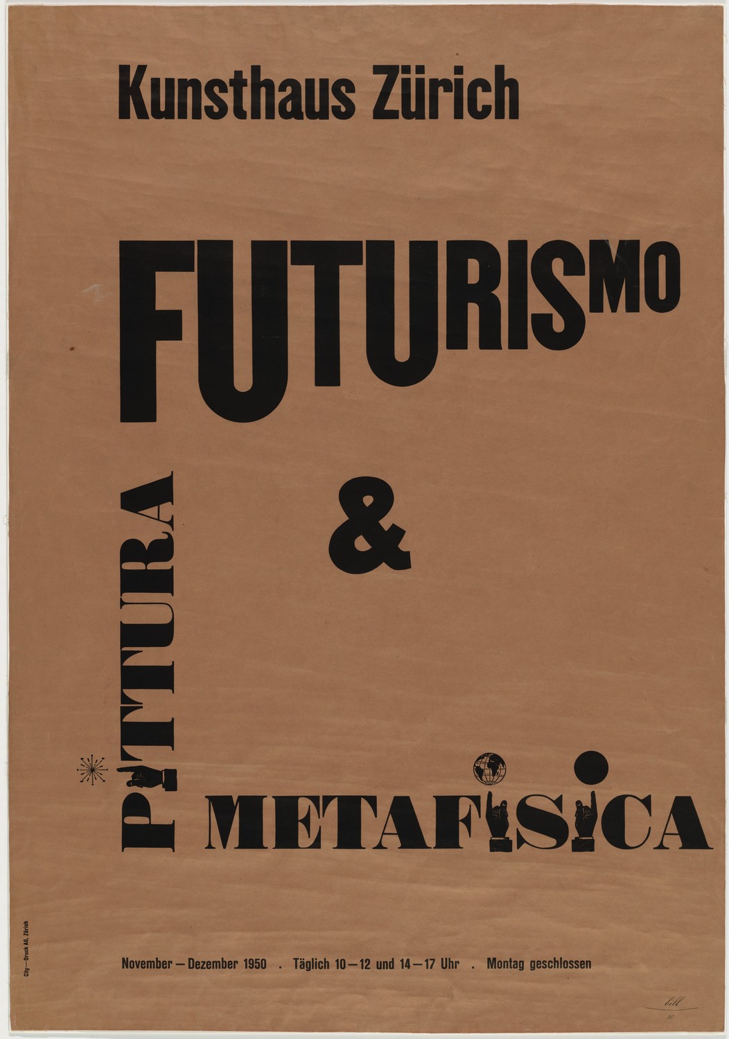
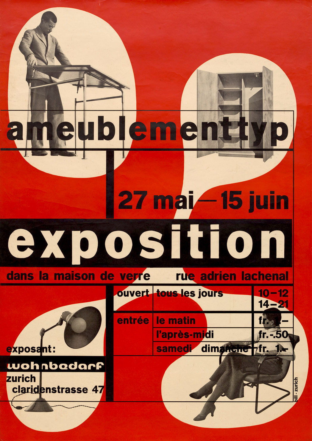
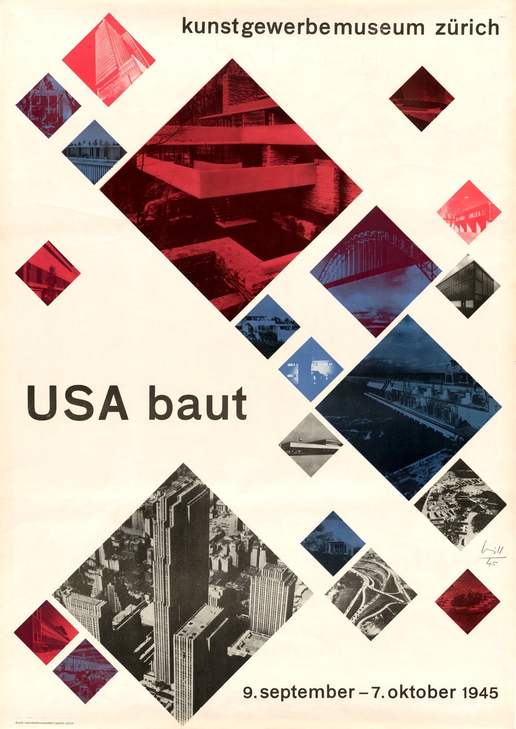
Max Bill (Swiss, 1908-1994) is another pioneer of Swiss Style. A jack-of-all-trades including architecture, typography, and graphic design, Bill is an early example of a designer who broke with Tschichold’s strict typographic guidelines by using fonts in a more playful, experimental way. In some cases, he ignored the emerging principle of the grid altogether.
-
 Max Bill, Poster for Modern Art Exhibition at the Kunsthaus Zurich Museum (1951)
 -
 Max Bill, Poster for Futurust and Metaphysical Painting Exhibition at the Kunsthaus Zurich Museum (1950)
 -
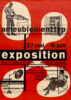 Max Bill, Poster for Exhibition of Furniture by Wohnbedarf at Le Corbusier's Maison de Verre, Geneva (1933)
 -
 Max Bill, Poster for USA Builds Exhibition at the Kunsthaus Zurich Museum (1945)
 -
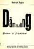 Max Bill, Cover for "Dämmerung: Notizen in Deutschland (Twilight: Notes in Germany)" by Heinrich Regius (1930)
 -
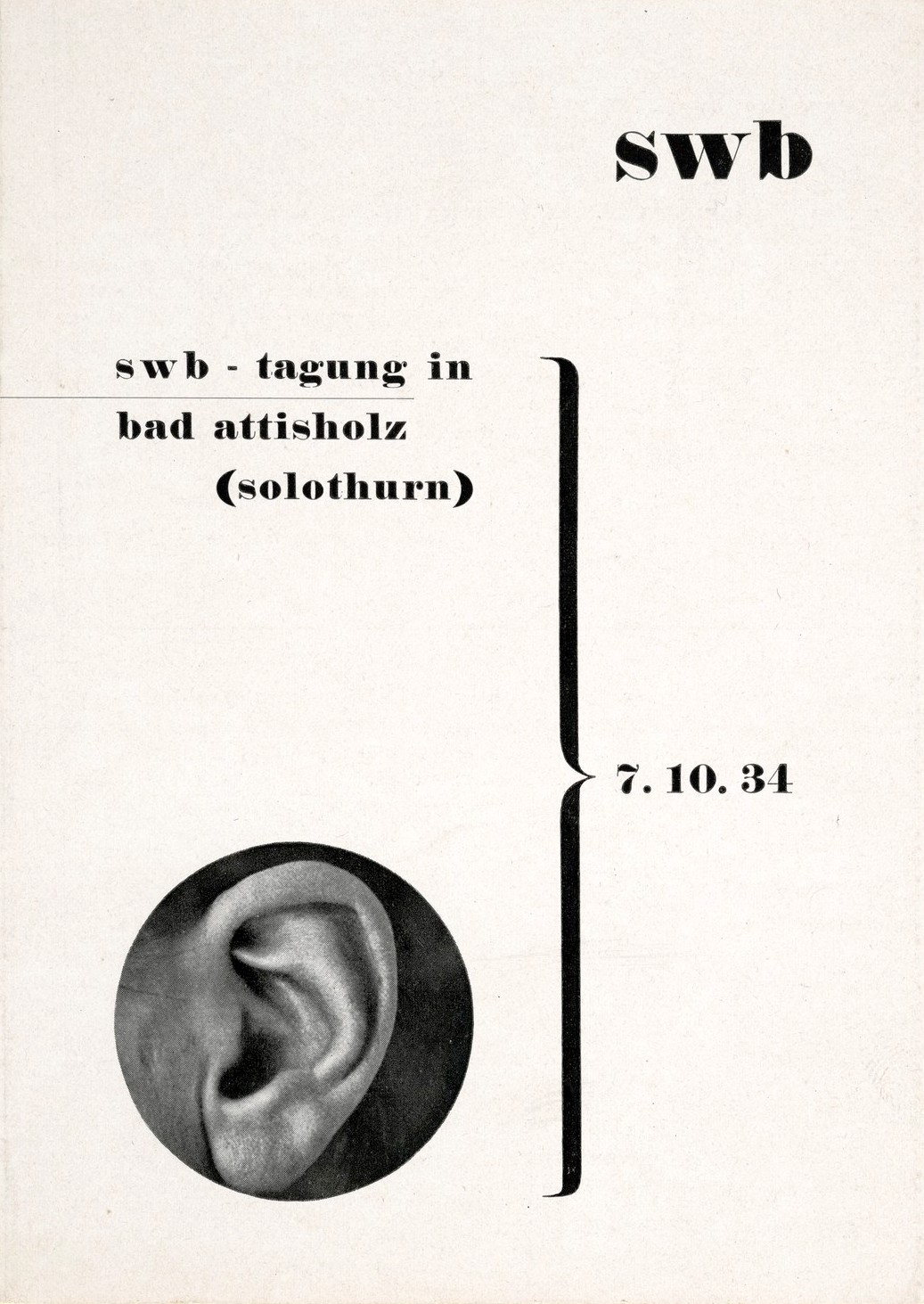
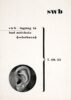 Max Bill, Poster for Schweizerischer Werkbund (Swiss Work Federation) Conference (1934)
 -
 Max Bill, Poster for an Exhibition on the Neubühl Housing Project, Zürich (1931)
 -
 Max Bill in 1969


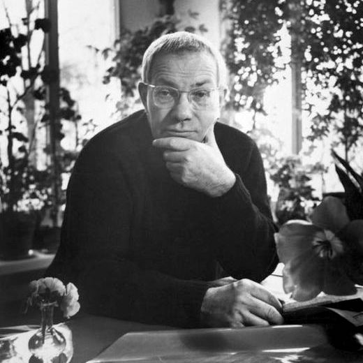
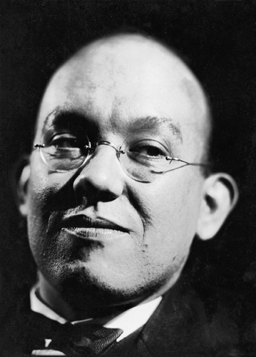
Another key figure in the Swiss Style movement was Josef Müller-Brockmann (Swiss, 1914-1996), who had a long career as a designer that extended into the 1950s and beyond. One of Brockmann’s most notable achievements was as editor of Neue Grafik, a Swiss design magazine first published in 1958 that would play a significant role in spreading the gospel of Swiss Style internationally.
 |
| Josef Müller-Brockmann |
The Swiss Style is many things, but one particular aspect at the heart of its philosophy cannot be easily detected by simply looking at various examples. Central to the Swiss design ideology is the notion that the graphic designer needs to “get out of the way”. In other words, a graphic designer is nothing more than a conduit to communicate a message or idea from their client to the end user. To that end, and in order to limit the potential for the designer’s own subjective influence to interfere with the client’s message, bare-bones minimalism became the preference — think “form follows function”.
-
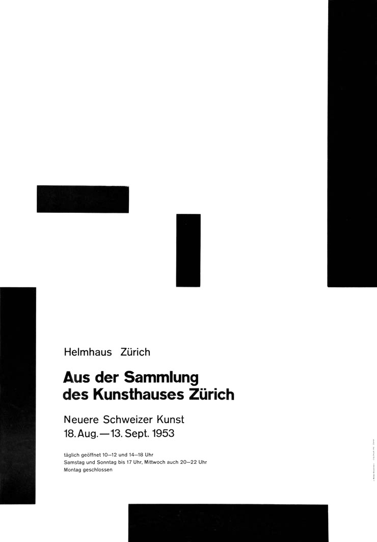
 Josef Müller-Brockmann, Poster for Art Exhibition "From the Collection of The Art House, Zurich: Newer Swiss Art" at the Helmhaus Gallery, Zurich (1953)
 -
 Josef Müller-Brockmann, Public Service Poster ("The Friendly Hand Signal Protects Against Accidents") [1954]
 -
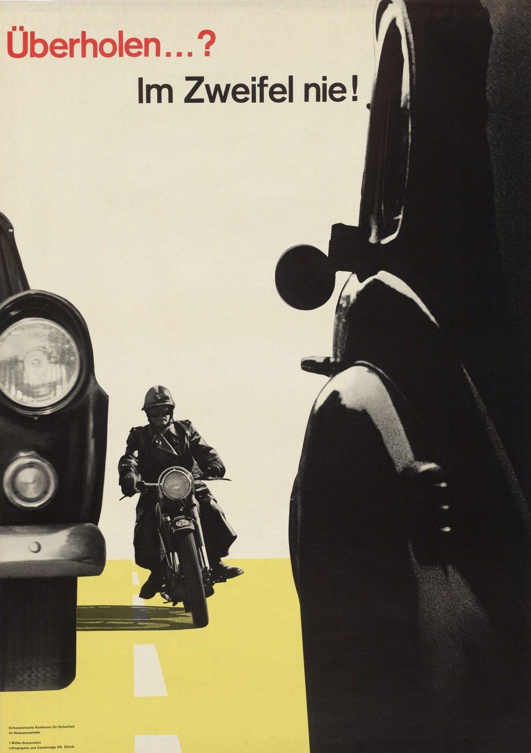
 Josef Müller-Brockmann, Public Service Poster ("Passing? When in Doubt, Don't!") [1957]
 -
 Josef Müller-Brockmann, Poster for 5th Spring concert of the Acoustic Society (1953)
 -
 Josef Müller-Brockmann, Poster for Concert for Strawinsky, Berg, and Fortner (1955)
 -
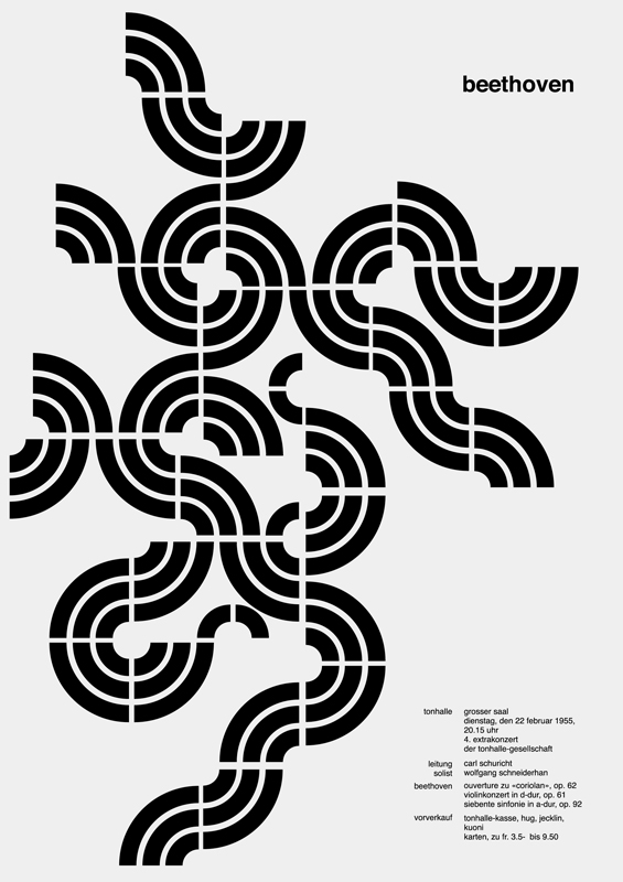
 Josef Müller-Brockmann, Poster for Beethoven Concert (1955)
 -
 Josef Müller-Brockmann, Poster for Beethoven Concert (1955)
 -
 Josef Müller-Brockmann, Event Advertisement (1957)


The industry-standard classroom text Meggs’ History of Graphic Design has a telling passage that creates a clear connection between this design philosophy and Brockmann specifically. Author Philip B. Meggs explains that Brockmann “sought an absolute and universal form of graphic expression through objective and impersonal presentation, communicating to the audience without the interference of the designer’s subjective feelings or propagandist techniques of persuasion.” It should again be easy to see these ideas manifesting in the work of our favorite album cover designers, which is especially true of Reid Miles, who notoriously did not like jazz. Perhaps this detachment from the music helped him to focus more effectively on his job as a designer.
Swiss Style in America
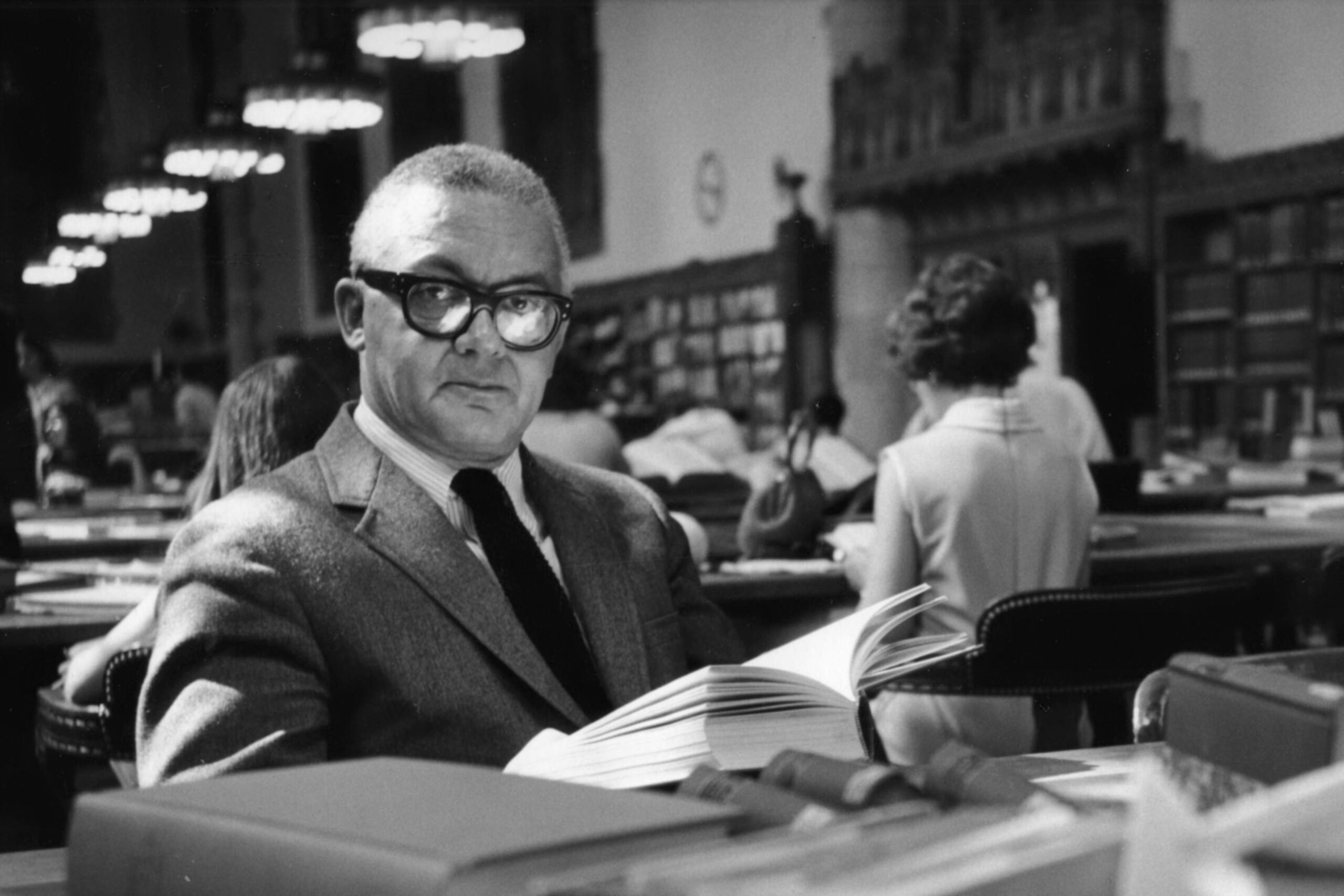
An early link between Modern American graphic design and Swiss Style can be found in the work of Alvin Lustig (American, 1915-1955). Born in Denver, Colorado, Lustig was closely affiliated with Bauhaus alum Josef Albers after Albers migrated to the states; Albers recruited Lustig to his departments both at Black Mountain College and at Yale.
 |
| Alvin Lustig |
Ironically, Lustig’s style was ideologically opposed to Albers’ in just about every way. In Lustig we have an Early Modern American designer whose work lacks any substantial connection to the European schools. There are also clear similarities between Lustig’s style and that of several jazz album designers working in the early 1950s, including the aforementioned Paul Bacon and John Hermansader, whose works all favor illustration over photography, serif and hand-drawn fonts, pastel tones, and a more playful use of shapes.
-
 Alvin Lustig, Cover for "A Room with a View" by E.M. Forster (1946)
 -
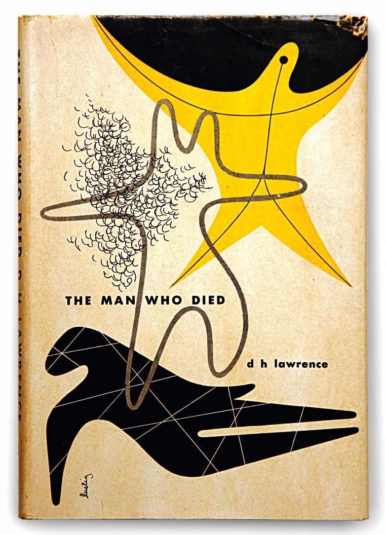
 Alvin Lustig, Jacket for "The Man Who Died" by D.H. Lawrence (1950)
 -
 Alvin Lustig, Jacket for "A Season in Hell" by Rimbaud (1947)
 -
 Alvin Lustig, Jacket for "A Handful of Dust" by Evelyn Waugh (1945)
 -
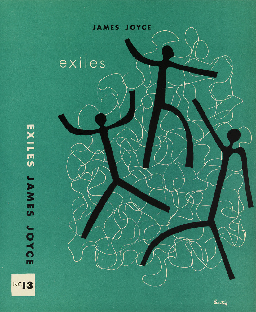
 Alvin Lustig, Jacket for "Exiles" by James Joyce (1947)
 -
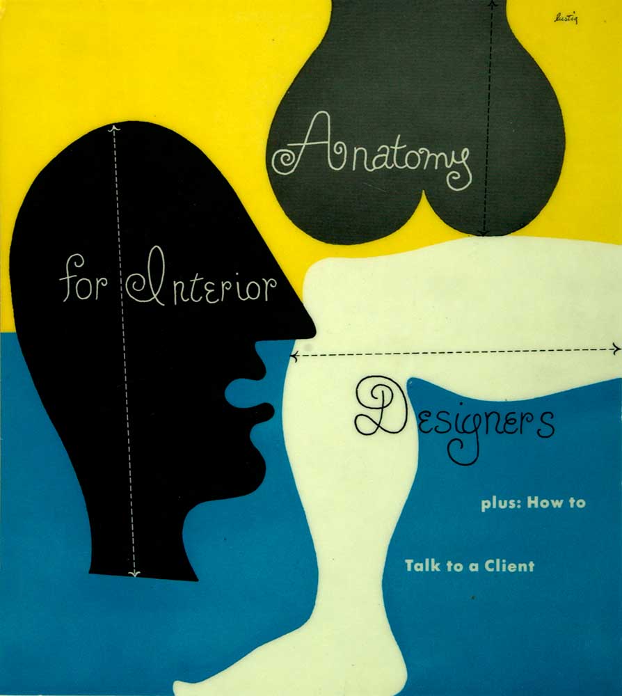
 Alvin Lustig, Cover for "Anatomy for Interior Designers" (1948)
 -
 Alvin Lustig, Invitation to Exhibition for the Artist (1949)


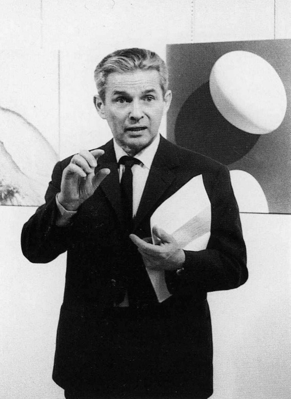
Also working and developing as a talented designer in America during the 1930s and ‘40s was Paul Rand (American, 1914-1996), who has become an eclipsing figure of graphic design with a legacy that is perhaps unsurpassed by anyone else. Rand’s massive portfolio is carefully documented on the website paulrand.design, where you can find his most famous work for companies like IBM, ABC, and UPS.
 |
| Paul Rand |
To my eyes, Rand had a wholly unique approach to graphic design that remained original down through the decades. Rand’s dogged work ethic produced countless magazine covers, advertisements, book covers, logos, and branding schema beginning in the 1930s and extending into the late 20th century. And while the influence of the Swiss Style is much more apparent in Rand’s work than Lustig’s, Rand typically exerts a playfulness that is decidedly more American than European in nature (thanks Matt B. and Will E.). I see parallels between Rand’s work and Swiss designer Max Bill, for example, but I believe Bill was breaking with Swiss tradition where I see those similarities.
-
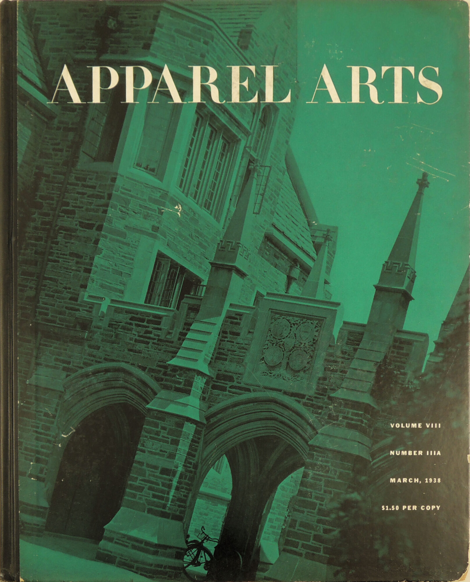
 Paul Rand, Cover for Apparel Arts Magazine (1938)
 -
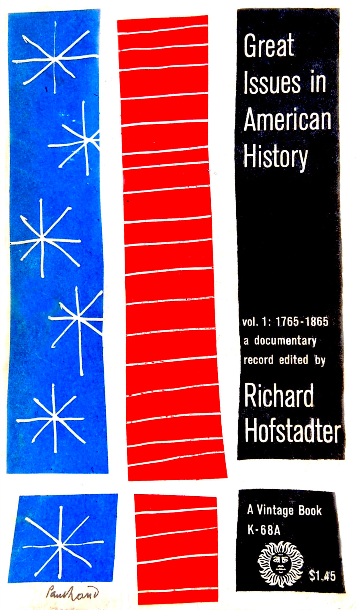
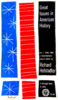 Paul Rand, Cover for "Great Issues in American History Vol. 1" by Richard Hofstadter (1956)
 -
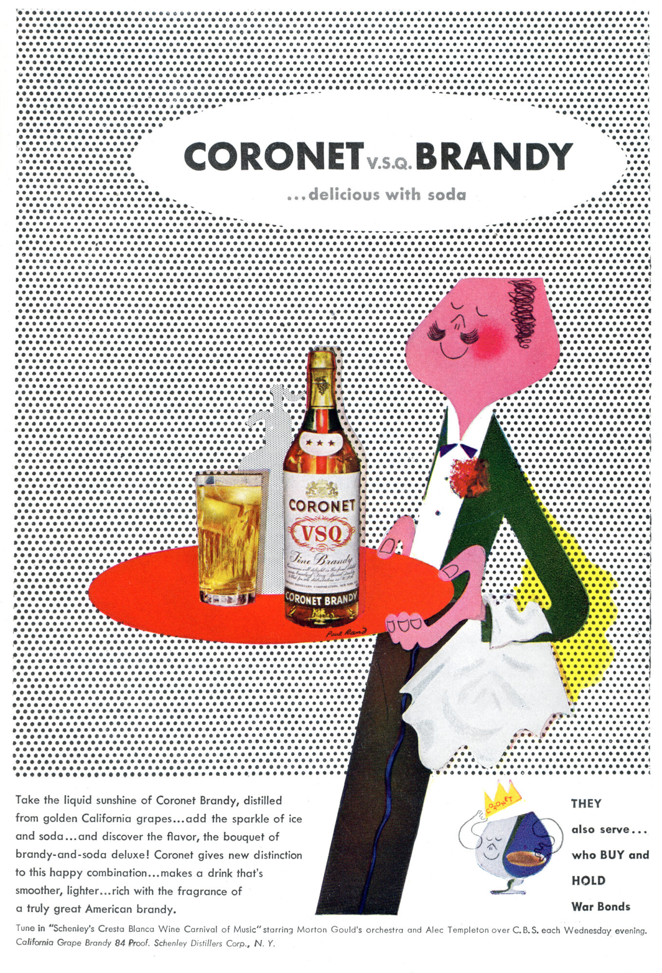
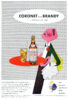 Paul Rand, Advertisement for Cornet Brandy (1940s)
 -
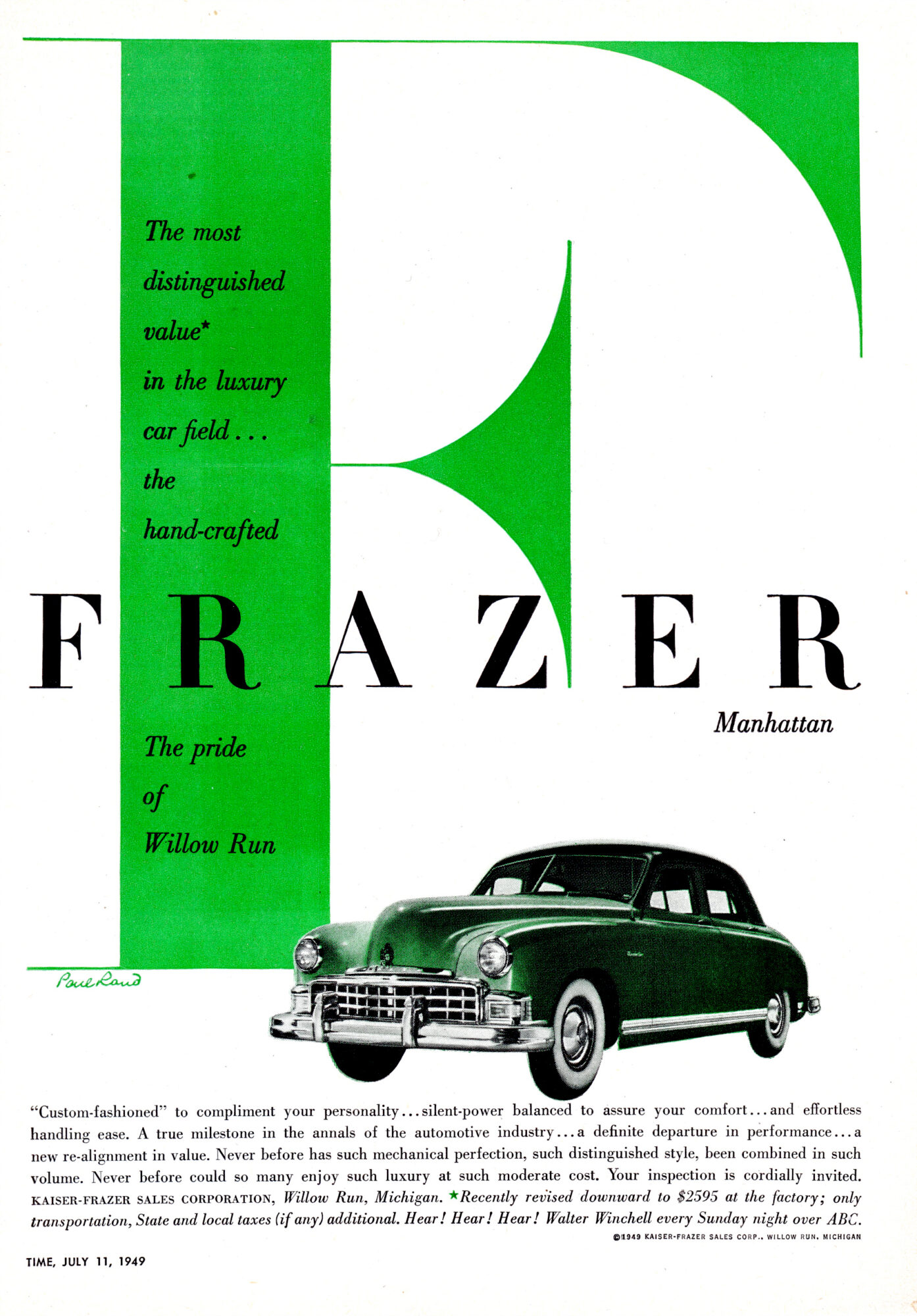
 Paul Rand, Advertisement for Kaiser Frazer (1949)
 -
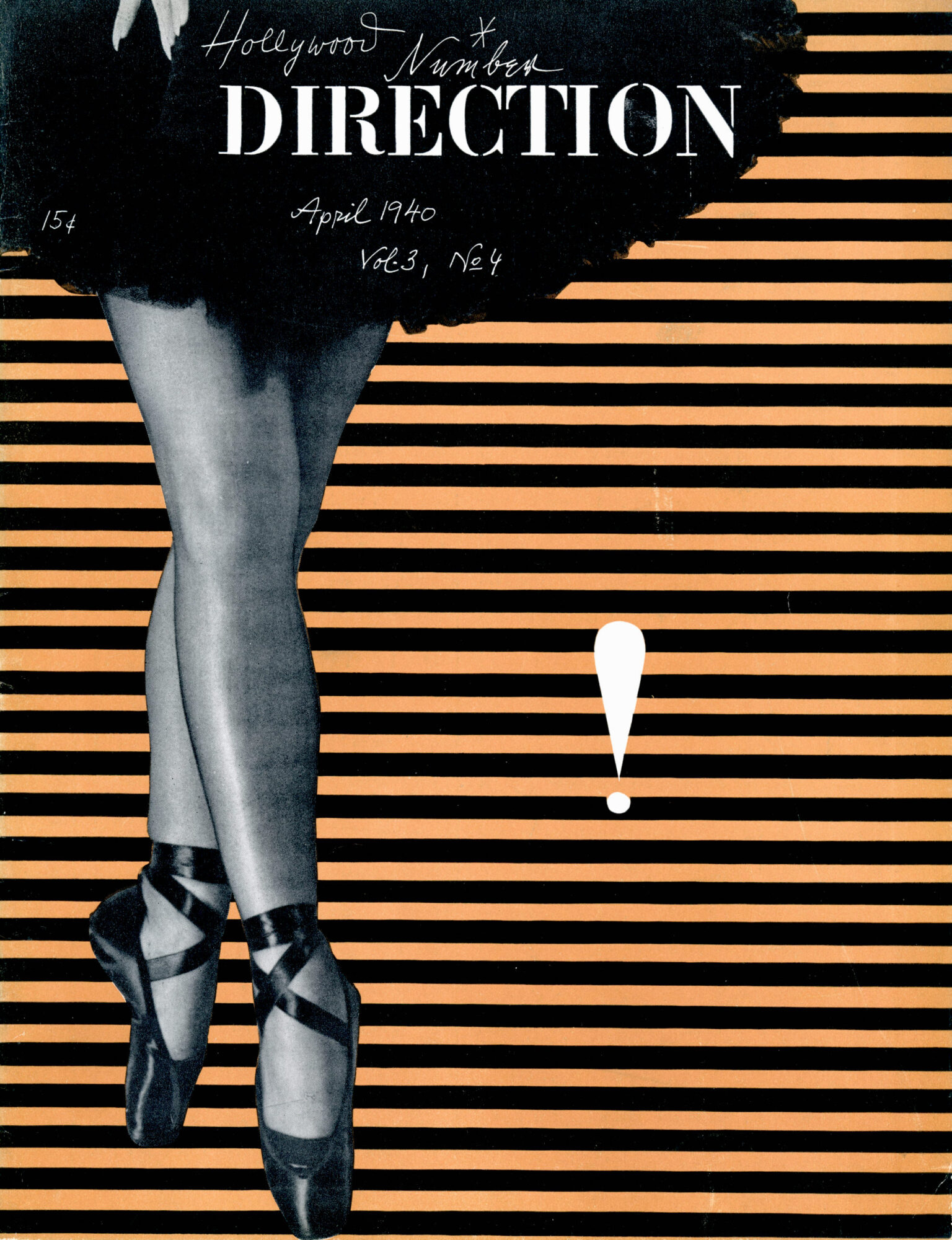
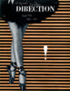 Paul Rand, Direction Magazine (1940)
 -
 Paul Rand, Cover for "Switzerland Builds" by G.E. Kidder Smith (1950)
 -
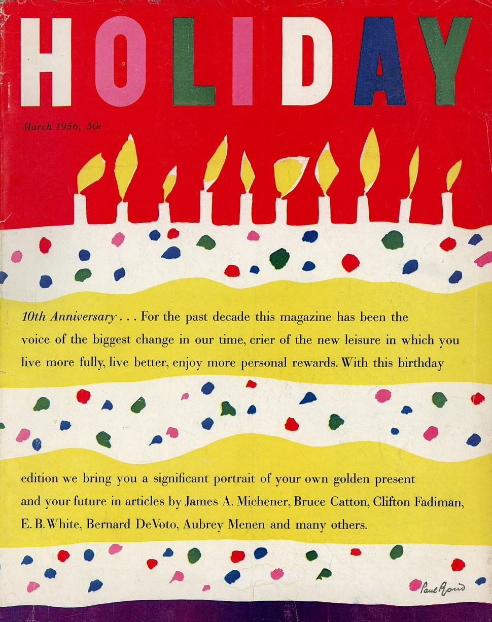
 Paul Rand, Cover for Holiday Magazine (1956)
 -
 Paul Rand, Inlay for Glamour Magazine (1956)

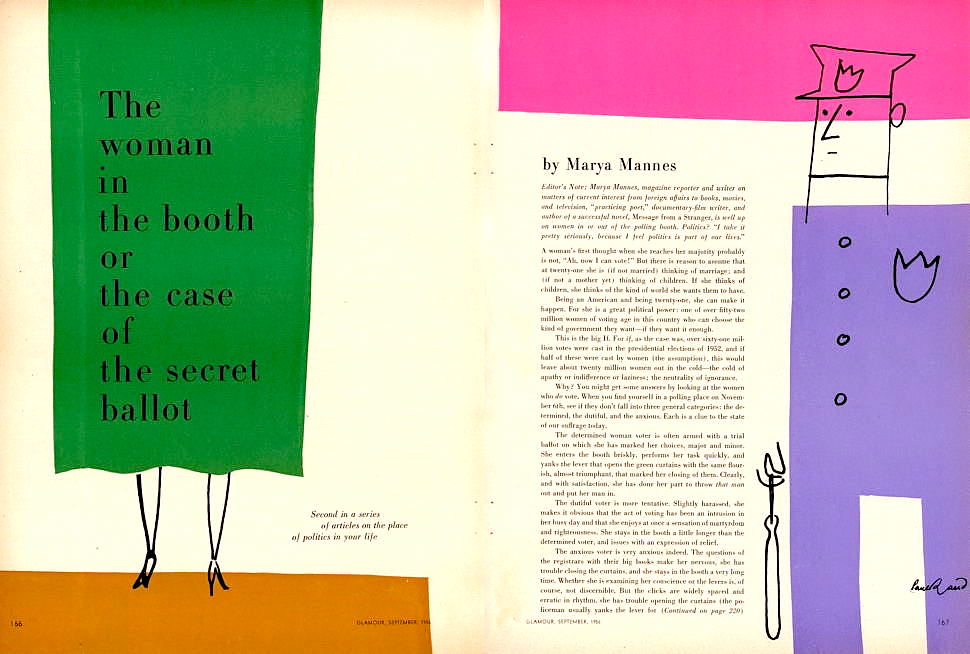
Among the many techniques he is famous for, there are numerous examples of Rand fusing photography with shapes and typography — a hallmark of Swiss Style. Rand also clearly believed in minimalism, especially when it came to branding, though he also loved incorporating illustrations and hand-drawn script into his work. So while Rand is the quintessential example of a designer marrying the Early Modern and Modern American design styles (the latter of which contains substantial Swiss influence), he is also a prime candidate in trying to pin down an influence on Reid Miles, the towering figurehead of Modern jazz album art design. Though Miles certainly loved all-caps sans-serif fonts and frequently integrated them with the photography of Francis Wolff, Miles also was not one to shy away from using serif typefaces, script, and modified shapes. In this way, Miles’ work is too playful to fall squarely into the box of the Swiss Style.
-
 Reid Miles (Source: "Wail: The Visual Language of Prestige Records" by Entwisle, Havens)
 -
 Reid Miles, Cover for "Jutta Hipp with Zoot Sims" (1957)
 -
 Reid Miles, Cover for "Lee Morgan Sextet" (1957)
 -
 Reid Miles, Cover for "True Blue" (1960)
 -
 Reid Miles, Cover for "Page One" (1963)
 -
 Reid Miles, Cover for "No Room for Squares" (1964)
 -
 Reid Miles, Cover for "Out to Lunch" (1964)
 -
 Reid Miles, Cover for "It's Time" (1965)
 -
 Reid Miles, Cover for "Unity" (1966)


Conclusion
The goal here was to try to gain a better sense of where this wonderful Modern style came from that is used in so many of my favorite jazz album covers. I hope I have painted a historical picture that is accurate, logical, and meaningful. For high-res images of some of my favorite jazz album covers as well as a bit of my own personal analysis, please visit The Deep Groove Mono Classic Jazz Album Art Gallery at the link below.
LINK: The Deep Groove Mono Classic Jazz Album Art Gallery


