
|
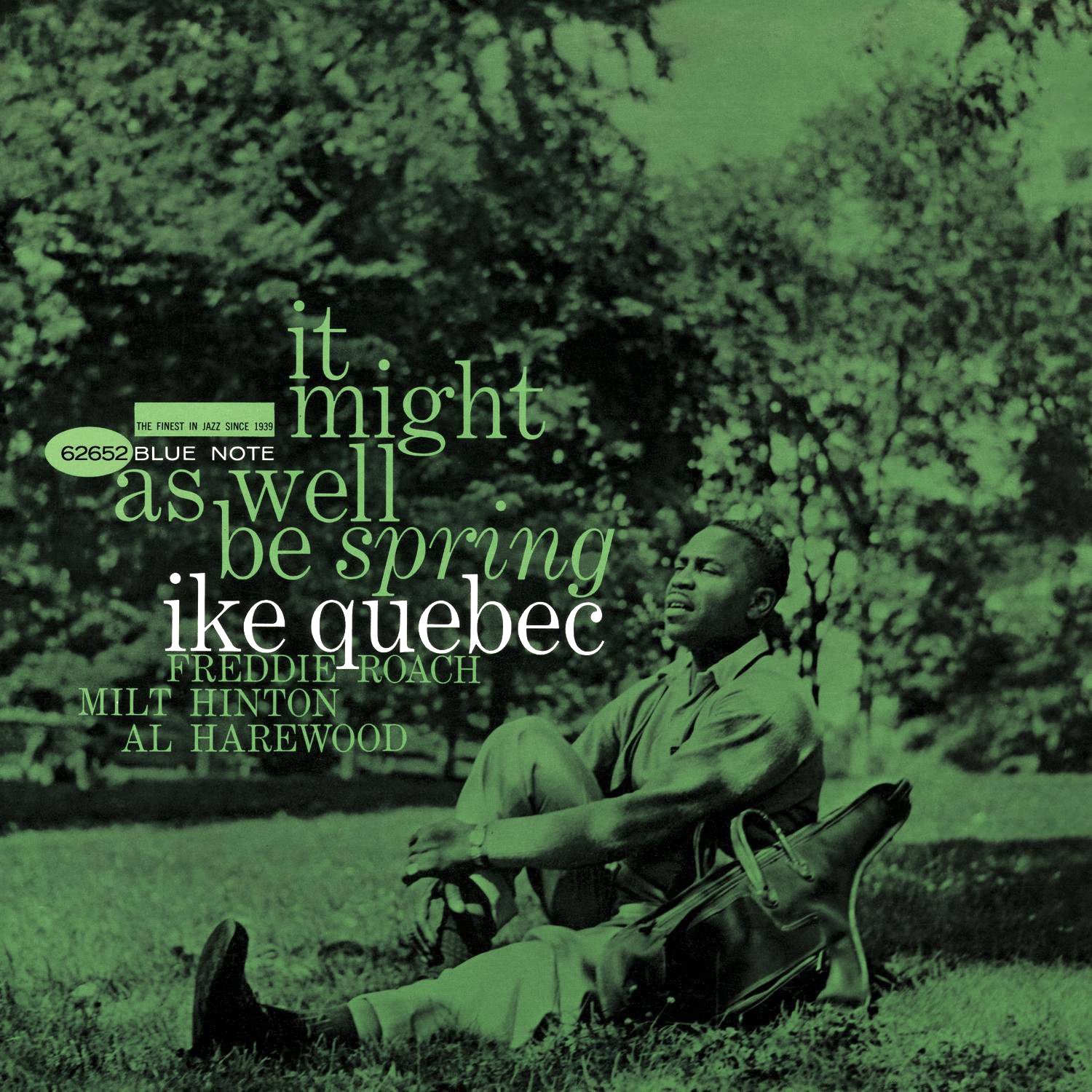
Ike Quebec Blue Note 4105 Design: Reid Miles I love everything about this typography: the choice of a thinner weight serif, the fact that it’s all lowercase, the word “spring” in italics, and they way it fits Quebec’s shape. It’s made big in a way that doesn’t intrude on this beautiful photo. Topping it off is a sublime choice of Kelly green that accents both the album title and background. |

|
Herbie Hancock Blue Note 4109 Design, Photography: Reid Miles I have always loved this cover, perhaps for how it makes such effective use of basic geometry. Hancock is looking dapper with his thick-framed glasses and skinny tie. Shot by Reid Miles himself instead of Francis Wolff, the image has a brilliant overhead point-of-view that clearly displays Herbie’s outstretched fingers tickling the ivories. Bold orange and black on top of cream for this skinny, stretched lettering is a delight, and in seemingly random fashion, Miles finds perfect asymmetrical placement for each line of text. This is minimalism at its finest. |

|
Joe Henderson Blue Note 4140 Design: Reid Miles Another iconic cover from the creatives minds of Miles & Wolff. Miles is really starting to hit a stride with making text fit the accompanying photography. Shot outside of Lincoln Center, the desolate stone backdrop creates the feeling of a peaceful, empty city for Henderson to pose in. The image also manages to complement the album’s light, sparse opener, now a jazz classic, “Blue Bossa”. |
|
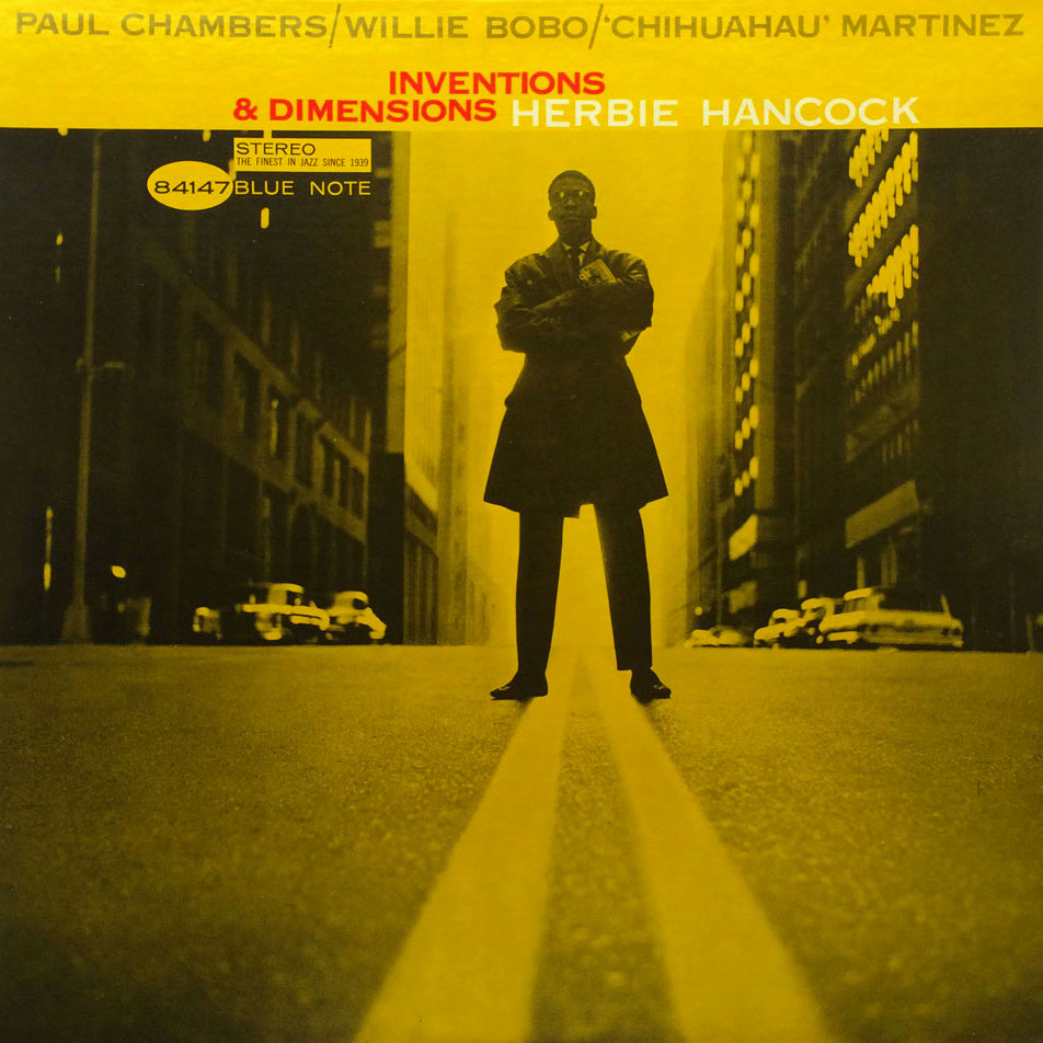
Herbie Hancock Blue Note 4147 Design: Reid Miles The brilliance of this photo needs no explanation. From what I’ve seen, the original has remarkably different contrast, which makes me guess that Miles and/or Wolff must have done a lot of work to get this looking the way it does. Of course, yellow is the right choice for a color overlay, as the eyes can’t help but move first to the double traffic line then up to a posing Hancock. |
|
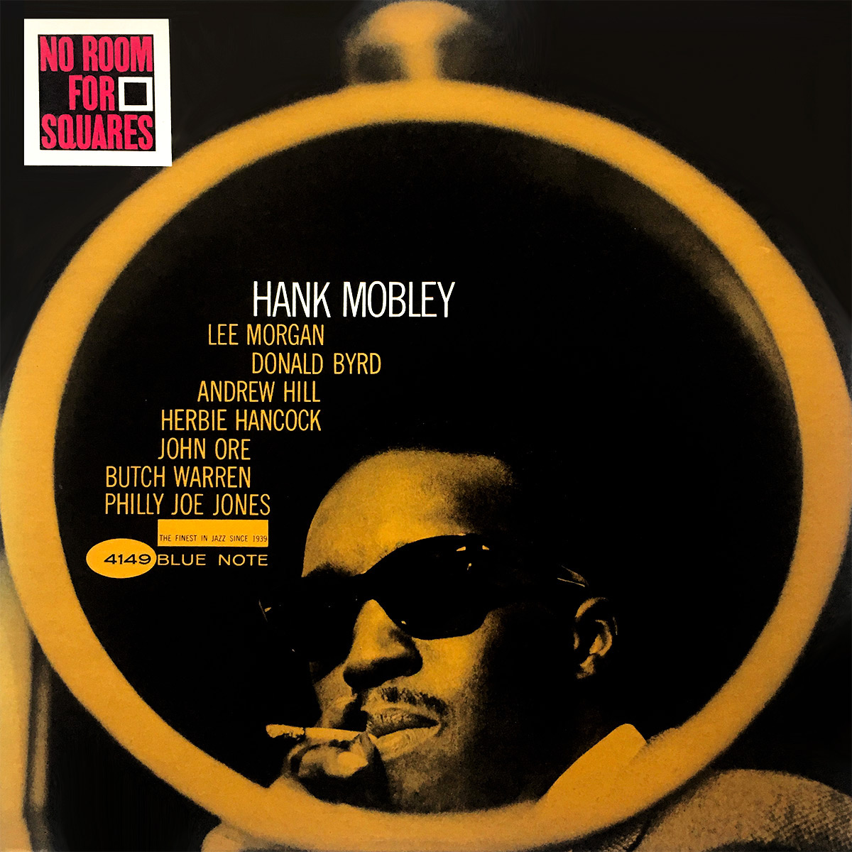
Hank Mobley Blue Note 4149 Design: Reid Miles Iconic in every way. (Are you getting tired of seeing “iconic” Miles & Wolff work yet?) The original photo was taken in the light of day, so a bit of editing might have been used to create the finished product. I don’t think a jazz musician has ever looked cooler on an album cover than Mobley does here as he takes a puff of his cigarette with black shades on. |
|
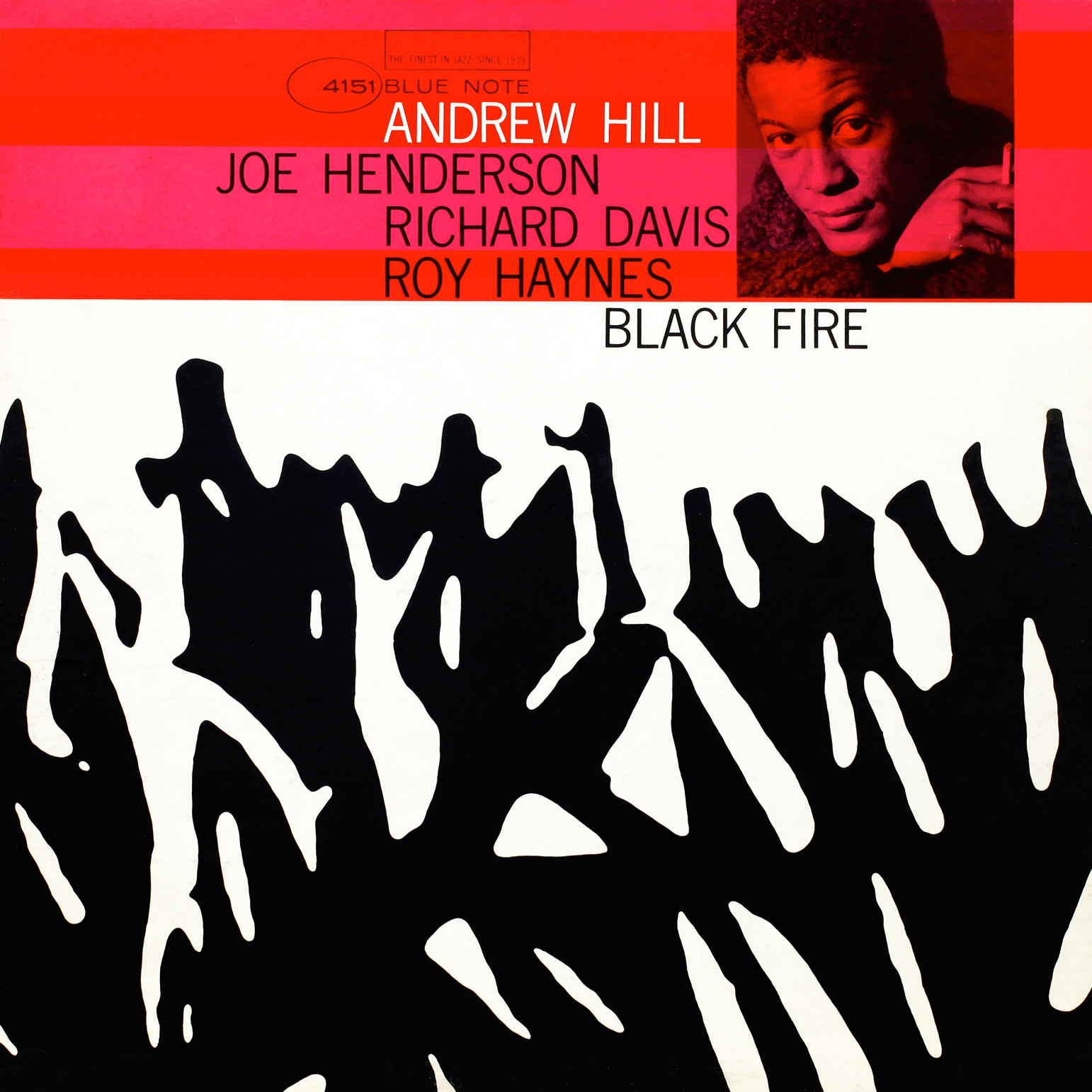
Andrew Hill Blue Note 4151 Design: Reid Miles Very high on my list of favorites. The color combination of red and pink paired with the stark contrast of black and white below is incredibly fresh. The use of horizontal strips of color at the top is unexpected for Miles and a welcome break from tradition. On its own, I don’t believe this abstract black shape would make me think of fire, but the fact that it does in this context speaks to the brilliance of its implementation. We are also starting to see the emergence of a new Reid Miles formula that gives precedence to pattern or shape-driven imagery occupying the lower majority of the cover’s real estate, with a rectangular strip at the top reserved for album info and a tightly-cropped photo of the artist. |
|
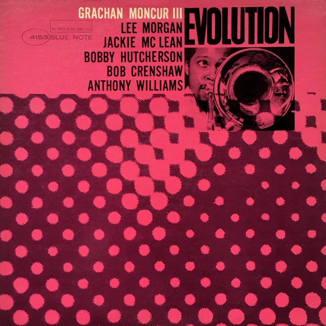
Grachan Moncur III Blue Note 4153 Design: Reid Miles Another of many designs utilizing Reid Miles’ new formula (mentioned directly above). The playful chopping of the bold font used for the title was a motif Miles would use on more than one occasion (Trompeta Toccata, Into Somethin’) and has a riveting effect. The leader peeks at us from behind his horn with youthful exuberance, and the blown-up newsprint pattern creates a mesmerizing diagonal array of circular shapes. Unorthodox color choices of pink and purple also contribute to this cover’s brilliance. |
|
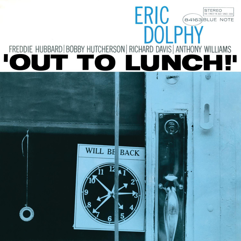
Eric Dolphy Blue Note 4163 Design, Photography: Reid Miles By 1964, Miles is taking more and more of his own photos for album covers. “Out to Lunch!” is exclaimed in a very ’60s presentation of all caps, sans-serif, and close-knit lettering. The blue overlay communicates the quiet mood of an empty storefront as our looney clerk has stepped away for a bite midday. The hand-drawn shade and old-fashioned door handle with thumb press give the image a vintage feel today. In one word, iconic. |
|
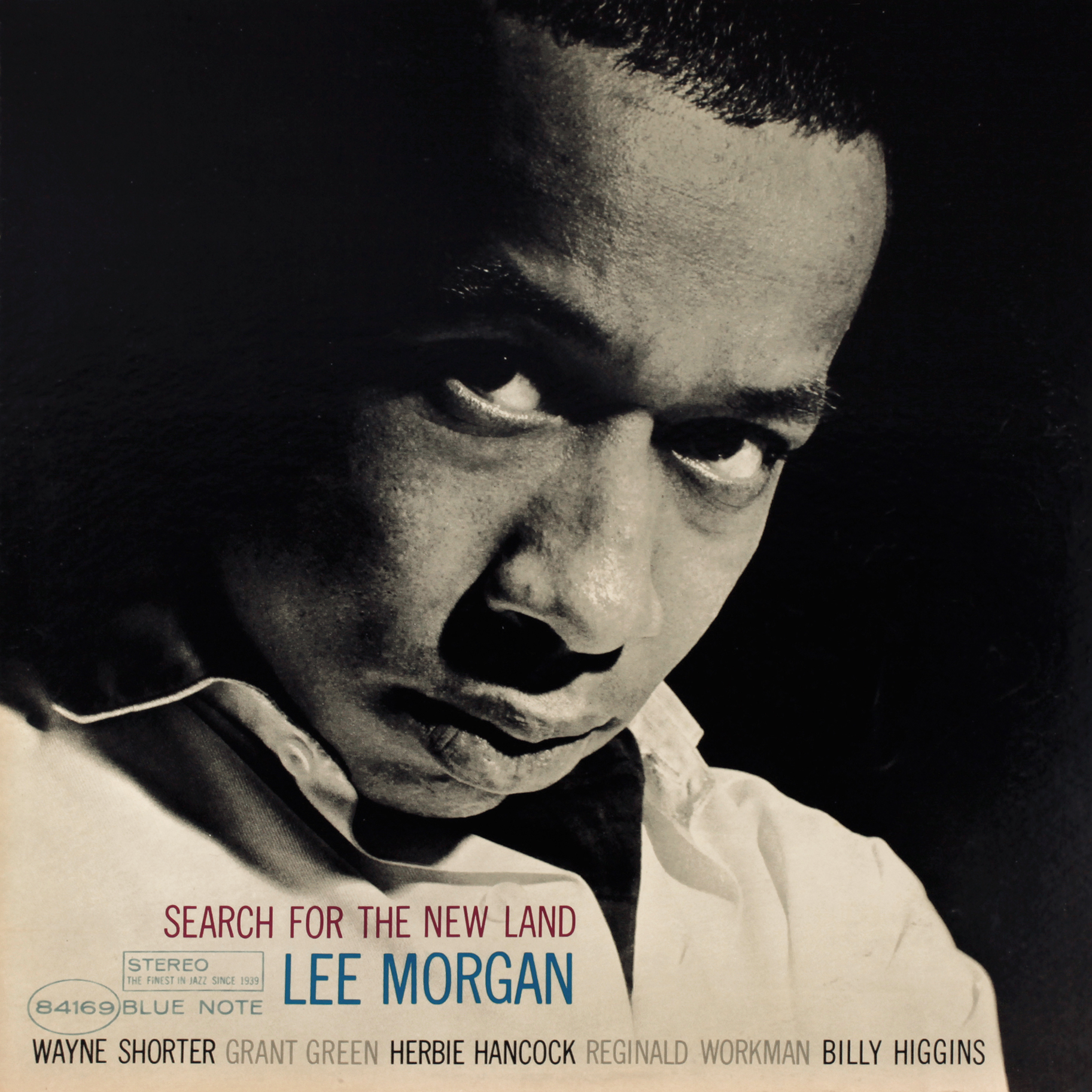
Lee Morgan Blue Note 4169 Design: Reid Miles I dare you to find an example of a more intense stare captured on camera. The original photo includes a goofy-looking Alfred Lion in the background at a moment where he appears to have been caught blinking while sporting a fashion-forward flower print button-down that is ultimately out of step with Morgan’s prep fashion. As much as I love Lion, he totally takes away from Morgan’s rather serious artistic moment, and the fact that Miles and/or Wolff (probably Miles) saw the immense potential for this cropped image is yet another nod to their genius. |
|
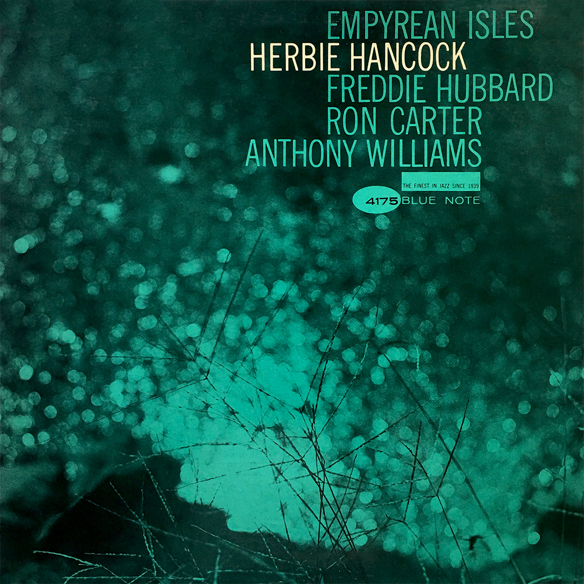
Herbie Hancock Blue Note 4175 Design: Reid Miles How did Miles and Wolff manage to take such a mundane photo and put it to such effective use! The out-of-focus shimmering of a lake creates space that allows us to relax and just take it all in, music included. The image also manages to complement the album’s title. Similar to Takin’ Off, Miles once again makes ideal use of asymmetry in his positioning of the lettering — a tried-and-true component of the Swiss Style. The aqua overlay also seems to make perfect sense; many reissues portray this hue as more of a flat blue, which I believe does the cover a mild disservice. |
|
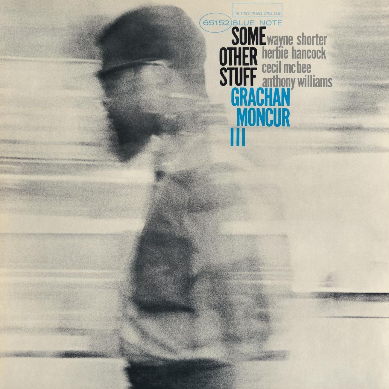
Grachan Moncur III Blue Note 4177 Design, Photography: Reid Miles More of that eye-catching asymmetrical alignment of typography. The blurred shot of Moncur renders him a slow-moving passerby in a fast-paced, merry-go-round-like world. |
|
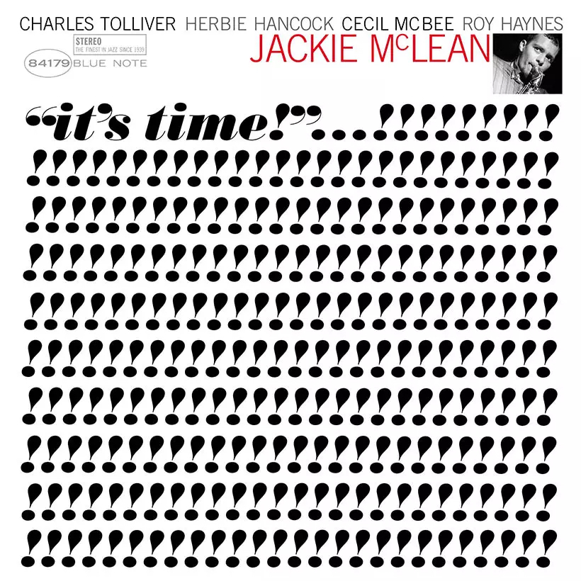
Jackie McLean Blue Note 4179 Design: Reid Miles I have heard this cover mentioned numerous times when people are talking about classic jazz album covers, for good reason. There is nothing predictable about this repetitious array of punctuation, which is possibly a nod to Rand Paul, who loved to make use of the exclamation point’s shape as well. |
|
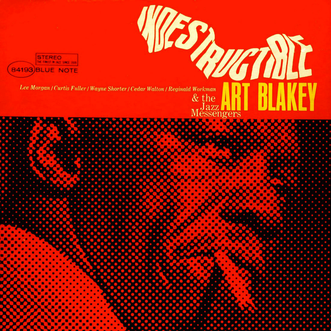
Art Blakey & The Jazz Messengers Blue Note 4193 Design: Reid Miles This newsprint motif is reminiscent of the cover for Grachan Moncur’s Evolution (pictured above) and is equally effective. I also love this combination of bold, all-caps sans-serif for the artist name with small, normal-weight serif for the band members’ names. The twisted portrayal of the album title is revolutionary (in jazz album art at least) and was surely executed by way of some sort of handmade process (I’m guessing it’s similar to the way they used projection to warp the image of The Beatles for the Rubber Soul cover). |
|
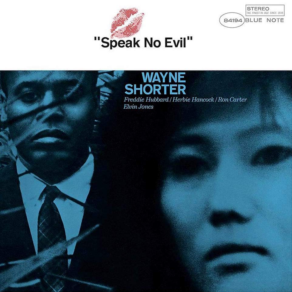
Wayne Shorter Blue Note 4194 Design, Photography: Reid Miles Great photo with the added flair of a lipstick stain. Reid Miles knew how to give his work a slight twist from time to time that would keep record buyers on their toes. |
|
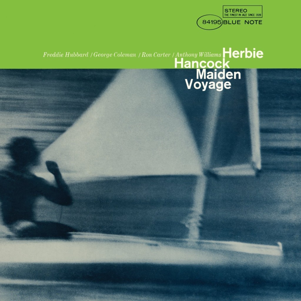
Herbie Hancock Blue Note 4195 Design, Photography: Reid Miles The blurring of this seascape somehow does not create a feeling of speed. Rather, its out-of-focus nature softens what would otherwise be the image’s harder lines of contrast. The effect also manages to complement the music, both in terms of the way the band plays on this date and the gentler sound engineer Rudy Van Gelder was getting from his studio in the mid ’60s. If any deliberate intention was made to do this, it was entirely the doing of Francis Wolff, who would on occasion give Miles an idea of what the music sounded like. The rarer use of traditional capitalization with normal-weight Helvetica really pops, and it’s paired with my favorite use of smaller italicized serif for the band members’ names. The maritime color scheme is also a perfect match for title and imagery. |