

|
Jimmy Smith Blue Note 4200 Design: Reid Miles Beautiful people make beautiful album covers, and a freshly-groomed Smith looks his usual dapper self with small-check collared shirt, cable sweater, and baby-blue umbrella. Also featured is a lovely pairing of serif and sans-serif fonts. I typically favor the classic style of two-tone covers made from black-and-white photos, but I think the use of color photography here was a good choice. |
|
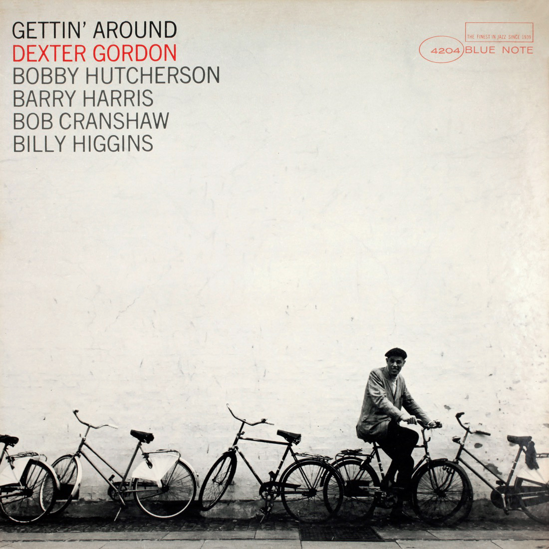
Dexter Gordon Blue Note 4204 Design: Reid Miles Brilliant use of negative space. Fun fact: The original photo for this cover depicts a building with a much shorter facade than is seen here, suggesting that the image was “Photoshopped” by Miles pre-Photoshop. |

|
Pete La Roca Blue Note 4205 Design: Reid Miles Another cover utilizing Miles’ new formula that pits a smaller photo of the artist against a large, pattern-driven illustration. There’s also some playful use of a very ’60s font with the leader’s last name. |
|
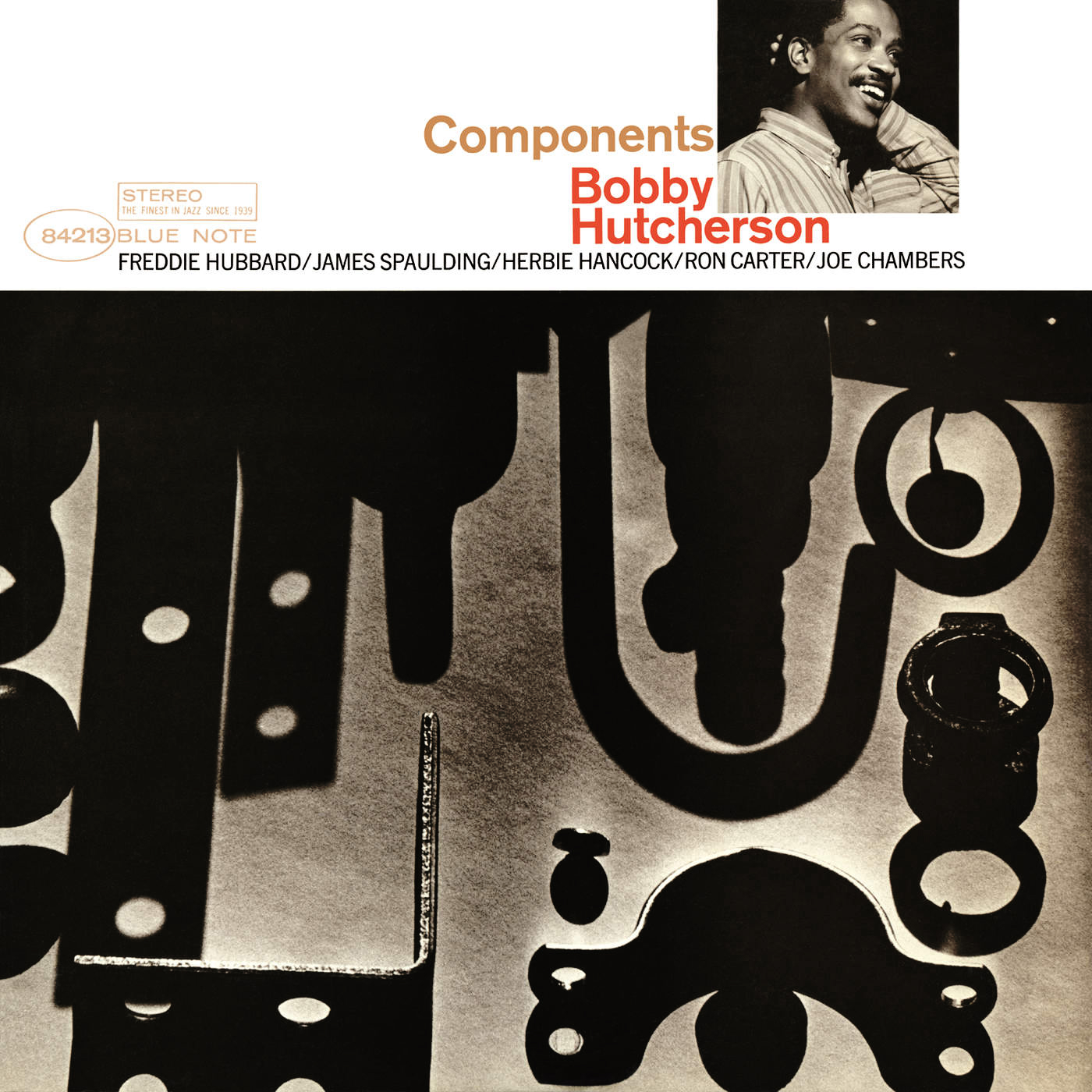
Bobby Hutcherson Blue Note 4213 Design: Reid Miles Atop the cover, a lovely photo of a smiling Hutch is hugged by capitalized Helvetica that is reminiscent of Maiden Voyage. The large, shape-driven imagery of metal parts and their shadows also fits Miles’ favorite new formula. |
|
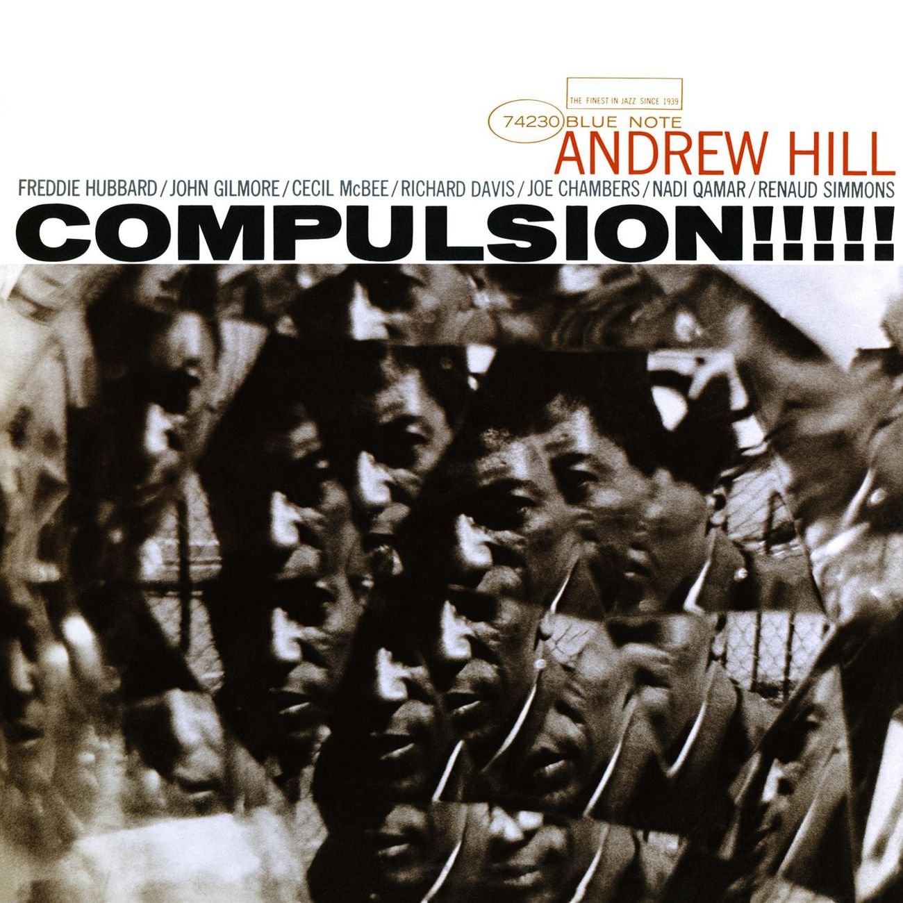
Andrew Hill Blue Note 4217 Design, Photography: Reid Miles This is the kind of album cover that makes you want to listen to an album. Compulsion takes a page out of the Out to Lunch playbook by making use of a similar font alongside a row of exclamation points. I originally mistook this photo for a shattered mirror, but upon closer inspection it appears to be a triangular-edged globe of sorts. |
|
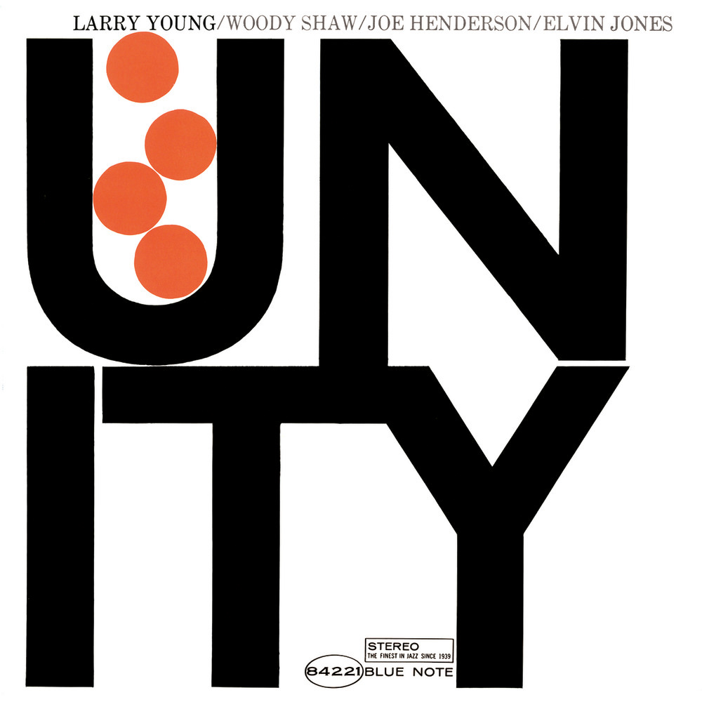
Larry Young Blue Note 4221 Design: Reid Miles What better way to end the Blue Note portion of the gallery with one of the most iconic jazz album covers of all time that is also a big favorite of mine. This is a work that is very clearly under the umbrella of Swiss Style: minimalist, typography-driven design that makes use of bold, all-caps Helvetica and simple geometric shapes. Miles also plays with the font a little by making it overlap. Perhaps the title inspired the cover’s sparse graphics, and I can’t help but think that each ball represents a band member. Fun fact: “Unity” is not the title of any song on the album, which was quite uncommon for a jazz album in 1966. |