
|
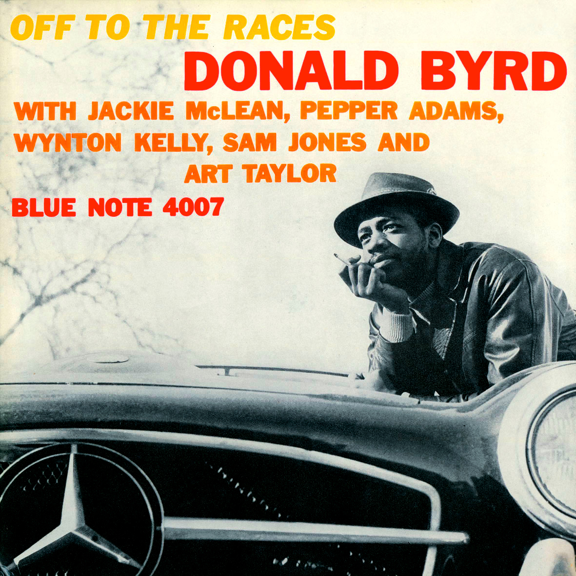
Donald Byrd Blue Note 4007 Design: Reid Miles I really dig outdoors shots taken in the fall. There’s something about the scenery that brings me a sense of peace. Byrd, posturing in a contemplative way, looks sharp sporting a fedora while clutching his cigarette. There is striking use of a lovely fat-bold, all-caps typeface in fiery red, orange, and yellow, and surprising use of italics for the title adds an element of fun. |
|
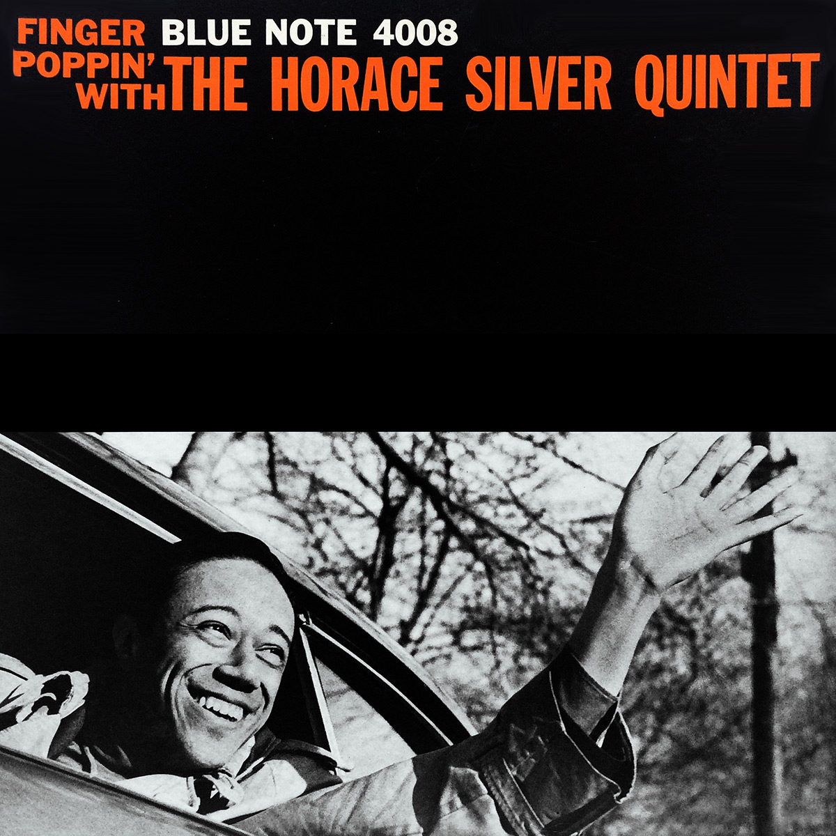
Finger Poppin’ with The Horace Silver Quintet Blue Note 4008 Design: Reid Miles Almost a companion piece to BLP 4007 (pictured above), this is another cover sporting bare trees suggesting a fall setting, and the juxtaposition of orange on black has a Halloween vibe that further accentuates the autumn spirit. Silver has his trench coat on again (Six Pieces of Silver, BLP 1539) as he waves gleefully from a car. The image doesn’t do anything to complement the album title (one could easily imagine a pic of the leader snapping his fingers) but it still works. Like Sonny’s Crib (BLP 1576), Reid Miles make effective use of negative space and rectangular sections of the grid. |
|
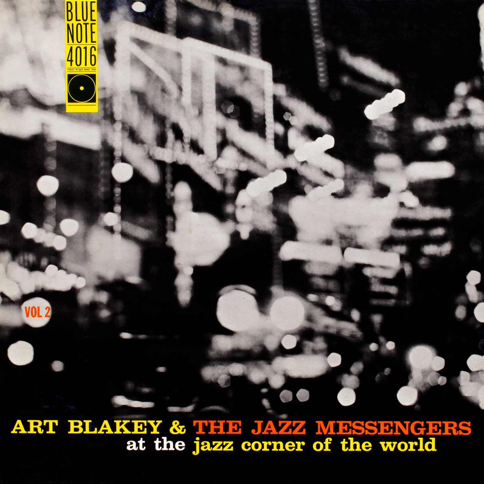
Art Blakey & The Jazz Messengers at the Jazz Corner of the World (Vol. 2) Blue Note 4016 Design: Reid Miles For some reason I find blurry photos of cityscapes comforting. It might be because the blurring of the photo somehow creates space between the observer and the observed, and maybe there’s something that feels “safe” while taking in these scenes. |

|
Lee Morgan Blue Note 4034 Design: Reid Miles The bold orange and the blown-up lowercase Clarendon font for the title creates excellent contrast with this cover. Lee also looks sharp playing his horn with a part in his hair and cig in hand. |
|
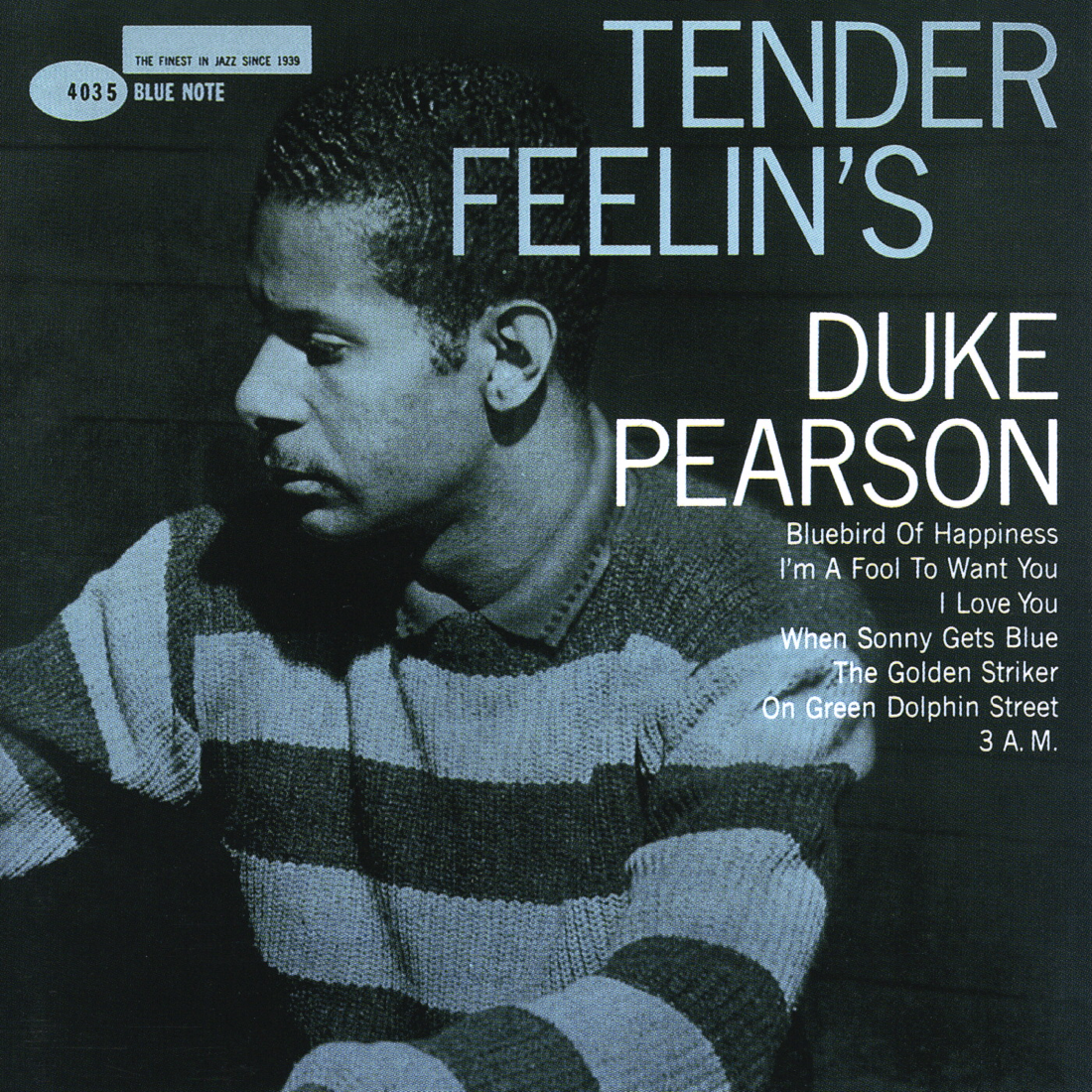
Duke Pearson Blue Note 4035 Design: Reid Miles There’s something about the blueish tint, the title, and the photo that give this image a very calming effect. |
|
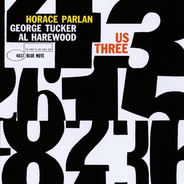
Horace Parlan Blue Note 4037 Design: Reid Miles This is a rare, highly-valued album, whose value I believe has a lot to do with how awesome this design is. Very playful use of typography creates all kinds of interesting shapes with negative space. |
|
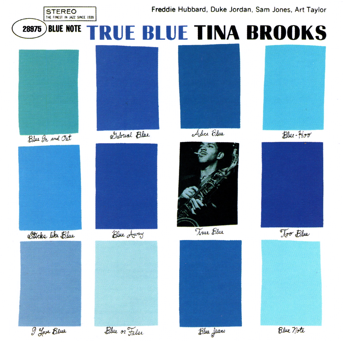
Tina Brooks Blue Note 4041 Design: Reid Miles Though very good musically, this is another album where its demand is surely enhanced by awesome album art. Despite the emphasis on simple geometry, this is a very American cover. The cursive looks like it came straight out of Paul Rand’s portfolio, and the cutout rectangles have a strong Saul Bass feel (thanks Matt B.). Fun fact: I never noticed how silly the “color descriptions” were until recently! |
|
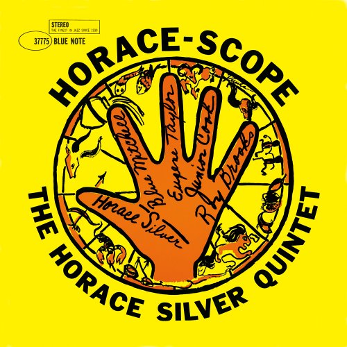
The Horace Silver Quintet Blue Note 4042 Illustration: Paula Donohue Like Lee-Way, this cover is dominated by a single flat, bold color that really pops. The black all-caps sans-serif adds intensity, and Paula Donohue’s illustration completes a triumvirate of appealing contrast. |

|
Horace Parlan Quintet Blue Note 4043 Design: Reid Miles This kind of jumbling of shapes would become a cornerstone of ’60s design. Miles makes use one of his favorite fonts, Clarendon, but this time in a thinner weight. Simple and elegant. |

|
Donald Byrd Blue Note 4048 Design, Photography: Reid Miles Once again, we have imagery that has a way of making me feel at peace. The green overlay serves as a veil creating distance between the observer and observed, which for some reason I equate with a feeling of comfort. The all-lowercase Helvetica is a nice change of pace for Miles, and I’ll never get enough of that big Blue Note “note logo”, which I prefer in its less cluttered form without the use of the word “STEREO”. |

|
Stanley Turrentine with The Three Sounds Blue Note 4057 Design: Reid Miles Another scene with a calming effect as it’s viewed from a distance. The shade of blue conjurs soulful notes that slowly seep out of the instruments. This is an iconic shot of the interior of Rudy Van Gelder’s Englewood Cliffs studio in 1960, and the glare off the floor gives us a sense of just how squeaky-clean this place was. Fun fact: The corner arch was edited out of the photo for this cover. |
|
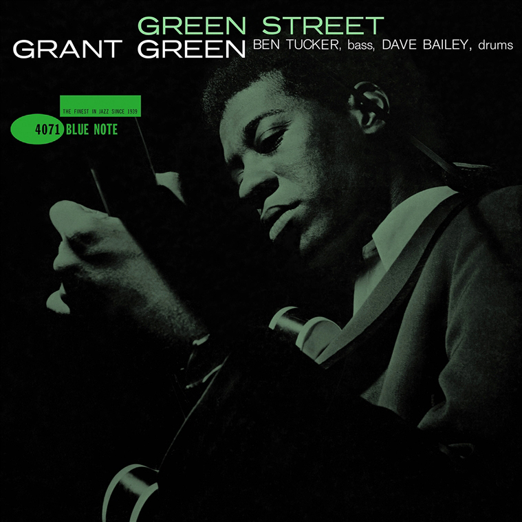
Grant Green Blue Note 4071 Design: Reid Miles This is an incredible shot of a handsome Grant Green looking like a total badass as he inspects the neck of his guitar. Taken in Francis Wolff’s patented style which made use of a flash on a dark background, Miles then bumps up the contrast for added intensity. Great choice of a stretched, narrow, all-caps Akzidenz Grotesk font also. |

|
Lou Donaldson Blue Note 4079 Design: Reid Miles I believe London Jazz Collector once said that he hated this cover. I have no idea what he’s talking about. Lou Donaldson personifies cool here as he shoves what looks like a hot dog into his mouth at a midcentury luncheonette. The super-bold fire-orange is given an extra dose of contrast thanks to the solid black and white all-caps lettering at the top…cool vintage soda machine in the background too. |
|
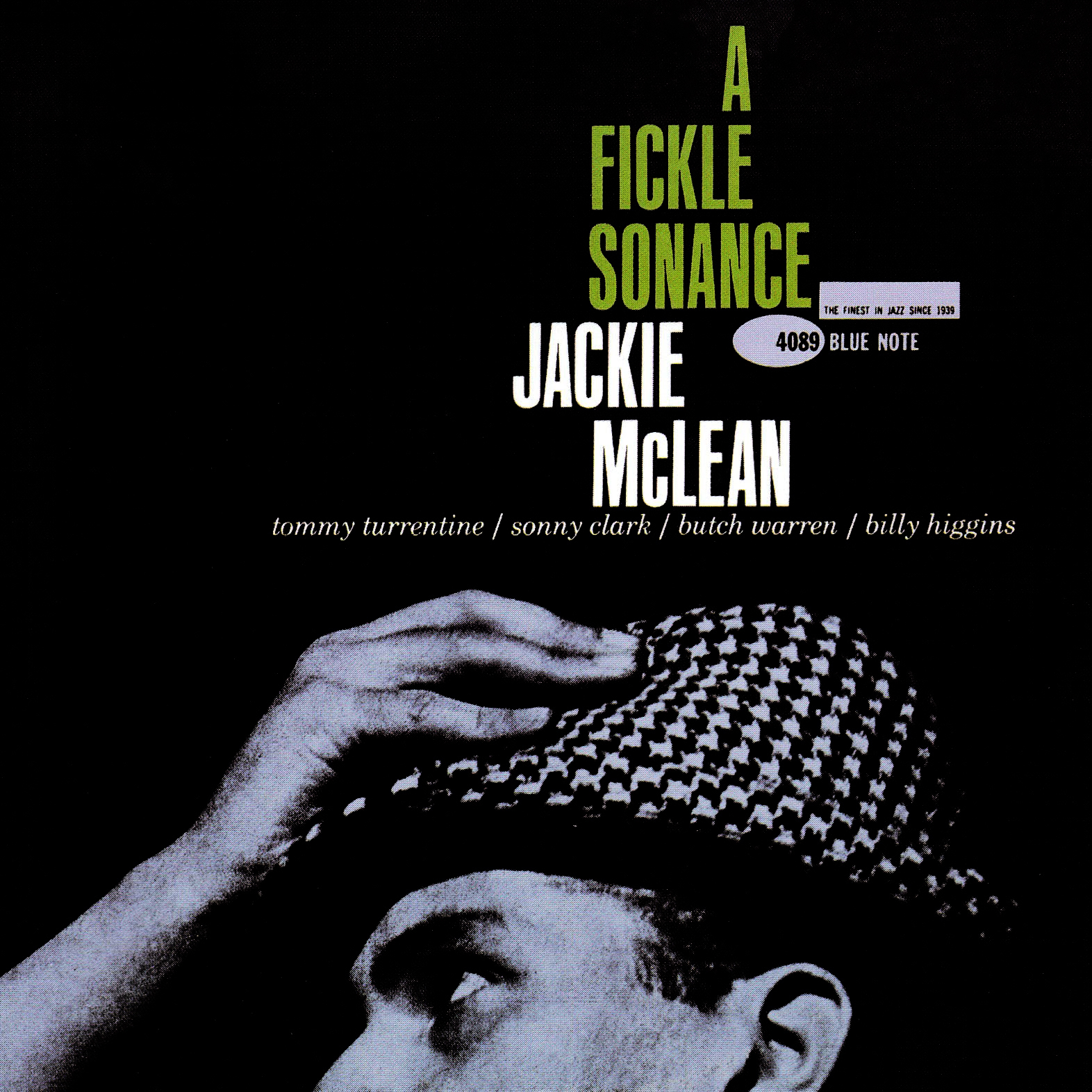
Jackie McLean Blue Note 4089 Design: Reid Miles This cover creates masterful synergy between the photograph and typography. Jackie is making a fashion statement while clutching his houndstooth fedora. Everything points upward toward the letter “A” in a triangular shape of positive space, and when graphic design demands a specific motion of your eyes, it has surely done its job effectively. |