
|
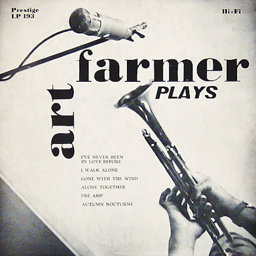
Art Farmer Plays Prestige 193 Photography: Dave Greenberg What’s not to like about this from-below point of view and elegant positioning of typography? |
|
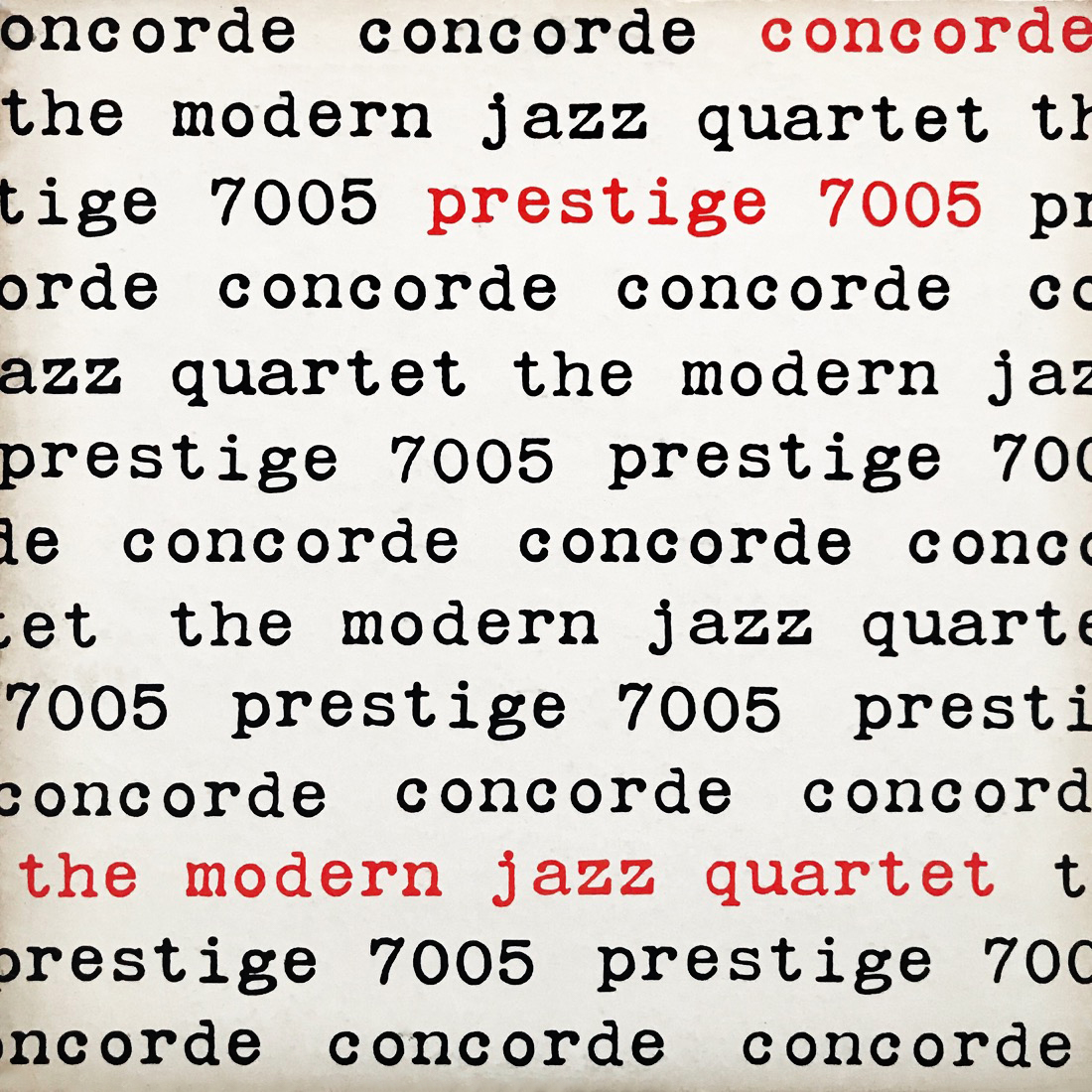
The Modern Jazz Quartet Prestige 7005 Design: Reid Miles Great art certainly does not need to incorporate advanced techniques or complexity. And when it comes to album art, apparently all that’s needed is a typewriter. This is a very early cover for Reid Miles, who did design for Prestige for a stint in the mid ’50s just as he became head designer for Blue Note. |
|
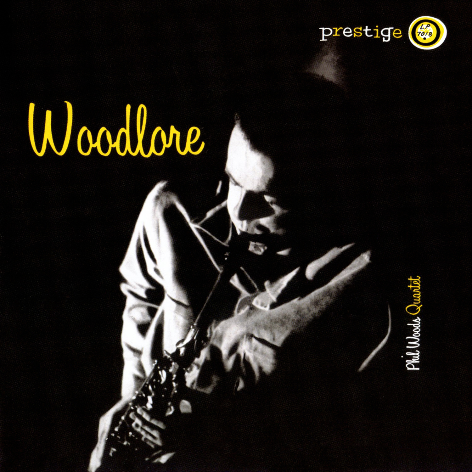
Phil Woods Quartet Prestige 7018 Nothing too fancy going on here but I really love this custom cursive font and color scheme. |
|
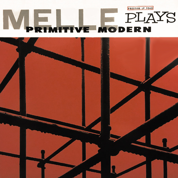
Gil Mellé Prestige 7040 Great use of photography (unknown credit) to create some interesting geometry. The hand-drawn font for “PLAYS” is done in the Early Modern design style. |
|
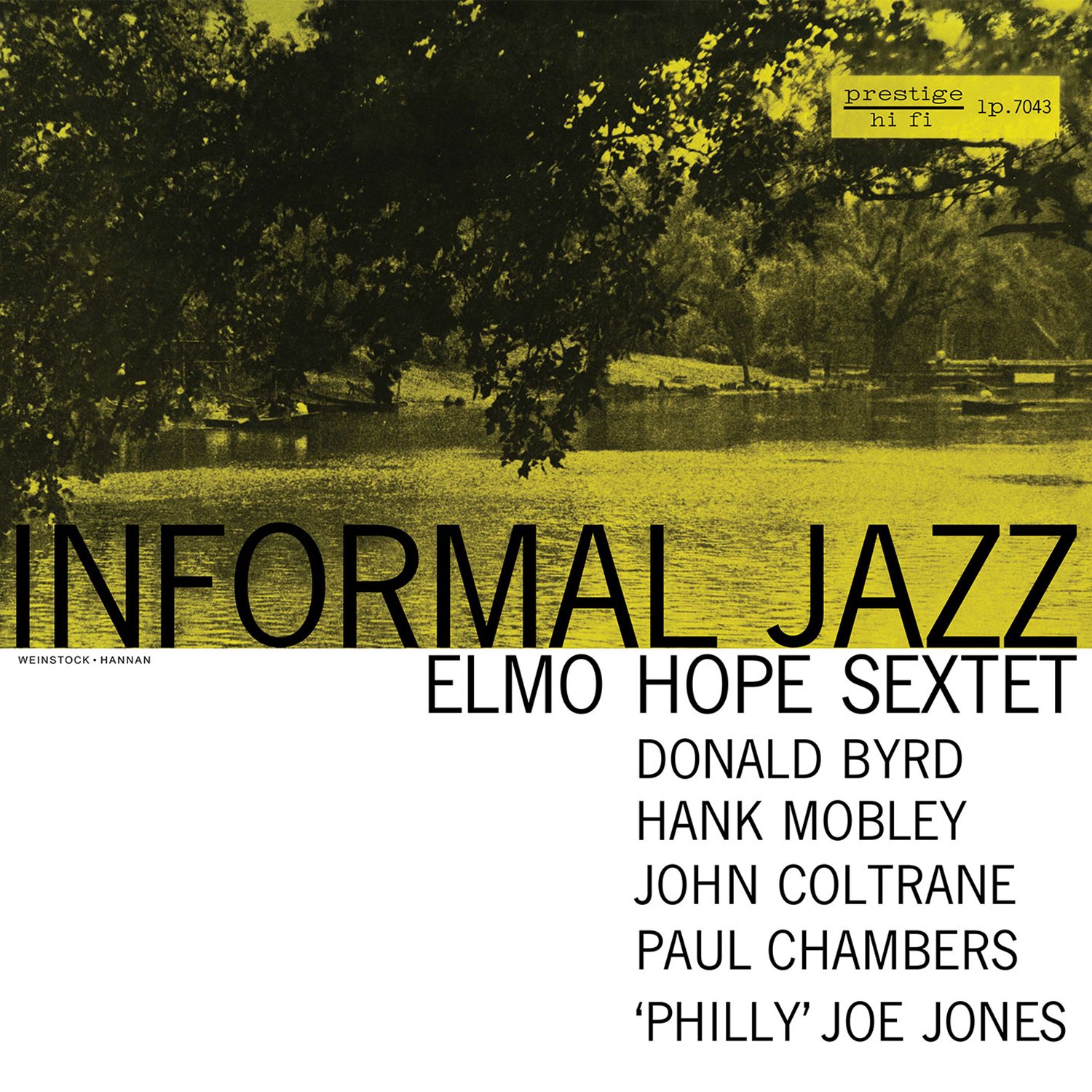
Elmo Hope Sextet Prestige 7043 Design: Tom Hannan Designer Tom Hannan makes impeccable use of Akzidenz Grotesk, a font popular with Swiss designers that would have eventually made its way to the states. For whatever reason, Prestige usually opted for some type of scenery (often in complete absence of people) over a photo of the bandleader. Though I like the “power-to-the-people” approach Blue Note took by featuring the bandleader on most covers, I can’t deny that Prestige did indeed produce some great covers that make use of landscape photography. This is certainly Central Park, and both the imagery and title set you up for a laid-back forty minutes of hard bop. |

|
Hank Mobley Prestige 7061 Design: Reid Miles This cover didn’t really grab my attention until I saw that the illustrious (and expensive) Electric Recording Company was reissuing it. The contrast of lime green with black and white makes for some eye-catching visuals, and the silhouette of electric power lines creates geometry in a way that is much more involved than the simpler shapes common in Swiss Style. A significant step off the beaten path for Reid Miles. |
|
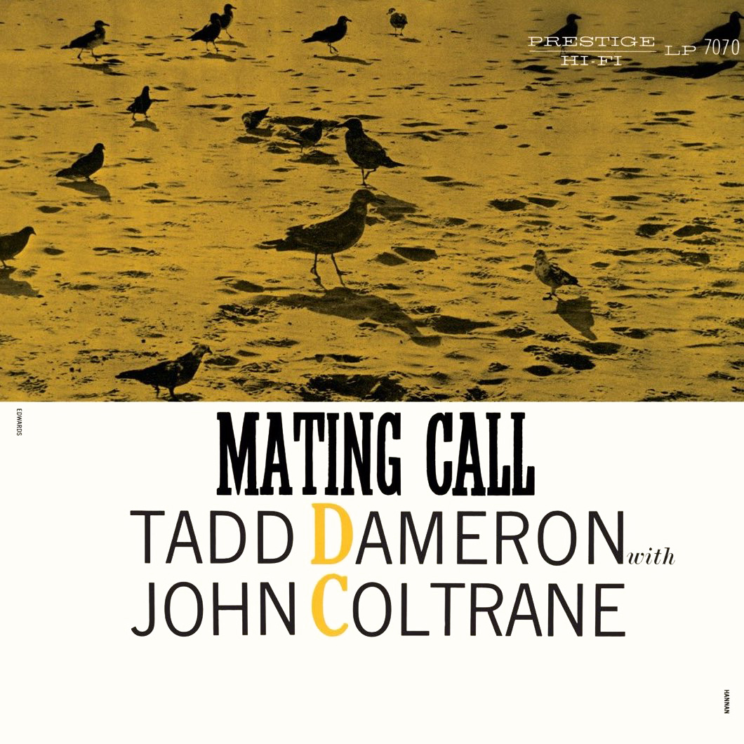
Tadd Dameron with John Coltrane Prestige 7070 Design: Tom Hannan By this point in time, Esmond Edwards has surfaced as a talented photographer and soon-to-be designer, and here he contributes a moody landscape consistent with Prestige’s most frequently-used late ’50s formula. Fonts are used creatively here, and the color scheme of yellow with white is a welcome break from the norm. |
|
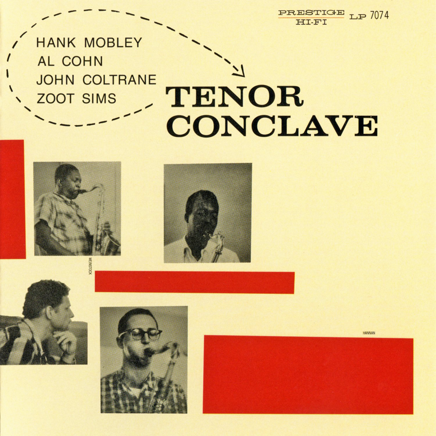
Tenor Conclave Prestige 7074 Design: Tom Hannan A cover I love for its simplicity, my favorite thing about it is the understated curved dotted line encircling the artist names at the top. |
|
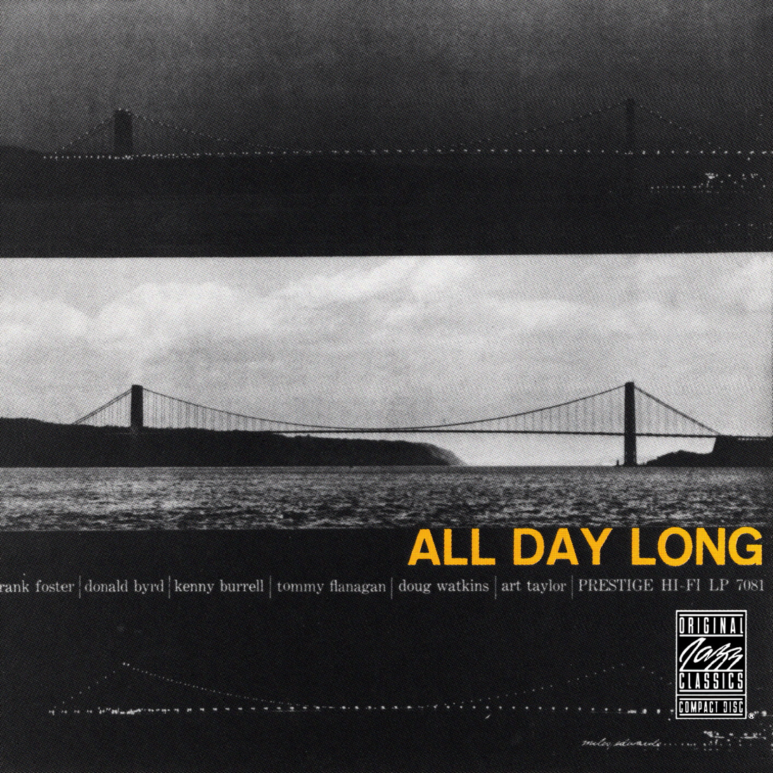
All Day Long Prestige 7081 Design: Reid Miles Once again we find a landscape that creates space between the viewer and the subject — in this case, a lot of space. It kind of reminds me of being high up in a tall skyscraper while looking down at the city below. Everything looks so quiet and peaceful, though the reality of course is that it is anything but that. This is actually the exact same color combination and choice of all-caps Helvetica Bold used for Lee Morgan Sextet on Blue Note around the same time, which was also designed by Reid Miles. In fact, you can find that quite often designers would use similar design schemes for a cluster of albums designed at the same time, which was likely done with the aim if maximizing efficiency. |
|
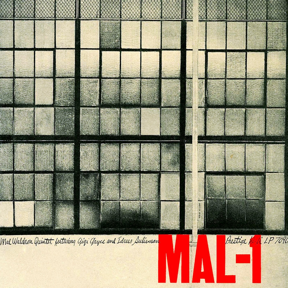
Mal Waldron Prestige 7090 Design: Reid Miles Simply brilliant and very much done in the Swiss Style, though finding geometry in photography was perhaps something more American than European. The balance between big, bold sans-serif for the title and small cursive for the band members rounds out this happy balance of the two styles. |

|
Paul Quinichette Prestige 7103 Design: Reid Miles This is just a simple, fun cover that has always resonated with me. Maybe it just boils down to the geometry of it all. (See what I did there?) And the eggs look tasty. |
|
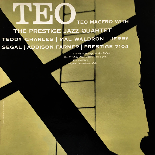
Teo Macero with The Prestige Jazz Quartet Prestige 7104 Design: Reid Miles Not much needs to be said about great, simple design like this. A very geometric, high-contrast photograph makes the strongest case for this cover’s appeal. |
|
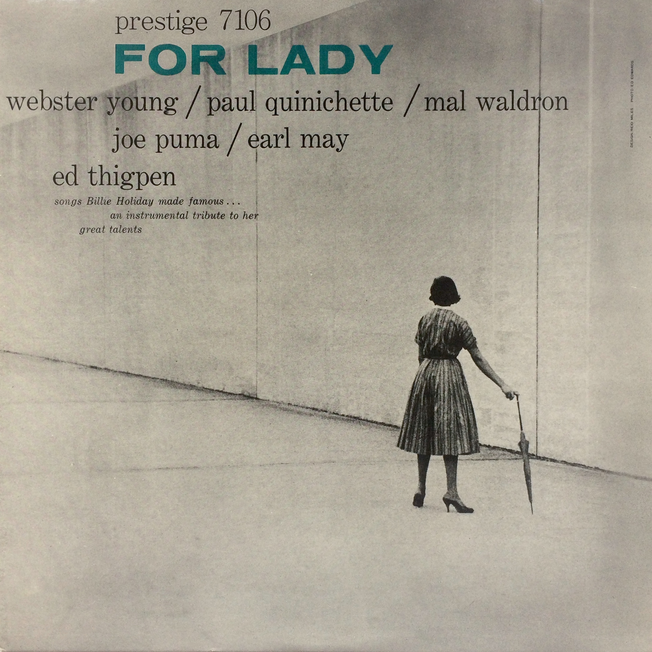
For Lady Prestige 7106 Design: Reid Miles This is a calm, cool cover with a peaceful vibe. The transparent typography for the album title is a very original and attractive choice by Reid Miles, one that unfortunately would not be used by the designer often. The small amount of color contrasted with the photo’s large, grey landscape is highly effective. I’m not sure where this photo was taken but I’m guessing NYC…maybe Lincoln Center, but that didn’t open until 1962. However, construction started in 1955 so maybe this part was completed by then, I’m not sure. |
|
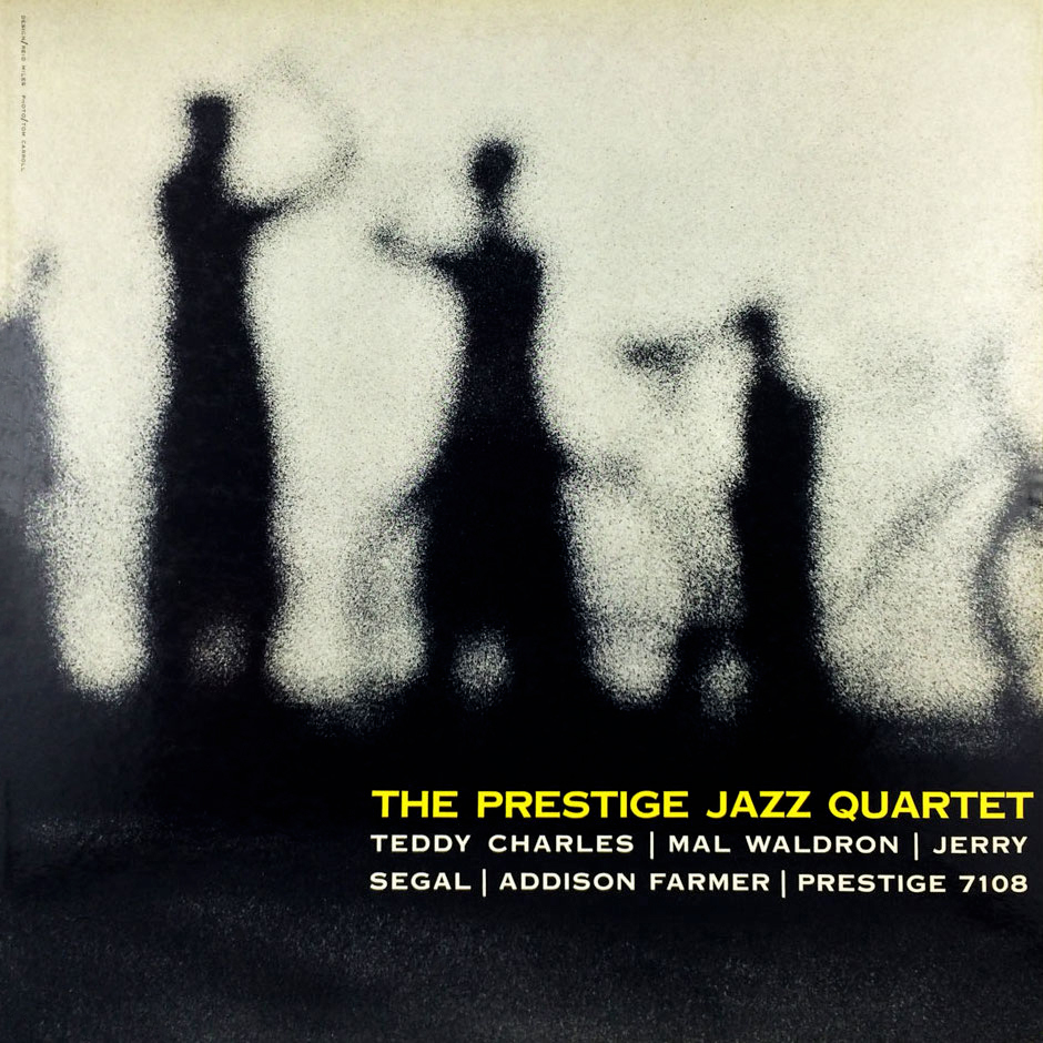
The Prestige Jazz Quartet Prestige 7108 Design: Reid Miles To me, this photo looks like a candid shot of people practicing tai chi at a public park in Chinatown, and the tranquility created by the image complements the music of this vibraphone-led quartet. The theme of blurred imagery comes up in jazz album art again and again, and as I have said multiple times before, I think this consistently makes the viewer feel something good. |