
|
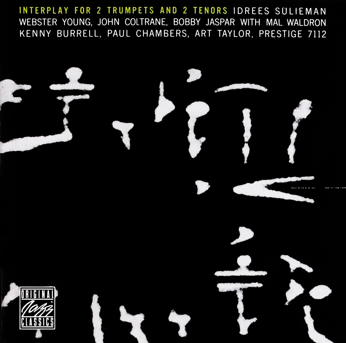
Interplay for 2 Trumpets and 2 Tenors Prestige 7112 Design: Reid Miles This is a super-minimal, pattern-driven cover with a very high-contrast image that creates loads of negative space. I have no idea what this is a photo of (Am I supposed to?), but the shapes created by the contrast bump are super interesting. |
|
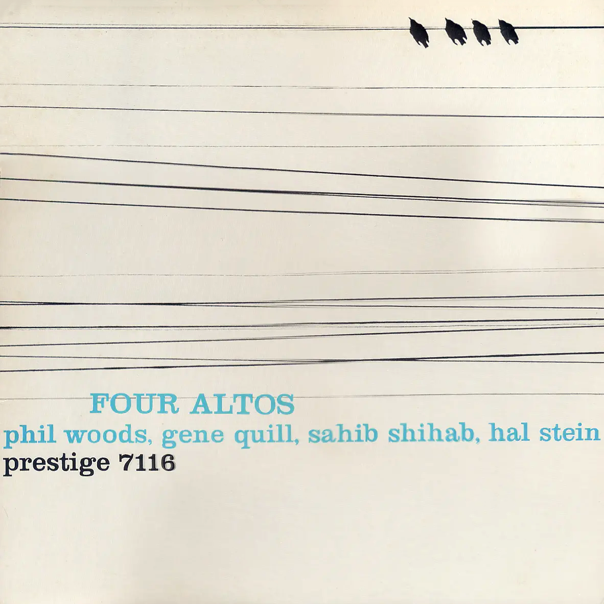
Four Altos Prestige 7116 Design: Reid Miles This was one of the first covers that really caught my eye back when I first started getting into jazz. Four birds sit atop a power line and look completely protected from the dangers that lie below. There’s lots of cool geometry created by the power lines, and powder blue seems like the right choice for the font. |
|
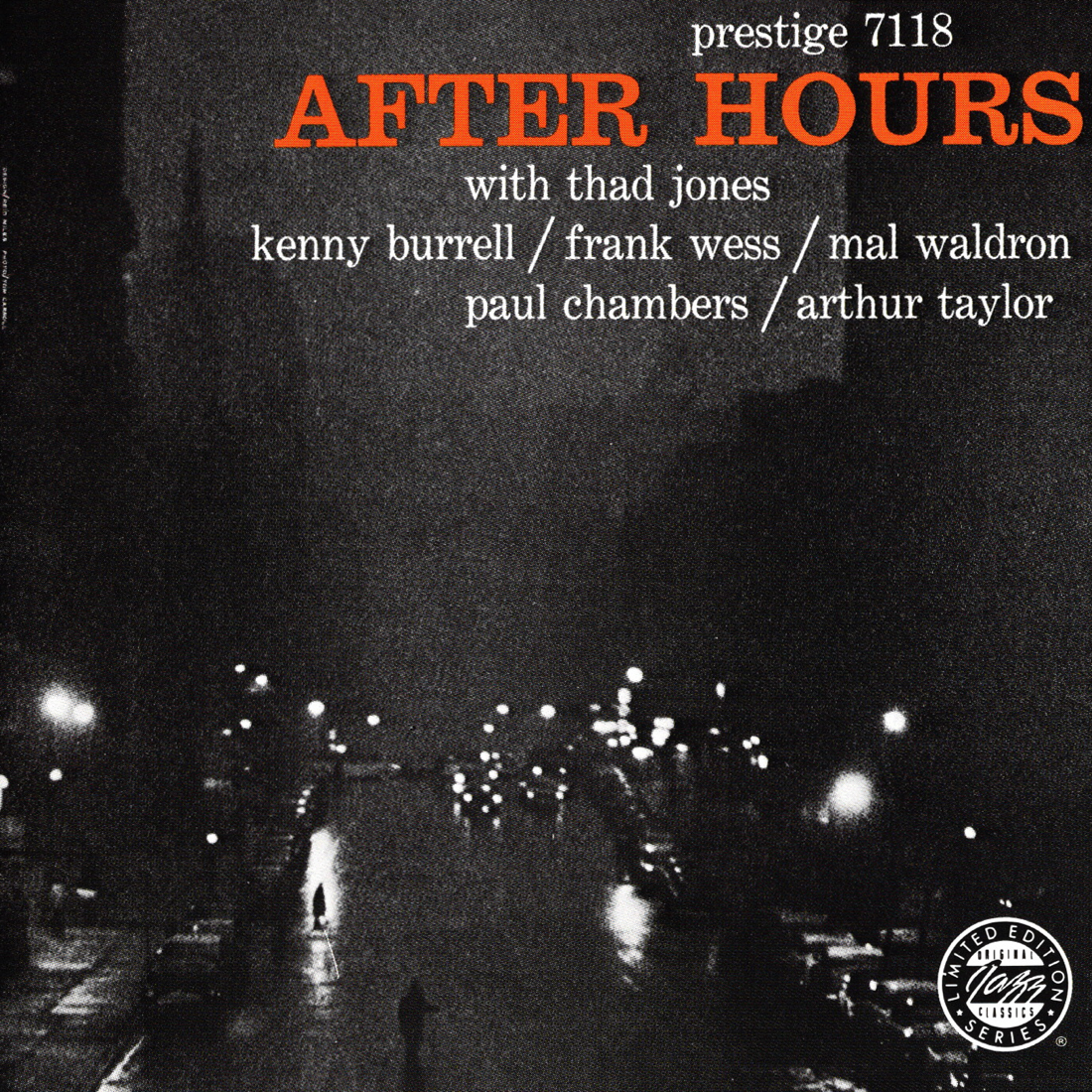
After Hours Prestige 7118 Design: Reid Miles This street scene has an incredibly cool vibe. The title and lack of cars on the road make me think it’s 2 A.M. in New York City and all is quiet on this foggy evening. I find the music here to be rather upbeat and not reflective of this album art, but that doesn’t stop this from being a great cover in and of itself. |

|
Herbie Mann & Bobby Jaspar Prestige 7124 Design: Marc Rice At this point, if you’ve been reading through since the beginning, you’re probably tired of hearing me talk about “peaceful” imagery. I’m sorry to do this to you again but I find this to be a peaceful image as well! I also love deep orange on black and white (see Blue Note 4008 Finger Poppin’ with The Horace Silver Quintet). My guess is Esmond Edwards did a negative exposure for this image while bumping the contrast. |
|
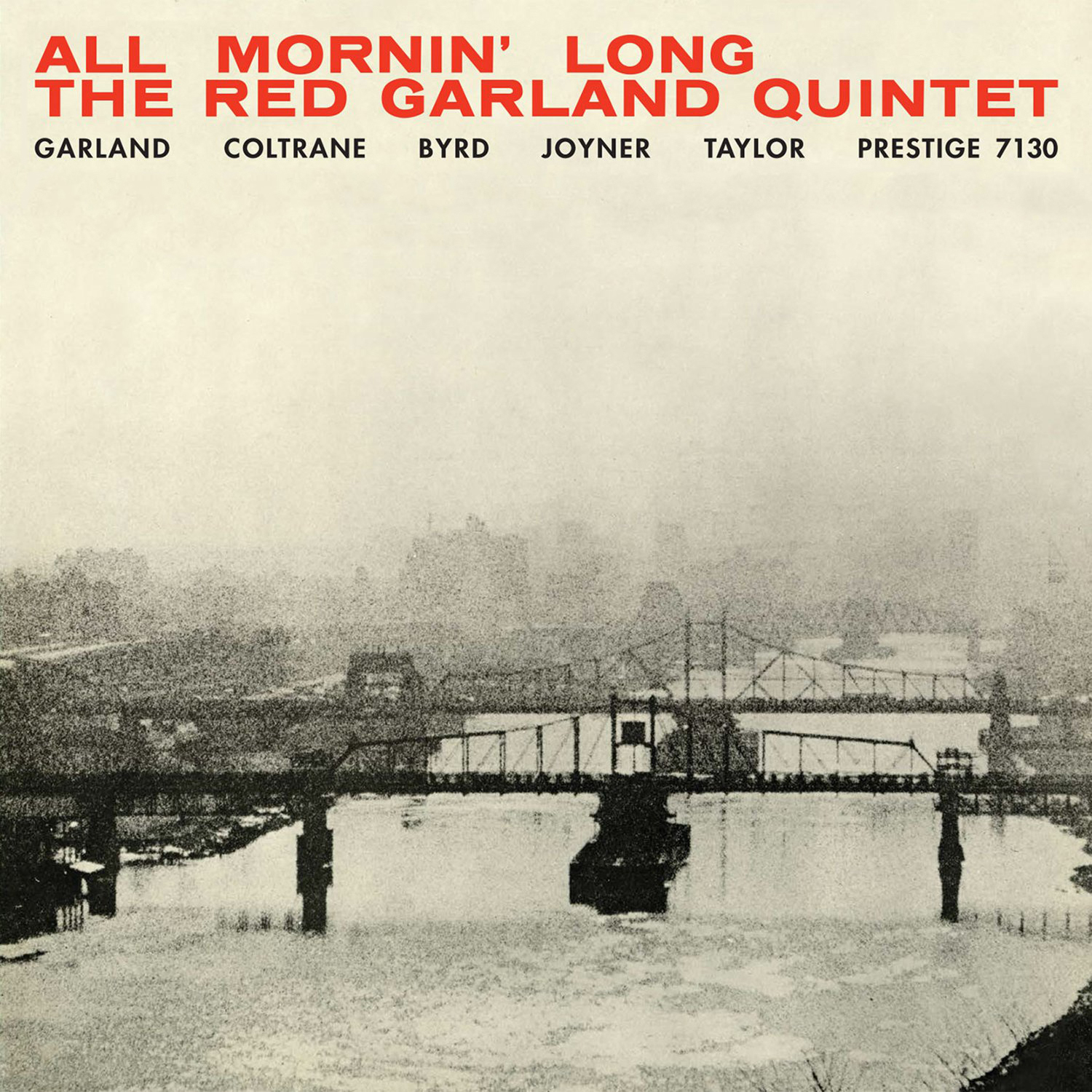
The Red Garland Quintet Prestige 7130 Design, Photography: Esmond Edwards OK, this is the ULTIMATE peaceful image. The fog, the view-from-a-distance, and the title all make me think of hanging around the house sipping coffee all mornin’ long. This is the same font used for BLP 1576 Sonny’s Crib (Reid Miles instead), and this cover uses the same color combo as well. I’m not exactly sure what part of NYC this is, possibly the East River above the 59th Street Bridge. I got myself an OJC vinyl reissue of this album since I love the cover so much and they did a great job with the printing. |
|
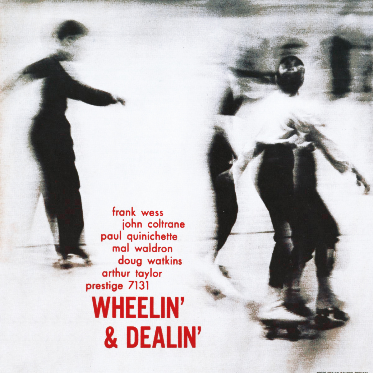
Wheelin’ & Dealin’ Prestige 7131 Design, Photography: Esmond Edwards The blur of these roller-skaters, who appear to be speaking to each other gleefully, make me think of a relaxing afternoon having fun with friends. Good vibes all around. |
|
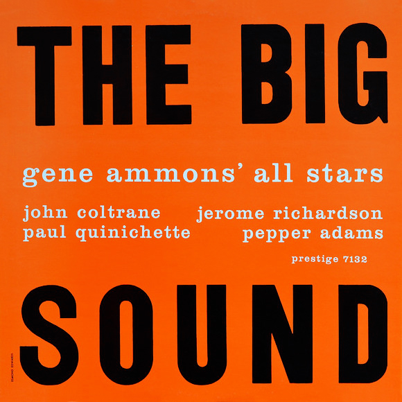
Gene Ammons’ All Stars Prestige 7132 Design: Esmond Edwards This is some brilliant minimalist use of typography that screams “Swiss Style”. Whether Esmond Edwards was inspired by Reid Miles, the other way around, or a little of both (my guess is it’s option 1 since Miles was designing covers a while before Edwards), in 1958 both designers are working Swiss Style in a highly effective way. |

|
Tommy Flanagan Prestige 7134 Design: Esmond Edwards I wouldn’t say Prestige has made nearly as many iconic covers as Blue Note, but I think this is one Prestige cover deserving of that classification. There’s something about this green that I absolutely love, and the play-on-words with a “sea” of repetitive typewriter “C’s” is pure genius. Esmond Edwards has finally arrived as a respected, legitimate graphic designer, and this cover makes that fact indisputable. |
|
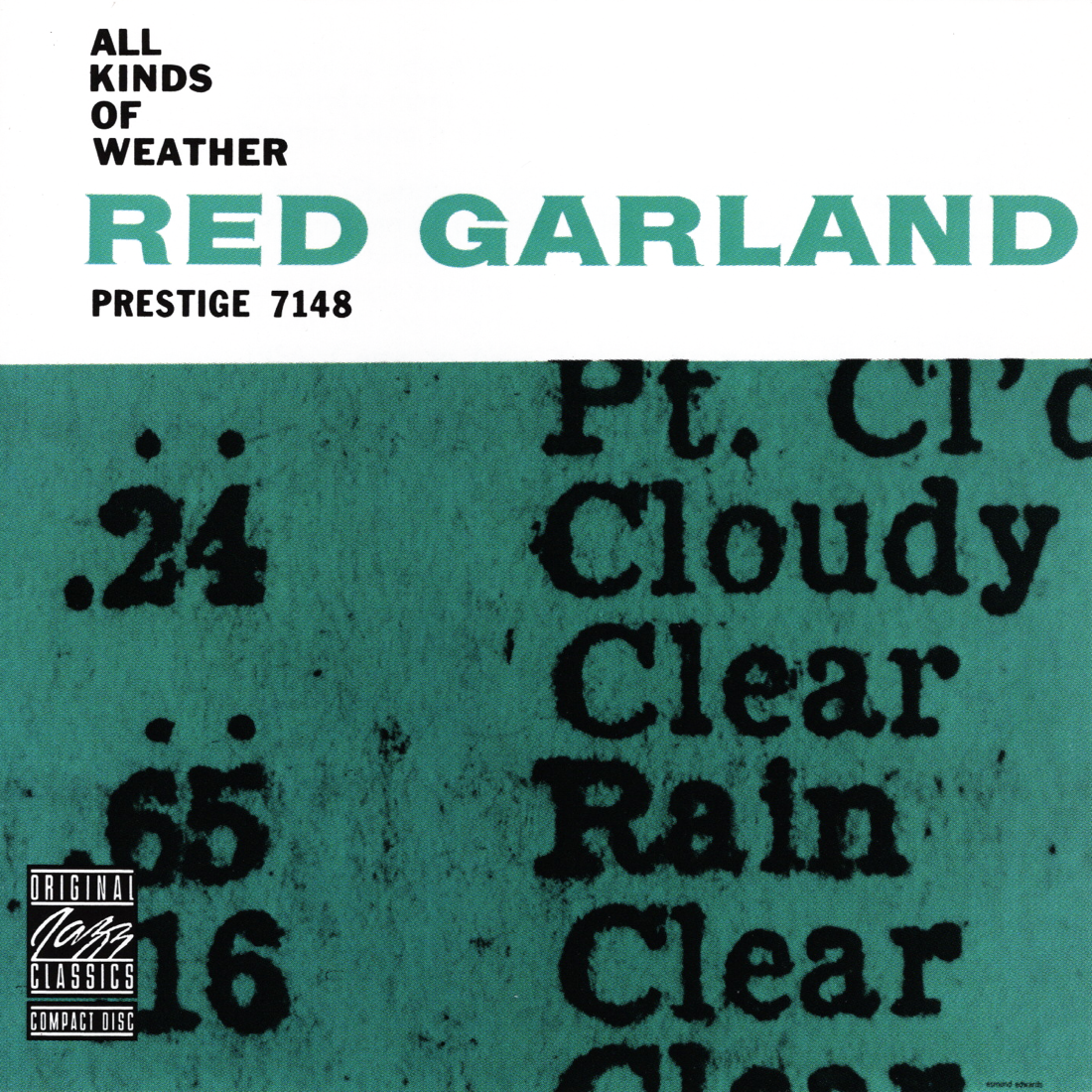
Red Garland Prestige 7148 Design: Esmond Edwards When I think of weather, I often think of rain, snow…basically, water, which is why I feel aqua is the right choice for this two-tone cover. I love this super-closeup of what appears to be some sort of printed weather forecast. |
|
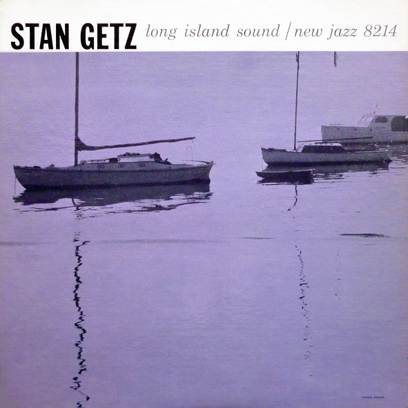
Stan Getz New Jazz 8214 Design, Photography: Esmond Edwards The music on this album consists of a very old recording session originally released on 78 disks and this cover breathes new life into it. Prestige/New Jazz was in a (kind of shady) habit of repackaging old material to resell to people, sometimes even the exact same album with a different title and new album art, but this is probably one of their lesser offenses since this is technically a compilation. The design is so fresh though, if I were buying this record without knowing what the music sounded like, I would probably anticipate a more high-fidelity, modern-sounding recording. I like the choice of light purple, and the reflection of the poles on the water creates some really cool patterns. |
|
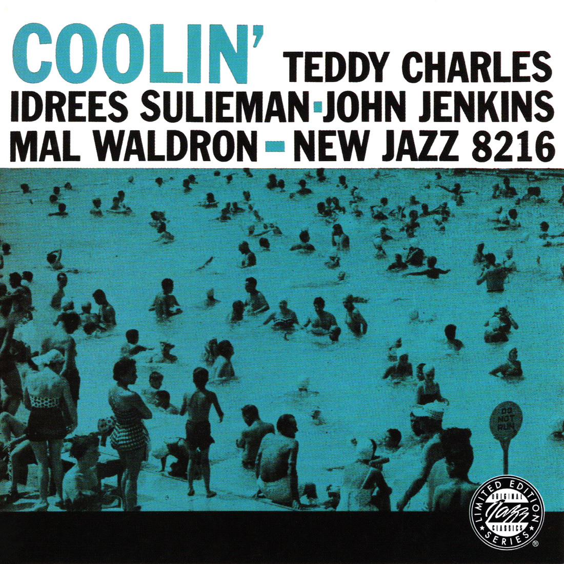
Coolin’ New Jazz 8216 Design, Photography: Esmond Edwards Here we have yet another one of my absolute favorite covers. Other collector friends of mine have confirmed: There is something sexy about this cover, and I’m pretty sure it’s not the middle-aged people in conservative bathing suits. These people all look so happy. They look refreshed, relaxed, and when we look at images like this, I think it makes us feel a little of that satisfaction as well…ahhh. This light blue is an ideal choice to complement the image and title, and speaking of the title, jazz album names can’t really get much…cooler. |
|
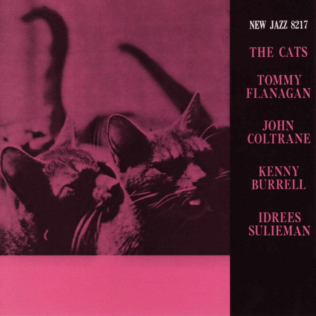
The Cats New Jazz 8217 Design, Photography: Don Schlitten What’s not to love about cute cats in a two-tone overlay? Also, I think album names can sometimes make albums more attractive, and “The Cats” is an incredibly hip album name. |
|
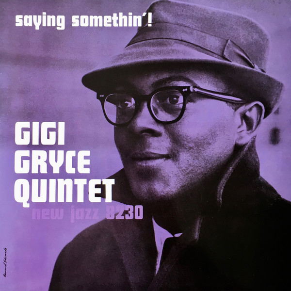
Gigi Gryce Quintet New Jazz 8230 Design, Photography: Esmond Edwards As I have already said about Jimmy Smith (and could have easily said about other dashing artists like Lee Morgan, Miles Davis, Bobby Hutcherson, Hank Mobley, and Horace Silver for example), beautiful people make beautiful album covers. This depiction of a young Gigi Gryce proves this point well, and his attire — a shapely fedora hat, thick-framed glasses, and wool coat with collar popped — only helps his case. I’m not a huge fan of the font chosen here but everything else, including the lovely shade of violet, makes up for it. Although Prestige/New Jazz would eventually start featuring more images of artists on their album covers, this is a less common occurrence of that in 1960. |