

|
Paul Gonsalves Argo 626 Design, Photography: LeRoy Winbuch This is a great photo of the leader blowing hard on his sax, and though the choice of overlaying a cracked window is rather unconventional, it succeeds at grabbing the viewer’s attention while giving them a sense of just how loud Gonsalves is playing. The especially cute handwritten album title adds even more to this cover’s flair. |
|
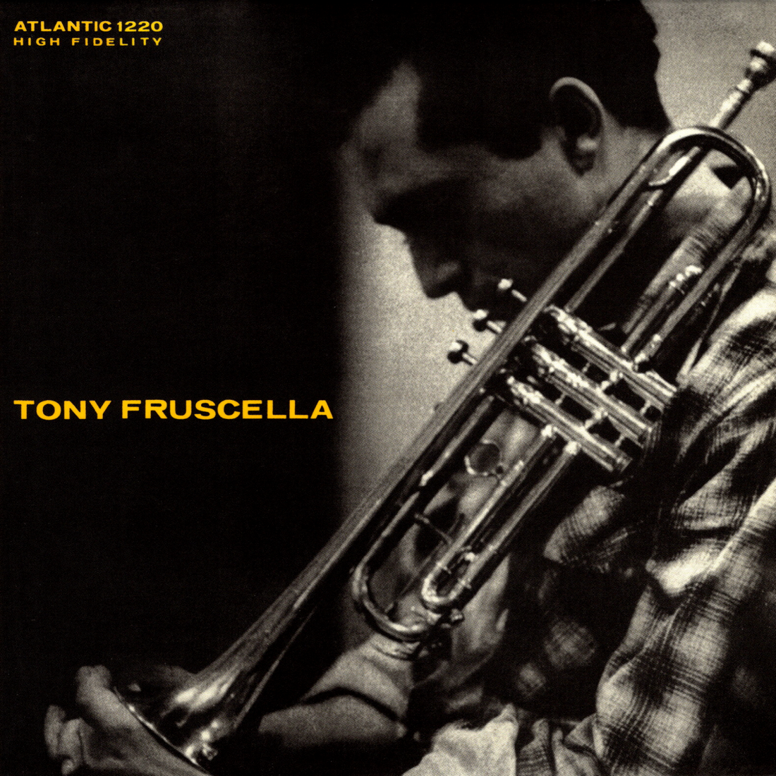
Tony Fruscella Atlantic 1220 Photography: Hugh Bell Effective minimalism. This cover features a pleasing all-caps sans-serif font and beautiful photo of the leader holding his horn, and yellow-on-black is a favorite color scheme of mine. |

|
The Teddy Charles Tentet Atlantic 1229 Design, Photography: Burt Goldblatt Generally speaking, I like Burt Goldblatt’s work, but this is my only entry of his in the gallery. While it looks like Charles is standing near a window with the blinds half-drawn, I read that the pattern was actually created by light from a projector. |
|
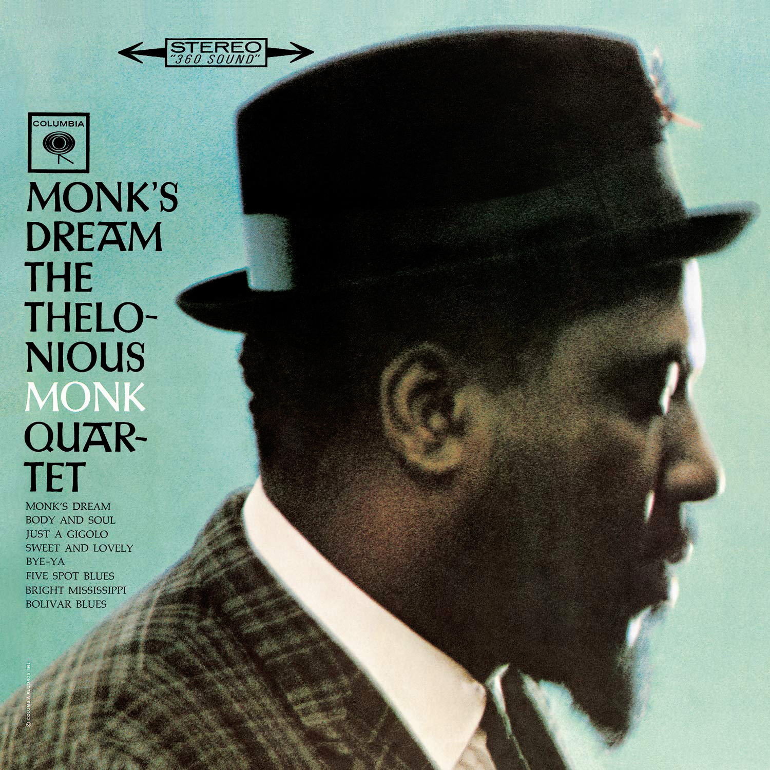
The Thelonious Monk Quartet Columbia 1965 Photography: Don Hunstein Columbia had good, but not great, album art in my humble opinion, and this cover is one of their best. It features a delightful photo of Monk with a warm, aqua-tinted background. I also adore the font (all-caps Jellen-Schrift) with it’s quirky “A’s”. |
|
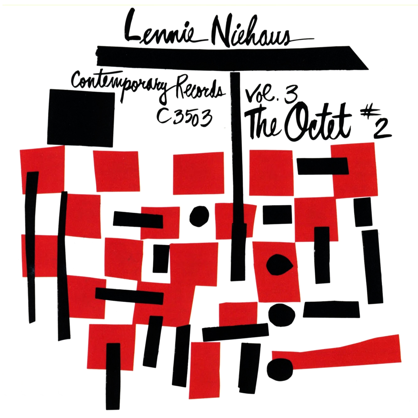
Lennie Niehaus Contemporary 3503 Design: Catharine Heerman Contemporary covers were generally done in the Swiss Style that was so popular with jazz labels in the ’50s and ’60s, but this cover is a step away from that convention with its handwritten script and lovely geometric design that screams “MoMA”. |
|
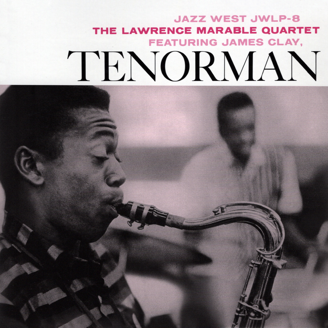
The Lawrence Marable Quartet ft. James Clay Jazz West 8 Photography: William Claxton A great album in its own right, this super-hip cover art probably does a lot to drive this record’s demand and the incredibly high price of originals. Featured is an exceptional photo of James Clay taken mid-note with leader Lawrence Marable at a distance. I especially like how the photo emphasizes the curvature of the saxophone’s neck. |
|
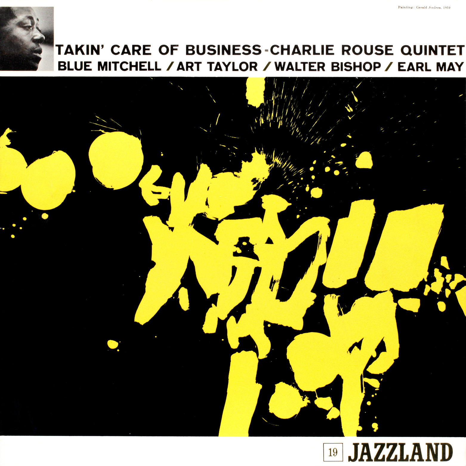
Charlie Rouse Quintet Jazzland 19 Design: Ken Deardoff This cover is interesting in part because it looks so much like a formula Reid Miles began using for Blue Note around 1964, yet this cover predates that by four years. A large pattern-driven piece of art occupies most of the cover’s real estate with a smaller artist photo and album info above. (For comparison, see other Blue Note covers in this gallery: Black Fire, Evolution, Basra, and Components.) Could Miles have somehow been influenced by this cover and perhaps others made by Ken Deardorff? Maybe it was a coincidence. Anyway, I really enjoy Gerald Andrea’s painting. |
|
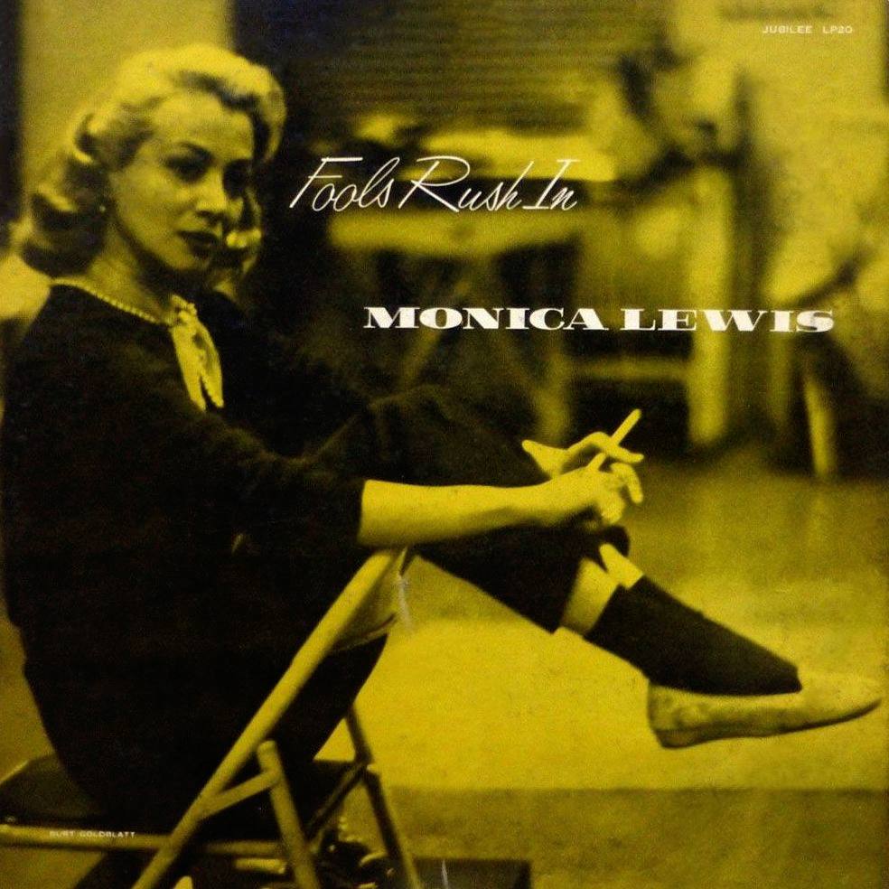
Monica Lewis Jubilee 20 The beautiful Monica Lewis is largely responsible for making this a great cover, and the way she has situated herself atop a folding chair during her cigarette break is especially cute. The use of handwritten cursive for the album title adds to the appeal, though I’m not a fan of the “money font” used for her name. |
|
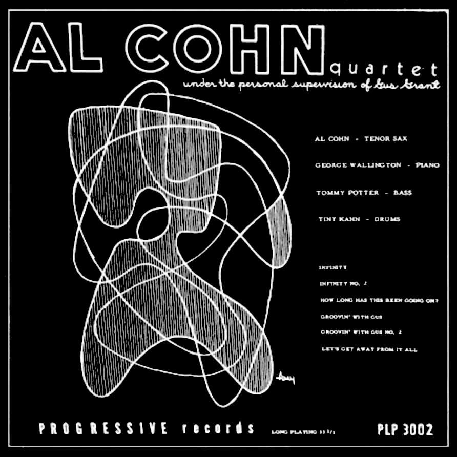
Al Cohn Quartet Progressive 3002 Another MoMA-esque piece of art gracing a rather early ten-inch release for the small Progressive label. This cover really does it for me, mainly because of the great font choices and the juxtaposition they create with each other. |
|
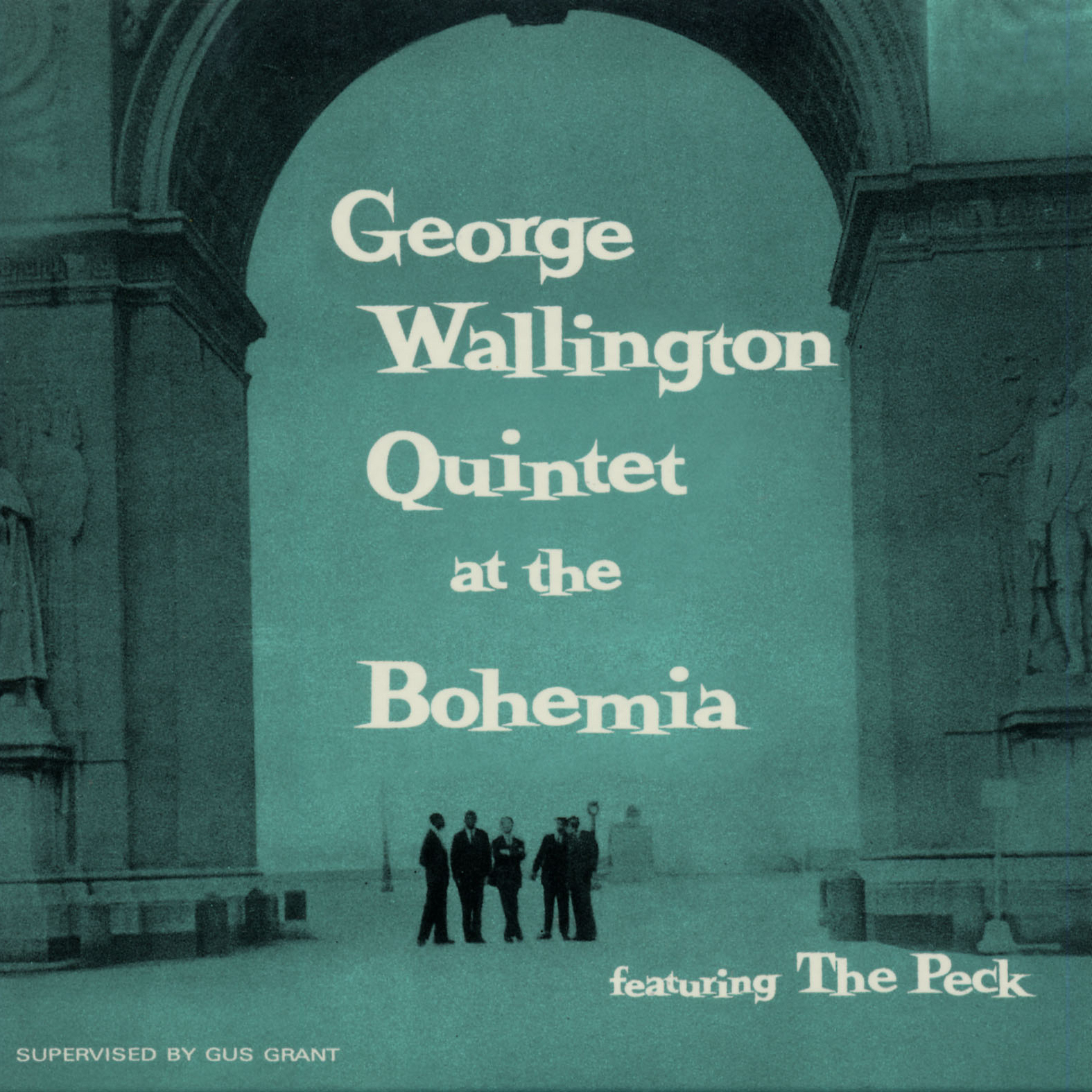
George Wallington Quintet at the Bohemia Progressive 1001 This cover is way up on my list of favorites. Though I typically don’t prefer the typographies that were popular during the Early Modern period of American design, this jumbled serif is an exception. I can’t get enough of soft aqua overlays like this, and the typography is smartly positioned within a brilliant photo of the band in NYC’s Washington Square Park, which wouldn’t have been too far from Café Bohemia in the West Village. |
|
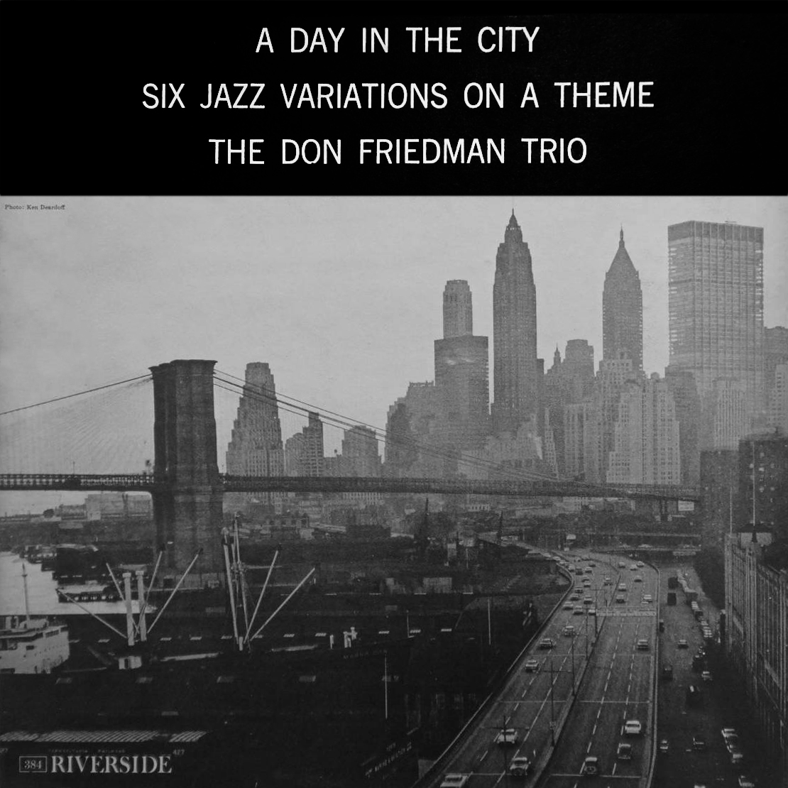
The Don Friedman Trio Riverside 384 Design, Photography: Ken Deardoff I love this cover for all the same reasons I love other cityscape covers like All Mornin’ Long (Prestige 7131). I liken viewing New York City from a distance to viewing a tiger from a distance: it might look like a cute cat, but up close it’s a beast. The photo features the Brooklyn Bridge, Wall Street, and the southernmost part of FDR Drive at the lower tip of Manhattan. Designer Ken Deardorff is wholly invested in the principles of the Bauhaus and Swiss schools here, using only what is needed to communicate with the record buyer. This is especially true of the typography and black-and-white presentation. |
|
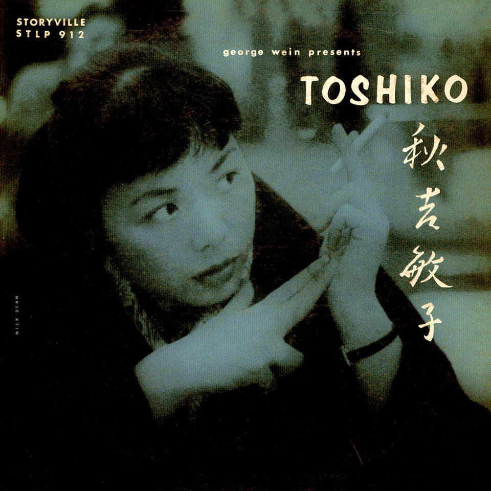
Toshiko Akiyoshi Storyville 912 Photography: Nick Dean The employment of minimalism in jazz album cover design is in full swing by 1956 and this cover is no exception. Aside from the aqua overlay, which always does it for me, I’m also a sucker for youthful beauty and smoking, and Toshiko has both going for her here. The highlights of Japanese calligraphy are an uncommon treat for American eyes as well. |
|
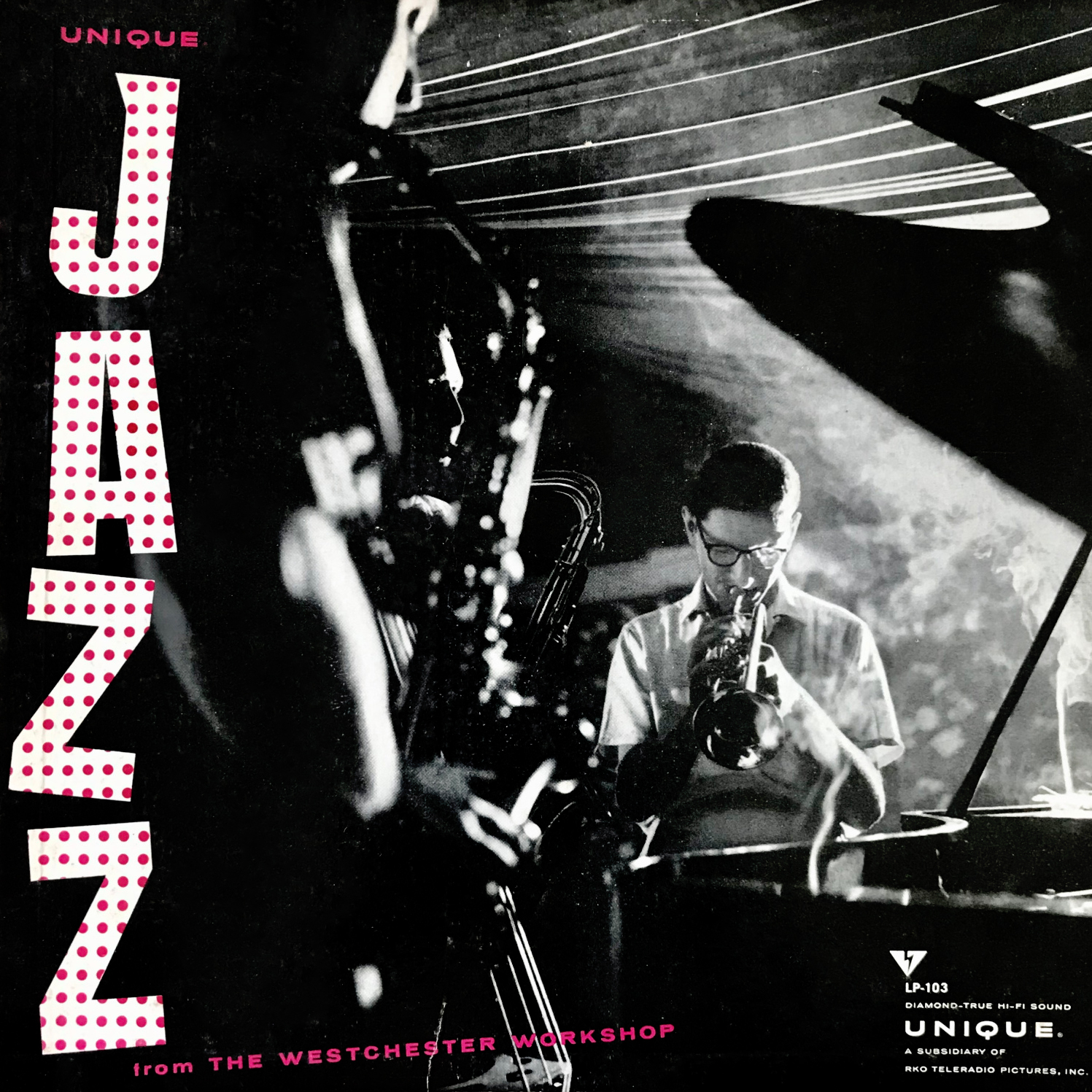
Unique Jazz from the Westchester Workshop Unique 103 The polka-dot print for the word “JAZZ” on this cover is lovely, and let’s admit it: smoke-filled jazz clubs are super cool-looking. The point-of-view is highly effective at leading the eyes down a row of saxophonists to trumpeter Joe Shepley, who exudes hipness by virtue of his youthful appearance if nothing else. |
|
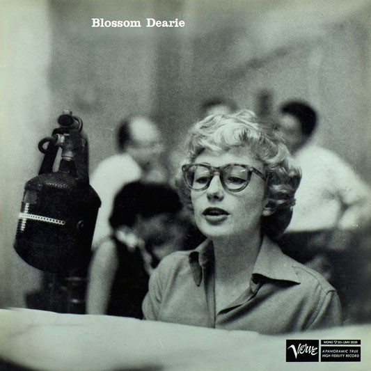
Blossom Dearie Verve 2037 Photography: Charles Stewart Simplicity at its finest. A studio microphone dangles above a young Blossom Dearie’s piano, who looks terribly cute with her slightly oversized thick-framed glasses. She rehearses for a take while miscellaneous studio gentlemen chat in the background. The choice of making her name especially small works to this cover’s advantage as it gives substantial weight to this beautiful black-and-white photograph of Dearie. |